Cape Cod cottage gate in fog with Buff Beauty apricot, Barbican Arts Centre, City of London, UK, Vineyard Field, Desk with motivational poster, and more — pen + watercolor for November 21, 2026
AI-generated daily art-practice references for pen and watercolor: Cape Cod cottage gate in fog with Buff Beauty apricot, Barbican Arts Centre, City of London, UK, Vineyard Field, Desk with motivational poster, Hutton-le-Hole approach, North York Moors, Three baskets, three species, South Asian e…
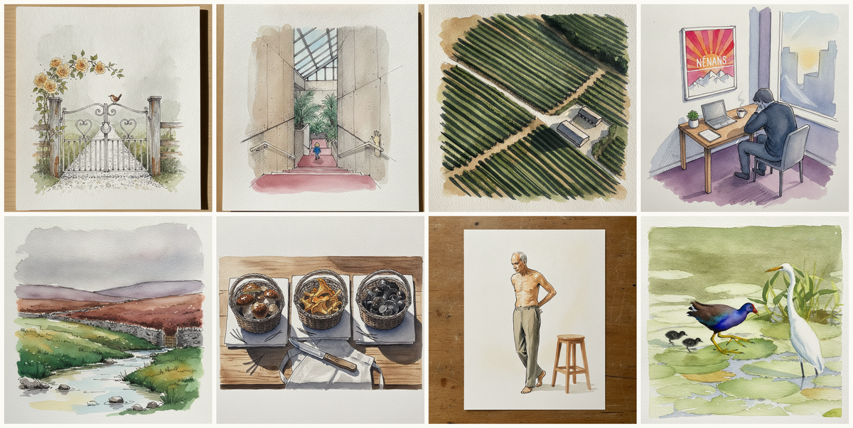
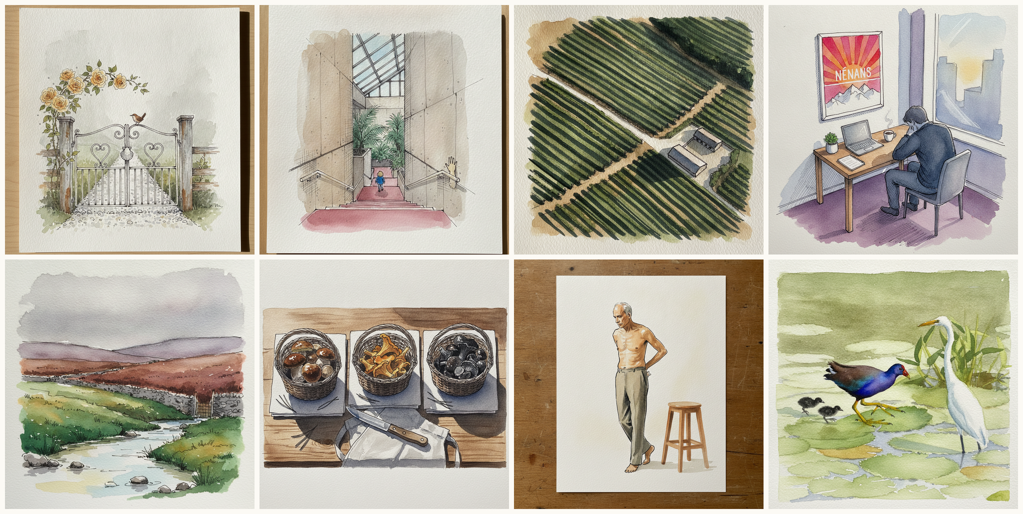
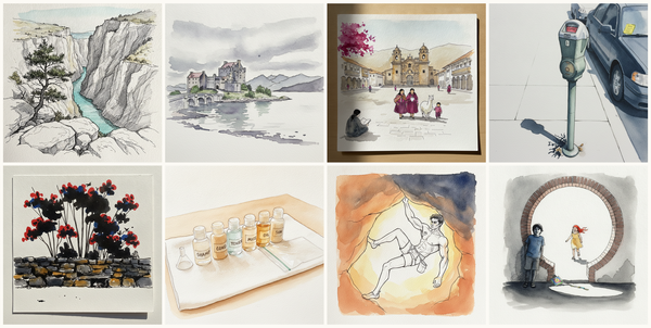
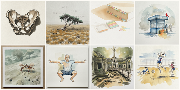
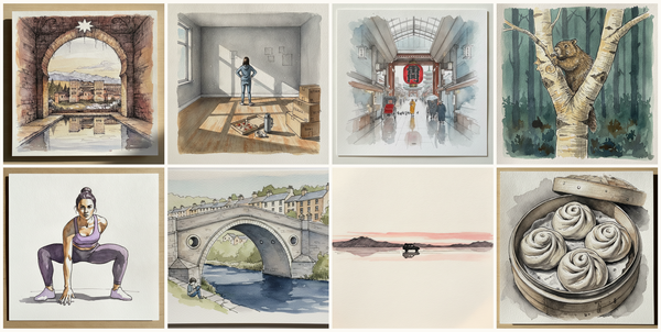
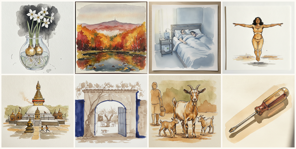
Today's 8 pen-and-watercolor pieces: Cape Cod cottage gate in fog with Buff Beauty apricot, Barbican Arts Centre, City of London, UK, Vineyard Field, Desk with motivational poster, Hutton-le-Hole approach, North York Moors, Three baskets, three species, South Asian elder, weight right, hands clasped behind, Purple gallinule. Each piece comes with an AI-generated photoreal reference, three AI-generated example artworks in different treatments, and a short focus paragraph naming what to study in this one.
Why these references use AI
This daily series uses AI-generated images as practice prompts, not as finished artwork to copy. Each subject starts with a synthetic photoreal reference generated with Gemini/Nano Banana, then moves into three pen-and-watercolor interpretations of the same subject.
I use AI here because daily art practice needs variety and low friction. Real life can get repetitive, busy, or visually narrow. These generated reference sets make it easier to study bodies, buildings, animals, landscapes, objects, gestures, light, palettes, and compositions that might not show up in an ordinary day.
The goal is not to reproduce any image directly. Treat each set as a starting point for observation and study: choose what interests you, change the framing, simplify the subject, alter the palette, and make your own version.
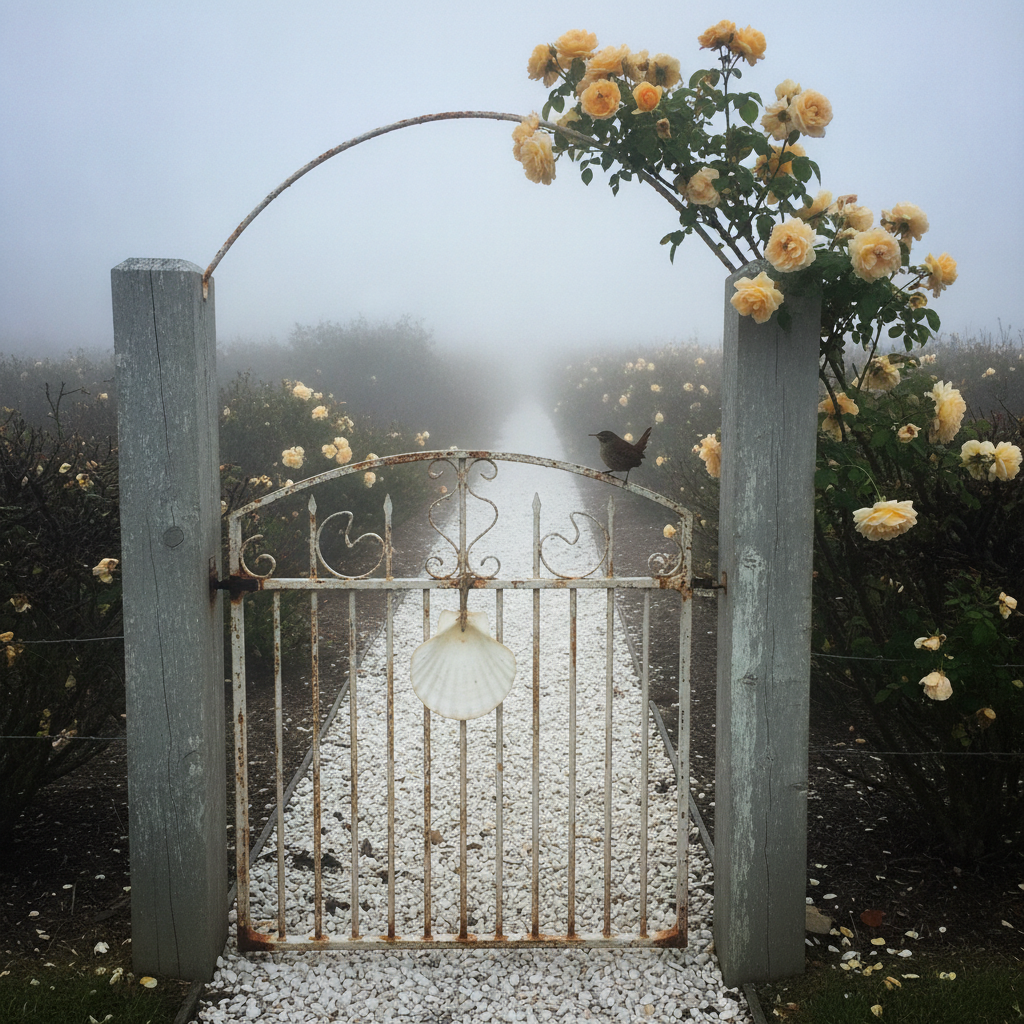
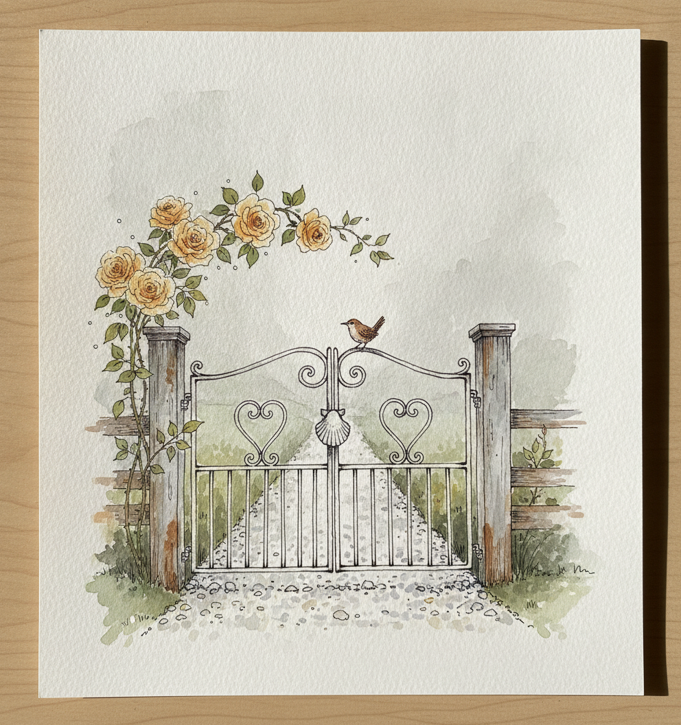
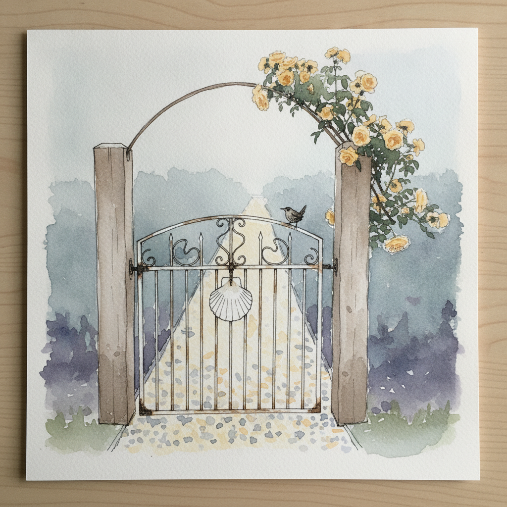
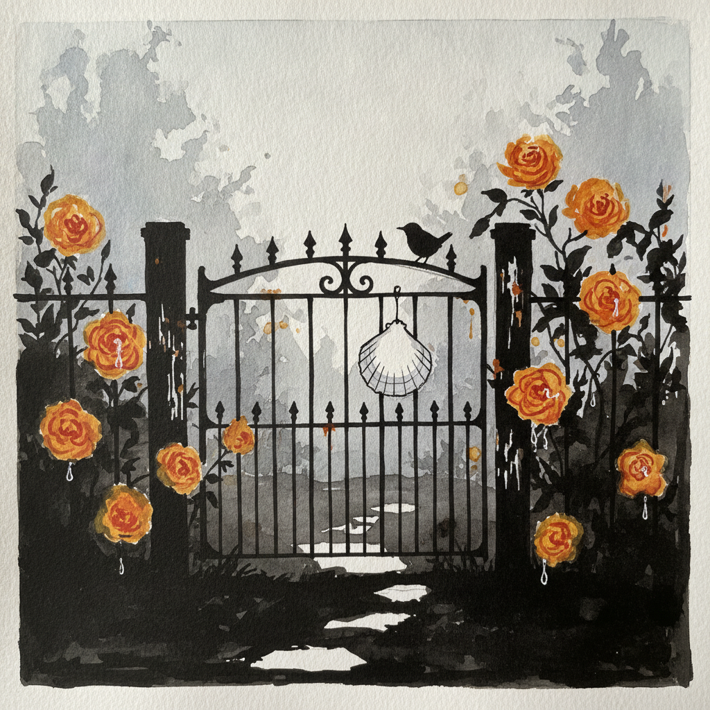
Piece 1 — Cape Cod cottage gate in fog with Buff Beauty apricot
Pen + Watercolor · Loose pen and watercolor line-and-wash
Three takes
Focus for this piece
This piece is an excellent study in creating atmospheric depth using a restrained, fog-influenced palette. Pay close attention to how soft, layered washes of desaturated color can suggest the visible movement of fog, especially in the background where form dissolves. Use varied line weights for the foreground elements like the wrought iron gate and the wren, letting the crispness fade into suggestion for the background beach plums.
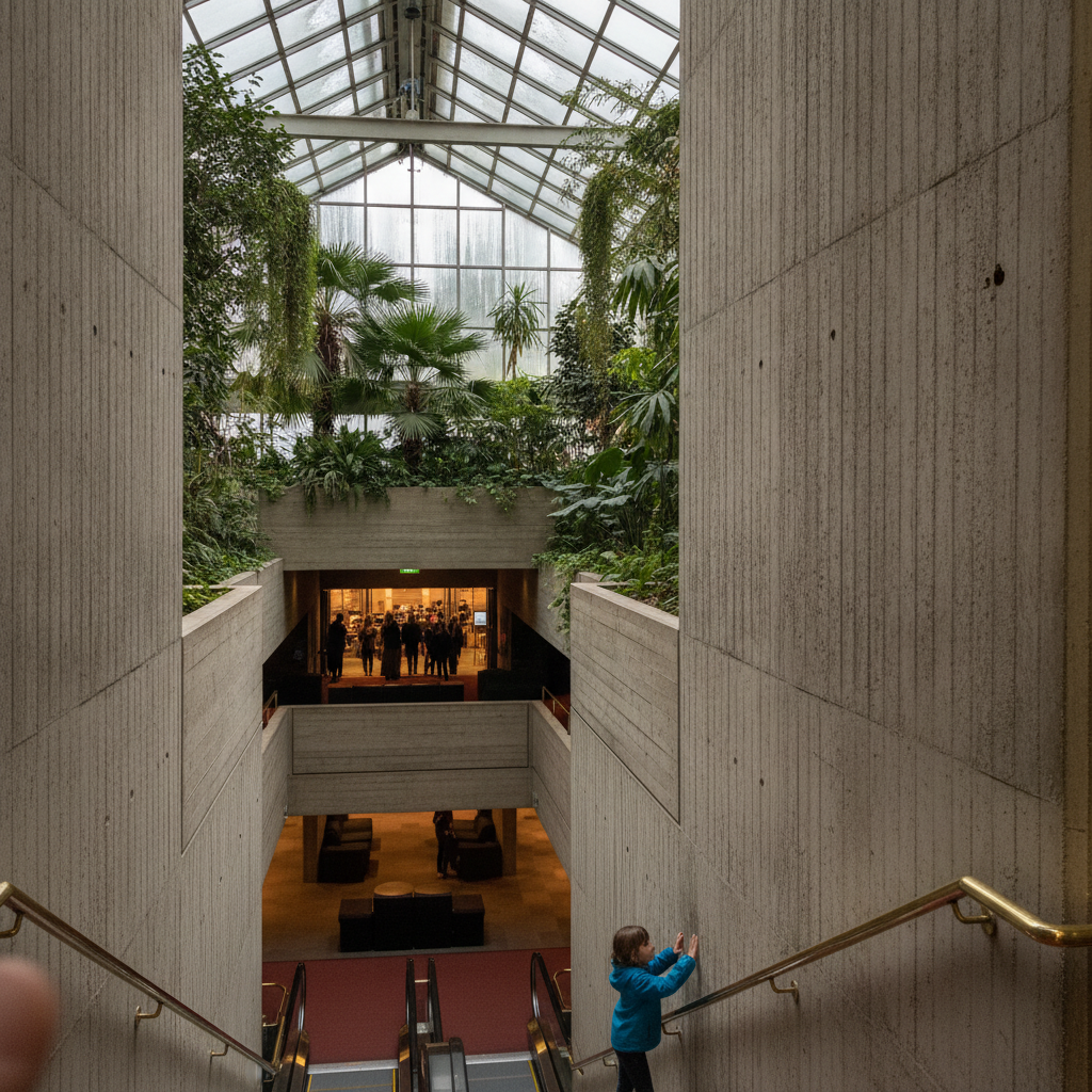
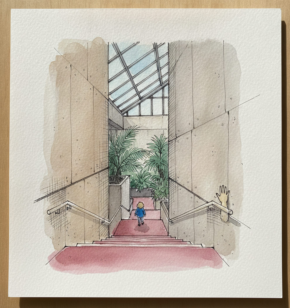
Piece 2 — Barbican Arts Centre, City of London, UK
Pen + Watercolor · Loose pen and watercolor line-and-wash
Three takes
Focus for this piece
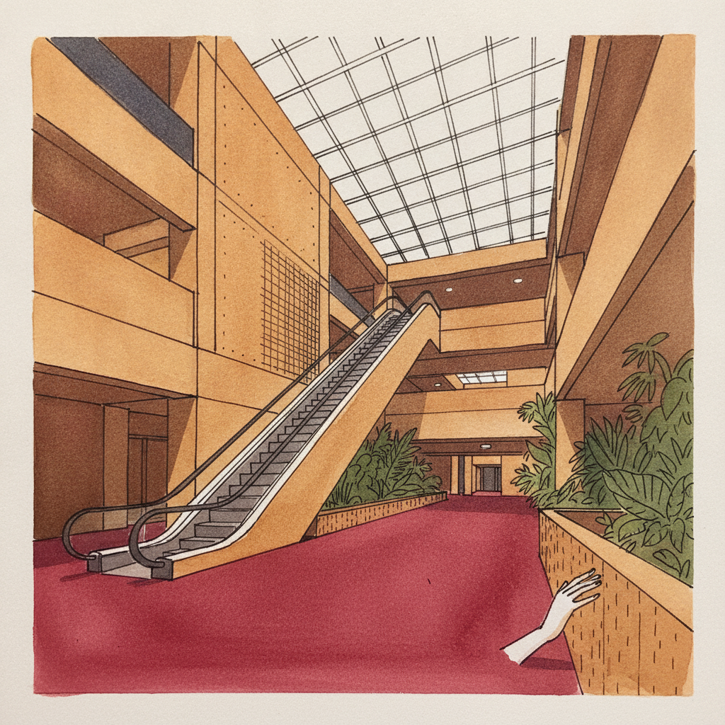
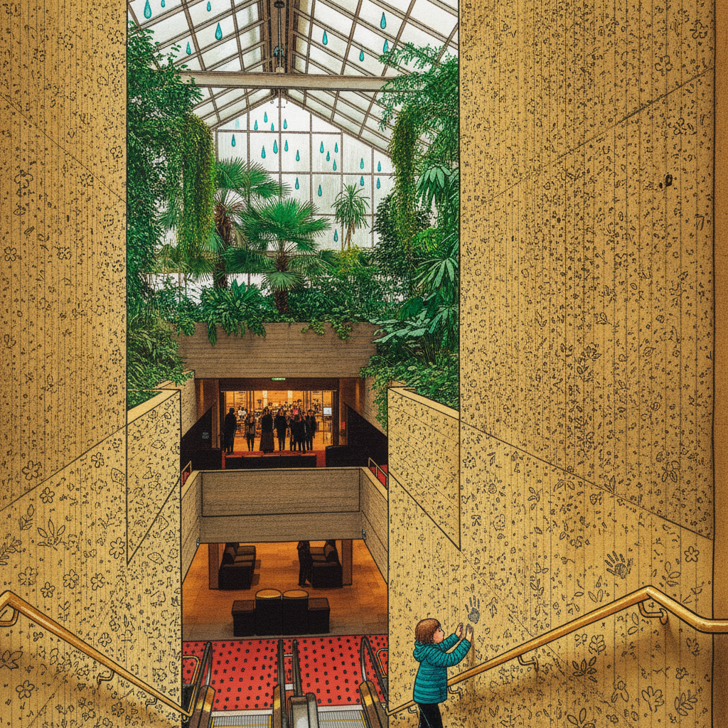
This Barbican interior is an excellent study in rendering contrasting surfaces and defining architectural depth. Use precise, varied pen lines to establish the strong linear perspective of the descending tiers and structural concrete, letting heavier lines define foreground elements like the brass handrails. Practice building the brutalist concrete texture with light, layered watercolor washes that allow the underlying pen work to anchor the form. Contrast this rigidity with fluid, green-dominant washes for the delicate tropical plants, letting their organic shapes soften the geometric structure.
Piece 3 — Vineyard Field
Pen + Watercolor · Loose pen and watercolor line-and-wash
Three takes
Focus for this piece
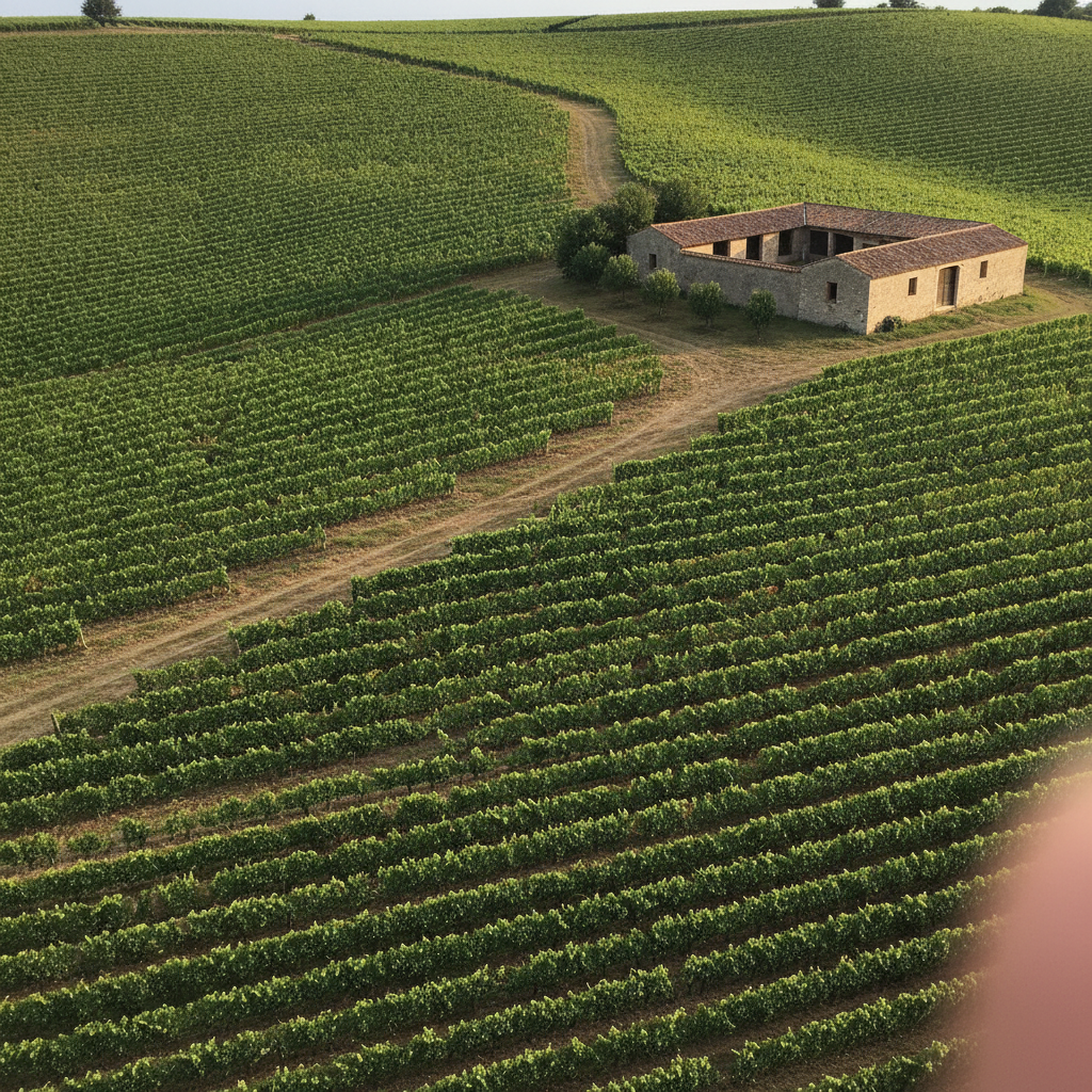
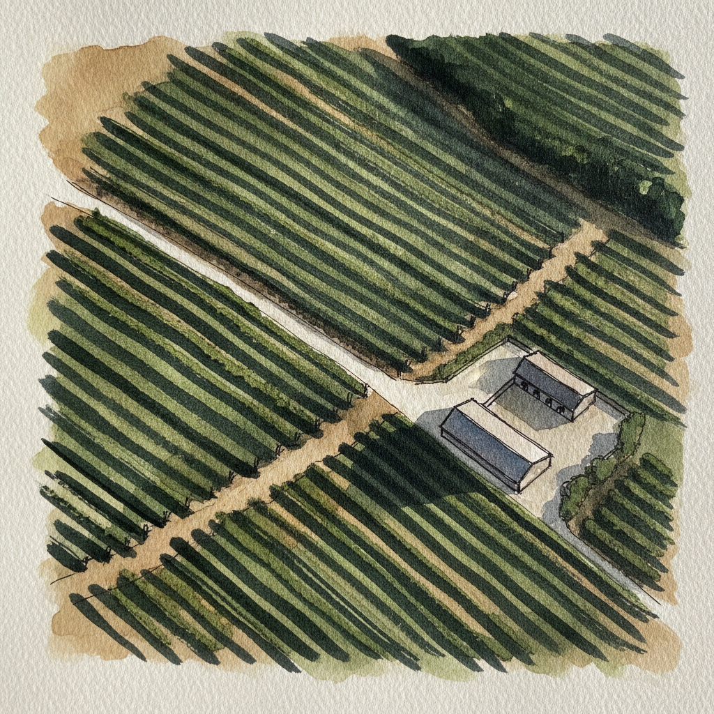
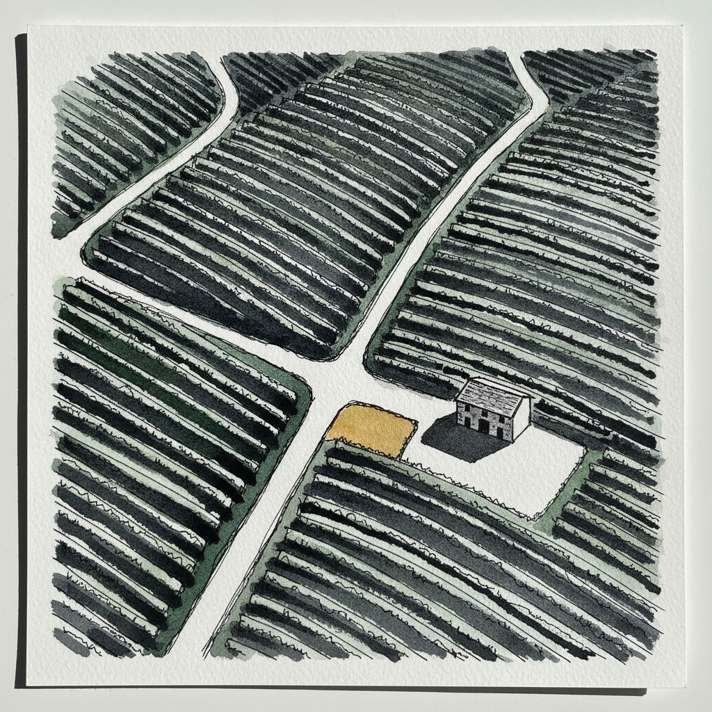
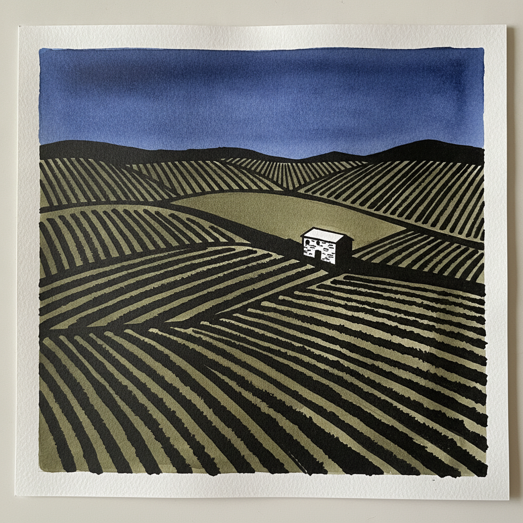
This drone-view vineyard offers a fantastic opportunity to practice conveying expansive aerial depth and the rolling topography of a landscape. Concentrate on using varying line weights—heavier for the central tractor lane, lighter for distant vine rows—to delineate form and guide the eye across the field. Use broad, wet-on-wet washes for the vast vineyard and its long afternoon shadows, letting the pigments create subtle textural variations over your carefully placed ink structure.
Piece 4 — Desk with motivational poster
Pen + Watercolor · Loose pen and watercolor line-and-wash

Three takes

Focus for this piece
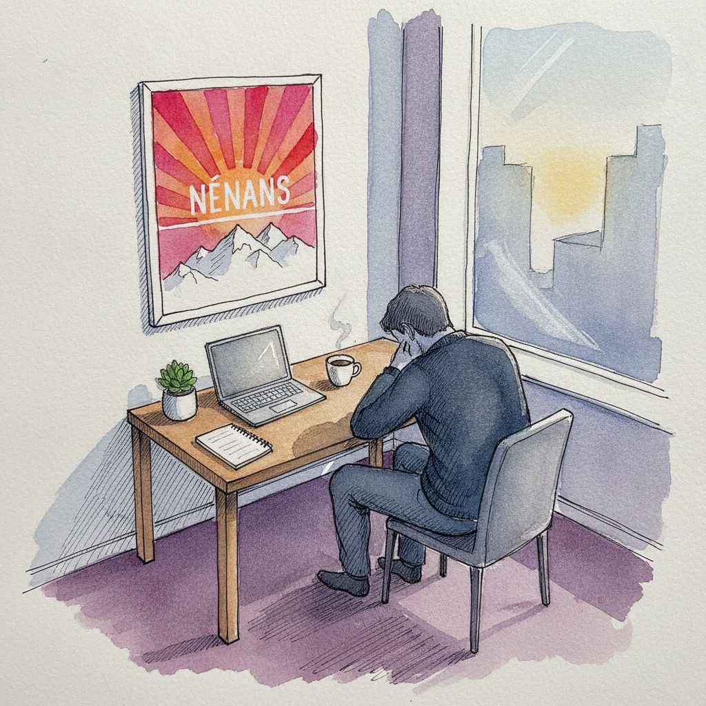
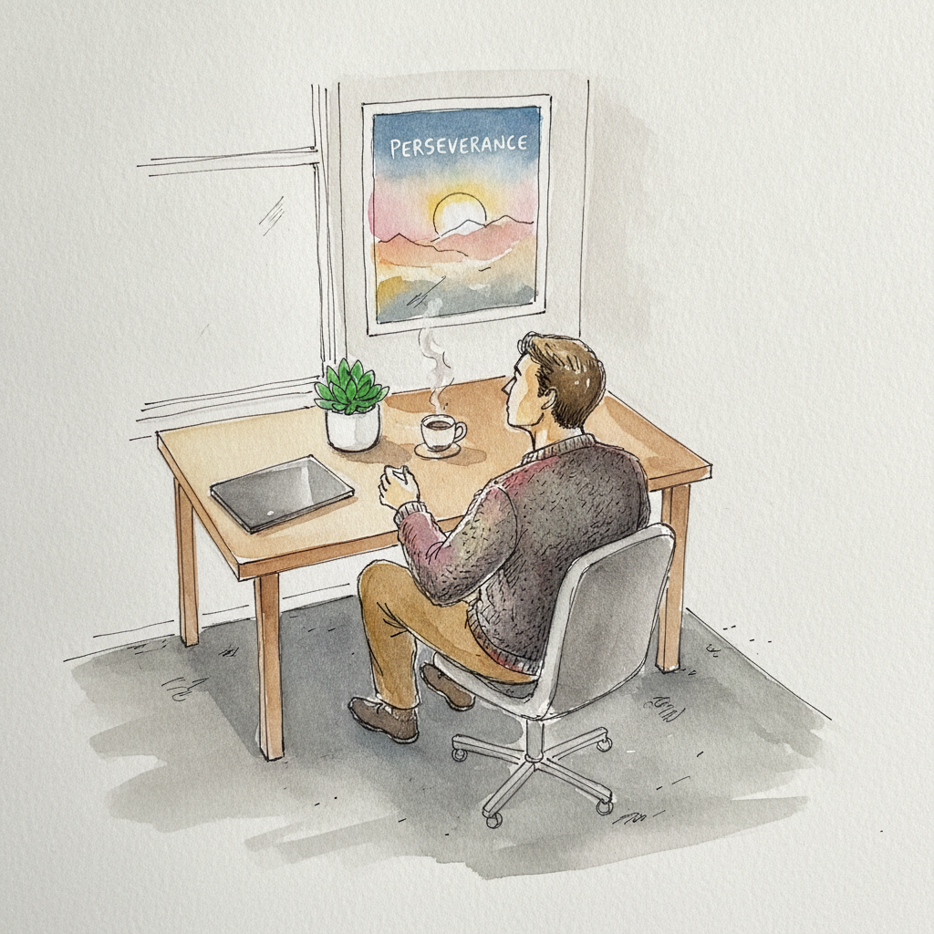
This piece offers a compelling study in using pen and wash to establish narrative contrast and depth. Vary your line weights significantly: bold, decisive lines for the poster's text and the man's expression, then lighter, more gestural marks for the desk's mundane details. Employ a largely desaturated, cool watercolor palette for the foreground, allowing a controlled, analogous burst of warm color for the poster's sunrise and the subtle window glow to create emotional tension. Use a soft, wet-on-wet wash for the industrial carpet to recede, emphasizing the sharp geometric forms of the desk and poster.
Piece 5 — Hutton-le-Hole approach, North York Moors
Pen + Watercolor · Loose pen and watercolor line-and-wash
Three takes

Focus for this piece
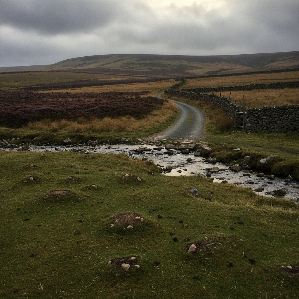
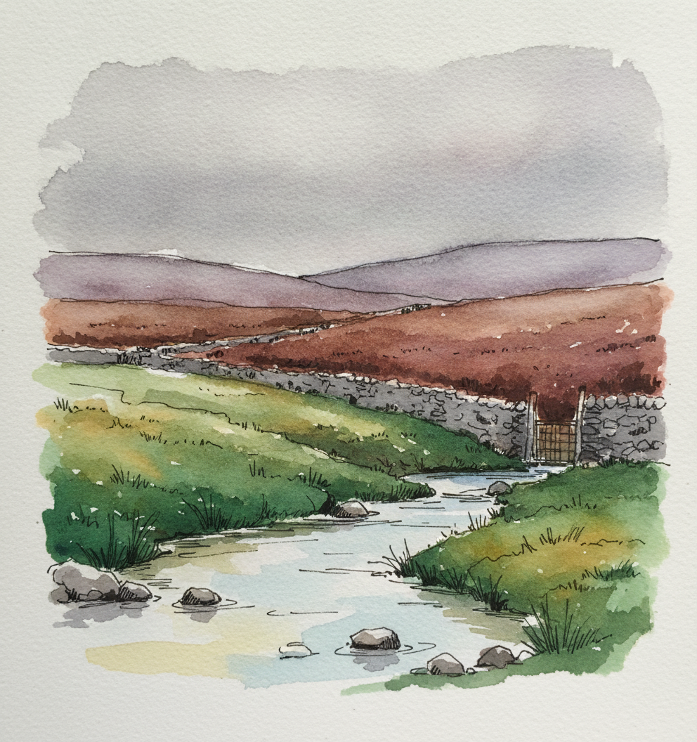
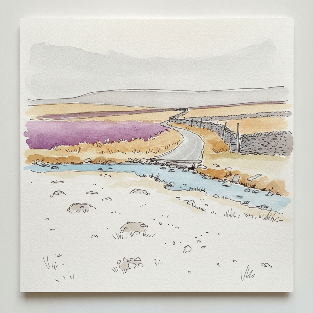
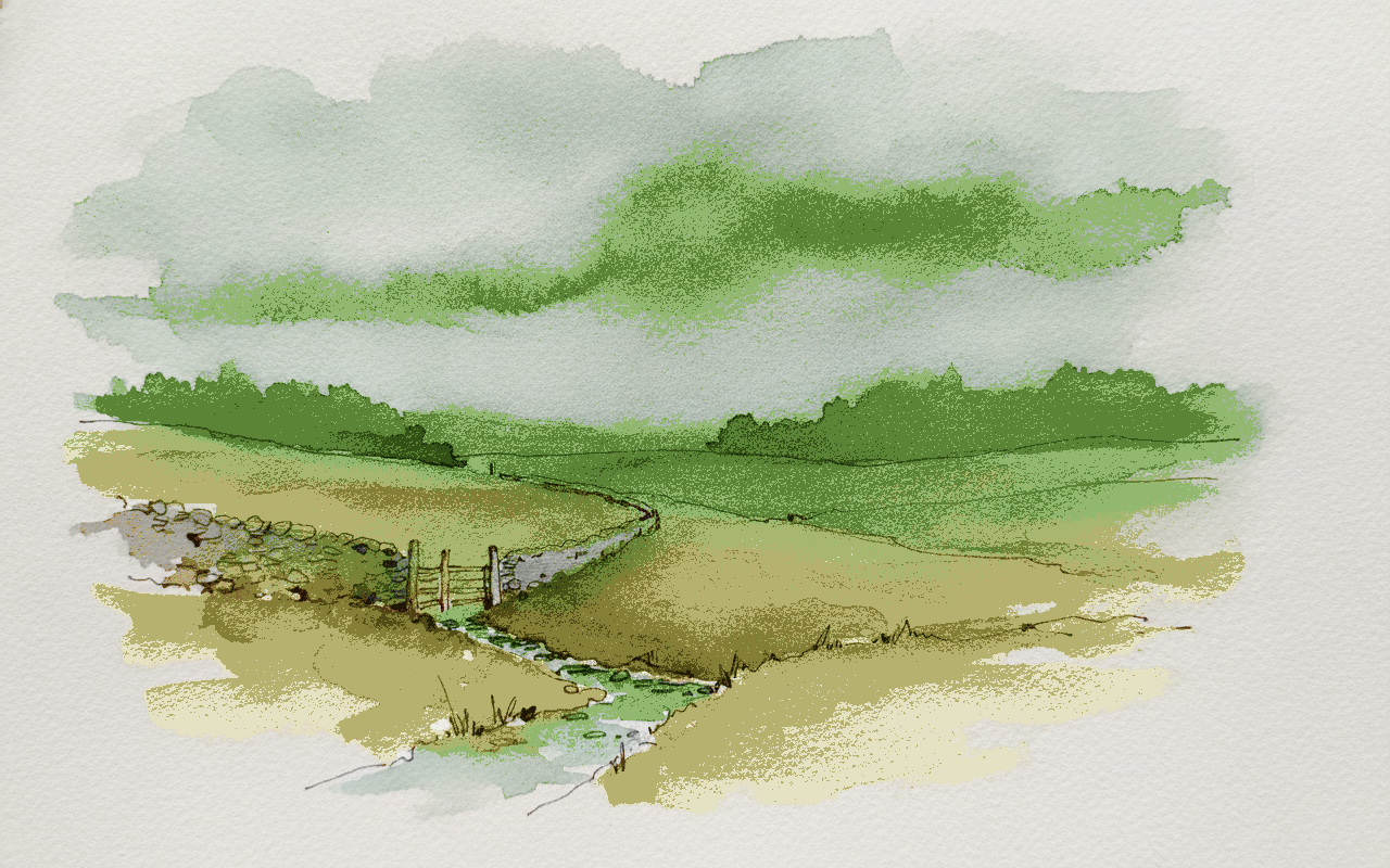
This piece is ideal for practicing how line weight and wash intensity work together to establish depth and texture, particularly by differentiating foreground detail from atmospheric distance. Use varied, broken pen lines and dry-brush texture to capture the rough pasture and ant-hills, contrasting this with soft, expansive washes of diluted cool purples and blues to suggest the rolling moor and low cloud. Pay careful attention to the drystone wall, letting its consistent form and varied line weight lead the eye into the increasingly muted background.
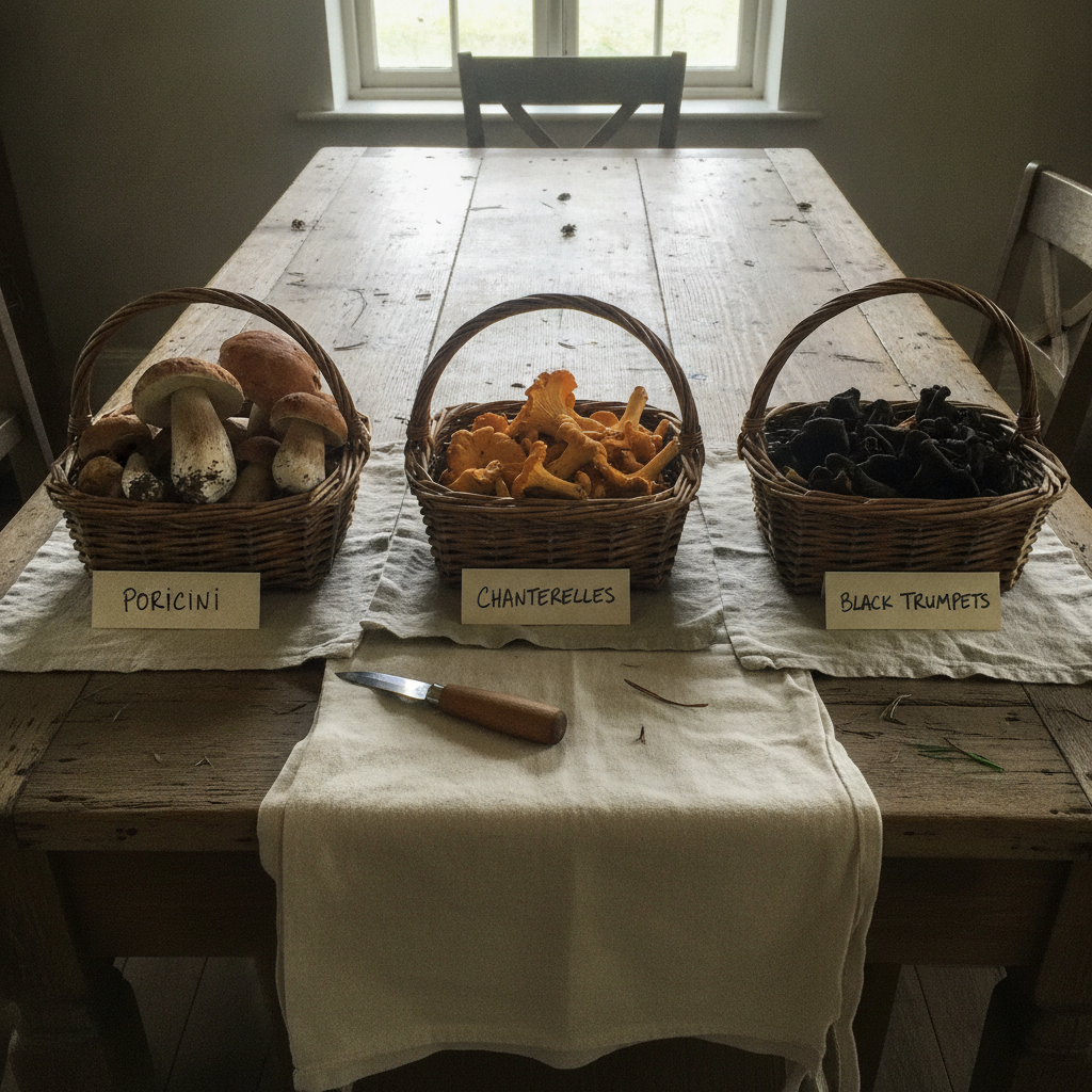
Piece 6 — Three baskets, three species
Pen + Watercolor · Loose pen and watercolor line-and-wash
Three takes
Focus for this piece
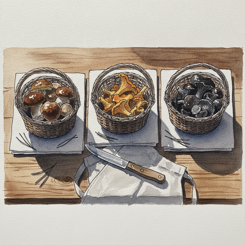
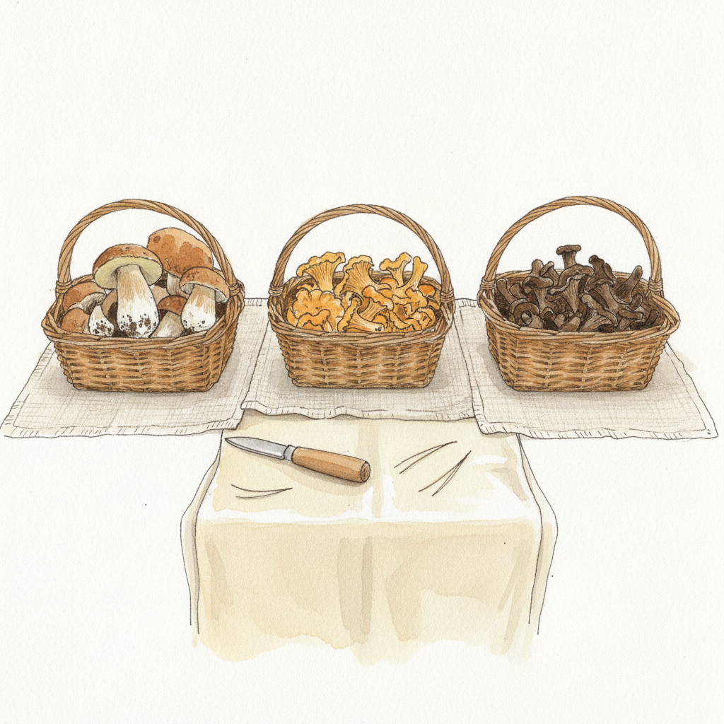
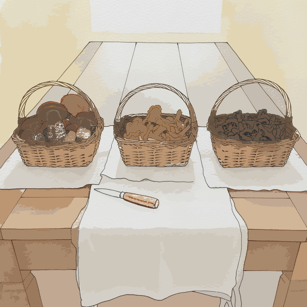
This piece offers a focused study in rendering dramatic backlighting and creating compelling silhouettes with pen and watercolor. Use a slightly heavier, continuous line weight for the primary contours of the baskets and mushrooms, allowing the ink to crisply define their forms against the light. Then, build the luminous background and subtle internal modeling of the shadowed elements with layered, transparent washes, carefully blending soft watercolor edges with your decisive ink lines to create depth and atmosphere.
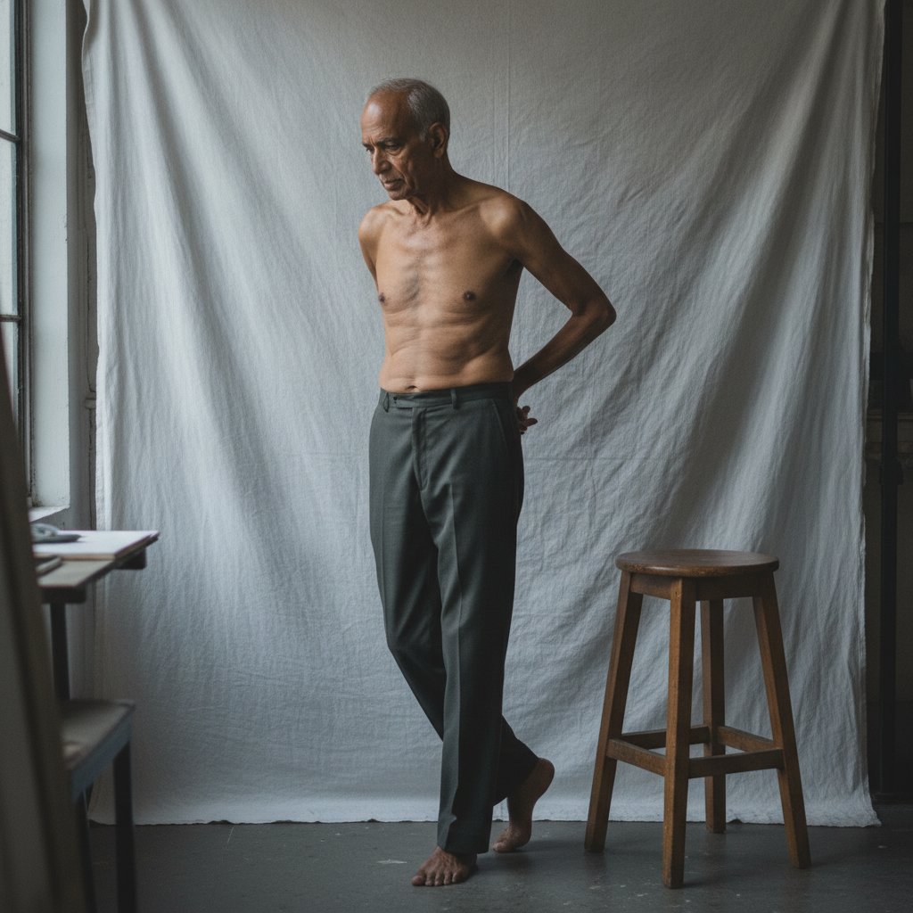
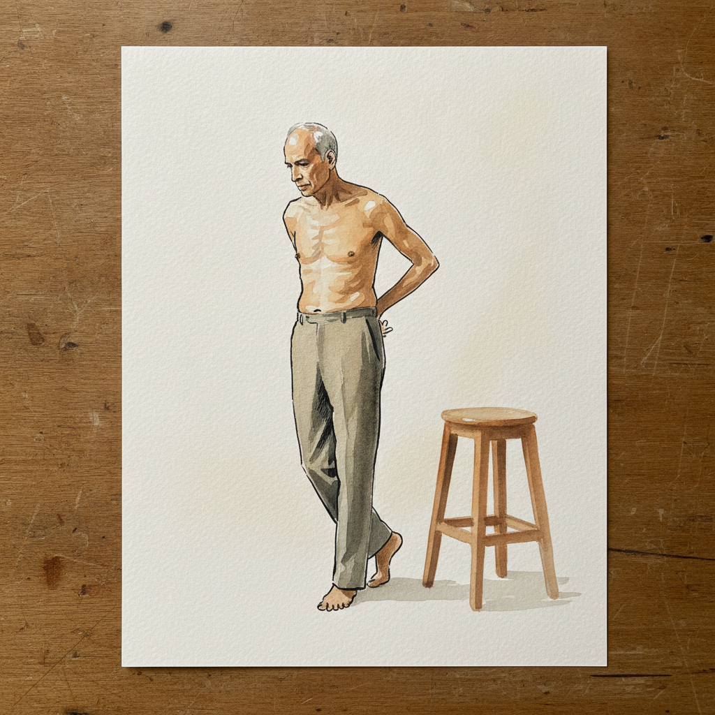
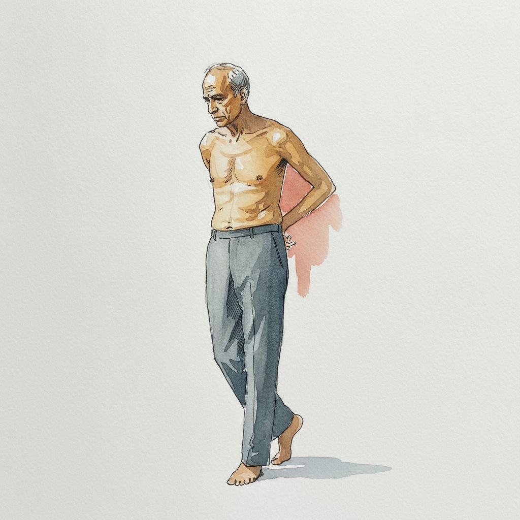
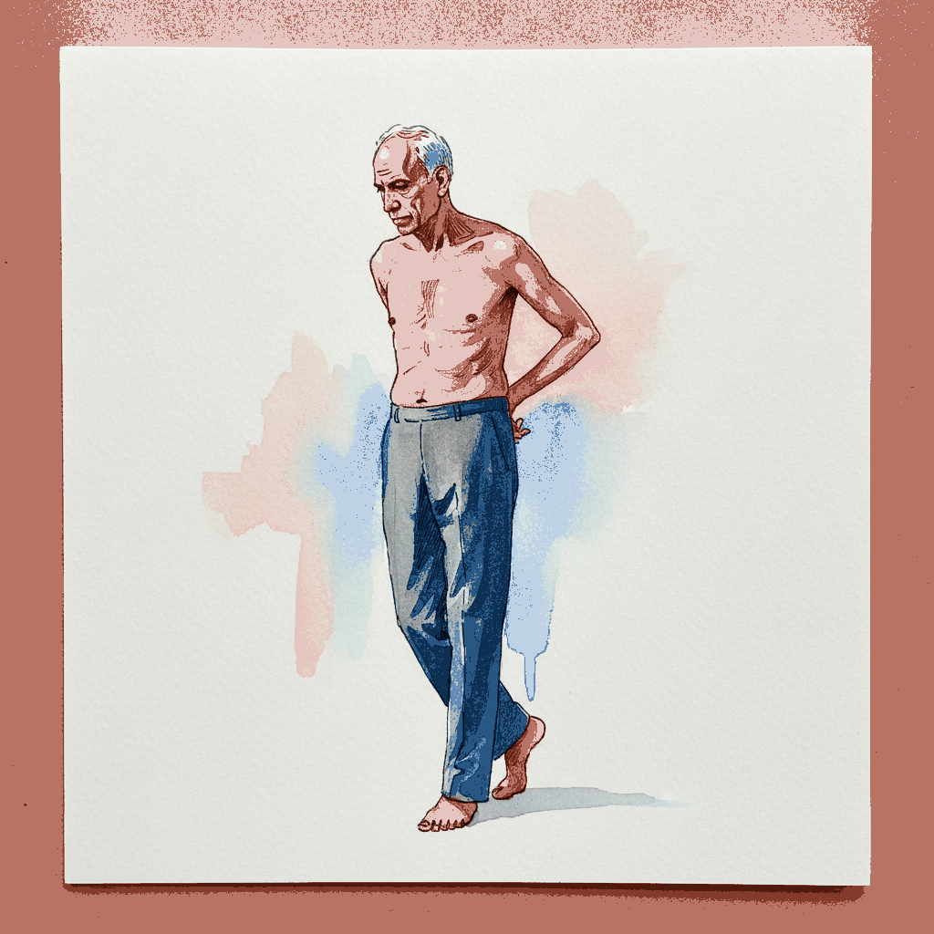
Piece 7 — South Asian elder, weight right, hands clasped behind
Pen + Watercolor · Loose pen and watercolor line-and-wash
Three takes

Focus for this piece
This piece offers an excellent study in conveying **dynamic balance** and the subtle shifts of the human form through **contrapposto**. Observe how the weight on the right leg creates a corresponding tilt and counter-tilt in the shoulders, emphasizing this with **responsive line weight** from your pen. Then, use **thin, cool-toned washes** to softly model the planes of the torso and the hollows around the clavicle, reflecting the even north light.
Piece 8 — Purple gallinule
Pen + Watercolor · Loose pen and watercolor line-and-wash
Three takes
Focus for this piece
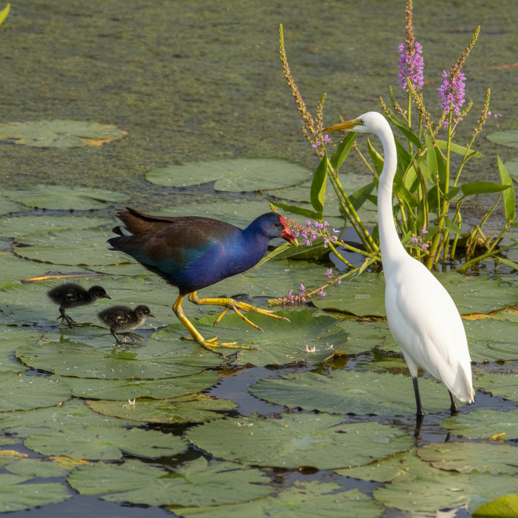
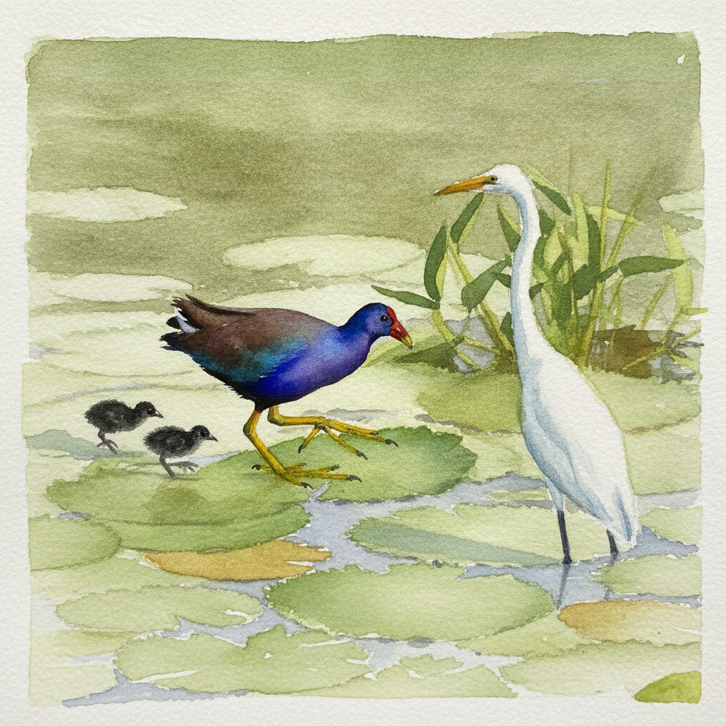
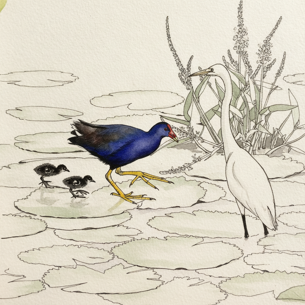
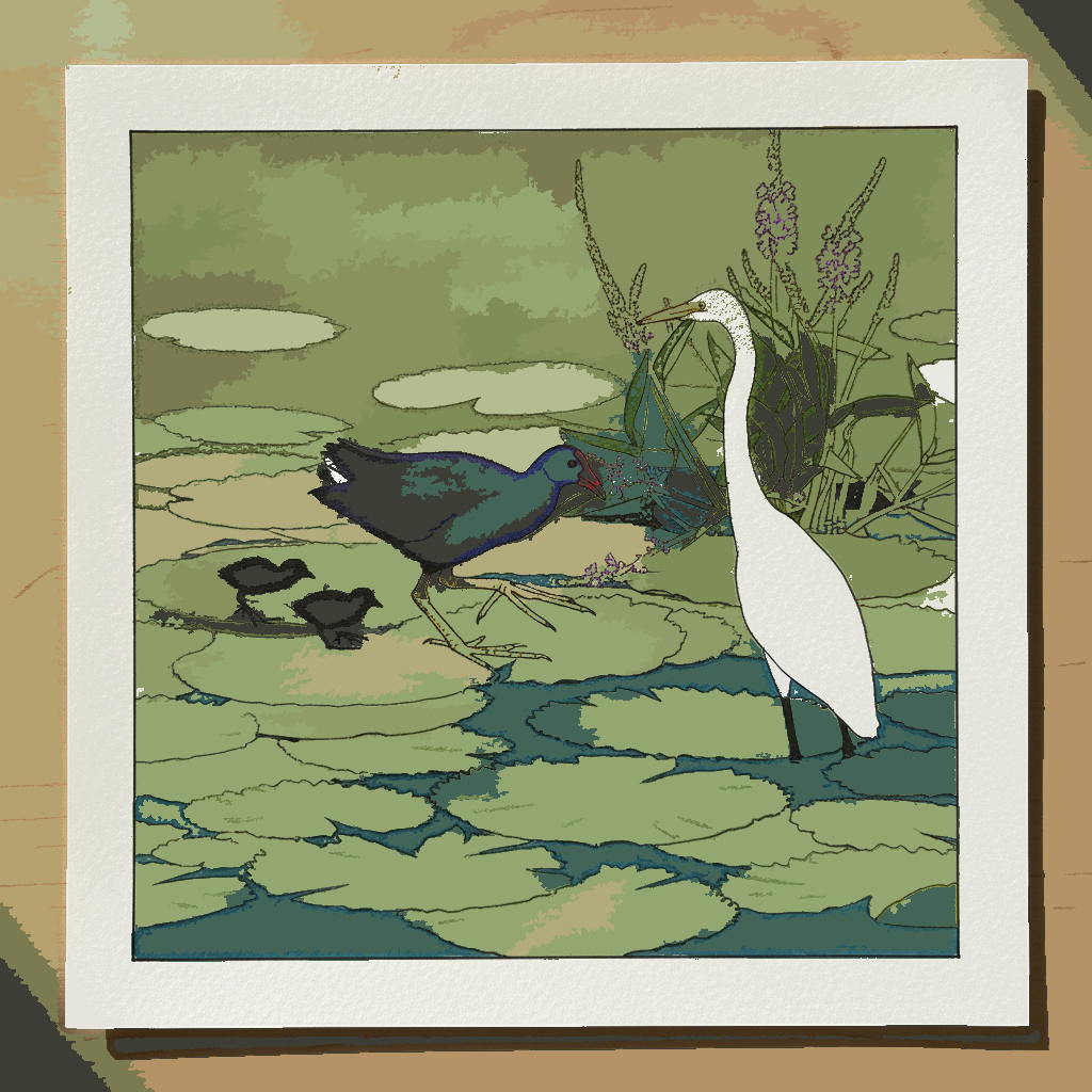
This piece is an excellent study in creating focal points through **vivid color contrast** and **varied line weights**. Practice letting the brilliant purple-blue of the gallinule’s body and its striking red and yellow bill truly *pop* against the more muted, layered greens of the lily pads and marsh. Use light, broad washes for the floating leaves, then define the bird's form and the texture of its iridescent plumage with crisp, deliberate pen lines, paying close attention to the expressive shapes of its enormous, splayed toes. Consider using a limited palette for your greens to further emphasize the bird's vibrant colors.