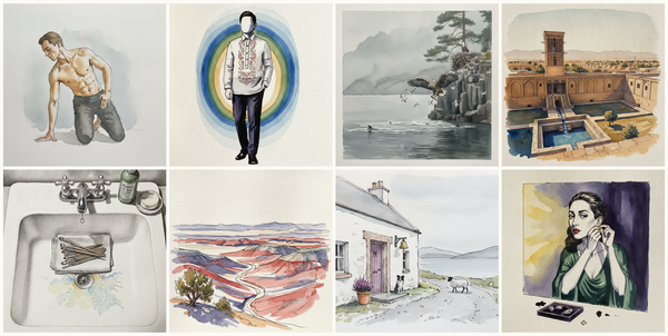
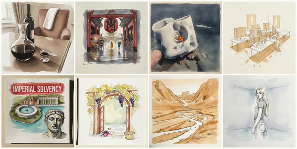
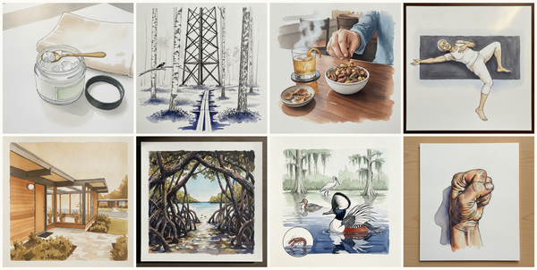
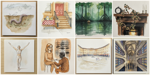
Latina non-binary person, 20s, twisted glance, Provencal gate after mistral, leaves piled at the foot, Scandinavian neutral bedroom, NMR tubes in beaker, and more — pen + watercolor for September 2, 2026
AI-generated daily art-practice references for pen and watercolor: Latina non-binary person, 20s, twisted glance, Provencal gate after mistral, leaves piled at the foot, Scandinavian neutral bedroom, NMR tubes in beaker, Chinese (lacebark) elm, Bryce Canyon Inspiration Point sunset, Utah, USA, La…
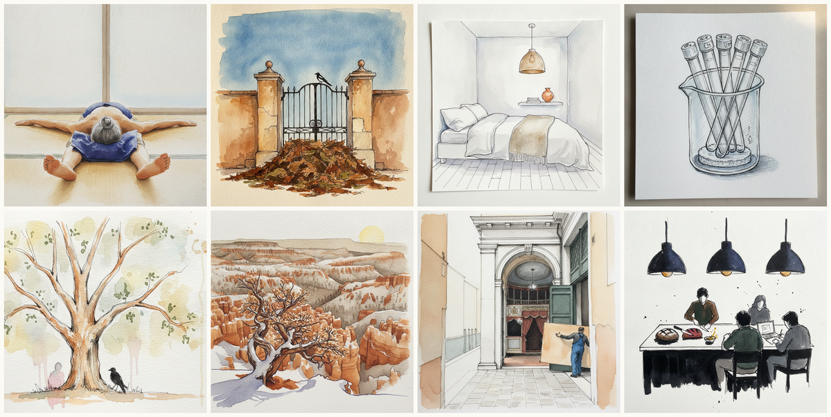
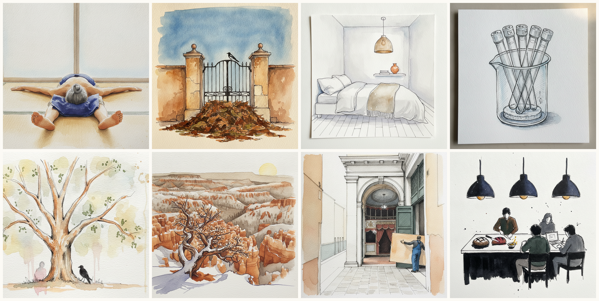
Today's 8 pen-and-watercolor pieces: Latina non-binary person, 20s, twisted glance, Provencal gate after mistral, leaves piled at the foot, Scandinavian neutral bedroom, NMR tubes in beaker, Chinese (lacebark) elm, Bryce Canyon Inspiration Point sunset, Utah, USA, La Fenice, Venice, Italy, Pendant light over island. Each piece comes with an AI-generated photoreal reference, three AI-generated example artworks in different treatments, and a short focus paragraph naming what to study in this one.
Why these references use AI
This daily series uses AI-generated images as practice prompts, not as finished artwork to copy. Each subject starts with a synthetic photoreal reference generated with Gemini/Nano Banana, then moves into three pen-and-watercolor interpretations of the same subject.
I use AI here because daily art practice needs variety and low friction. Real life can get repetitive, busy, or visually narrow. These generated reference sets make it easier to study bodies, buildings, animals, landscapes, objects, gestures, light, palettes, and compositions that might not show up in an ordinary day.
The goal is not to reproduce any image directly. Treat each set as a starting point for observation and study: choose what interests you, change the framing, simplify the subject, alter the palette, and make your own version.
Piece 1 — Latina non-binary person, 20s, twisted glance
Pen + Watercolor · Loose pen and watercolor line-and-wash
Three takes
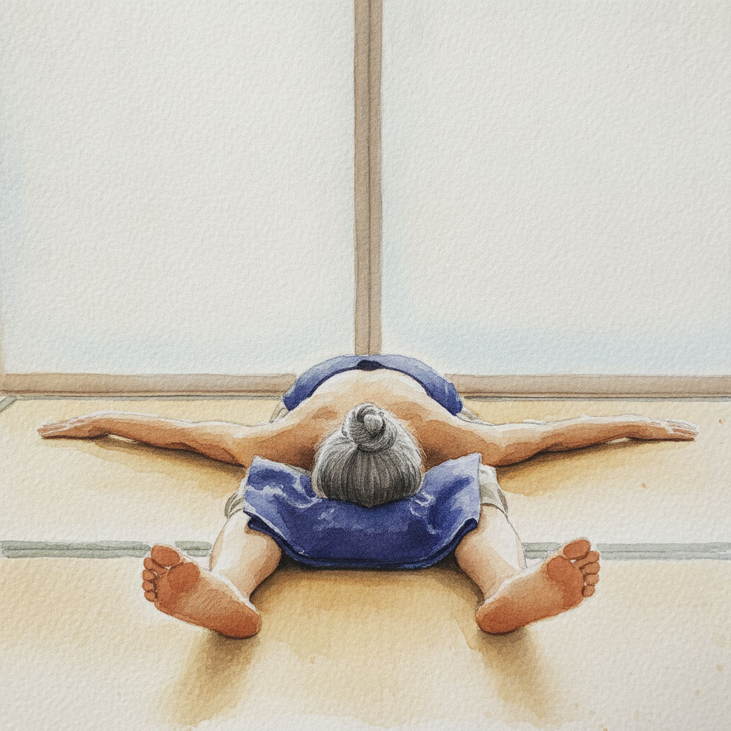
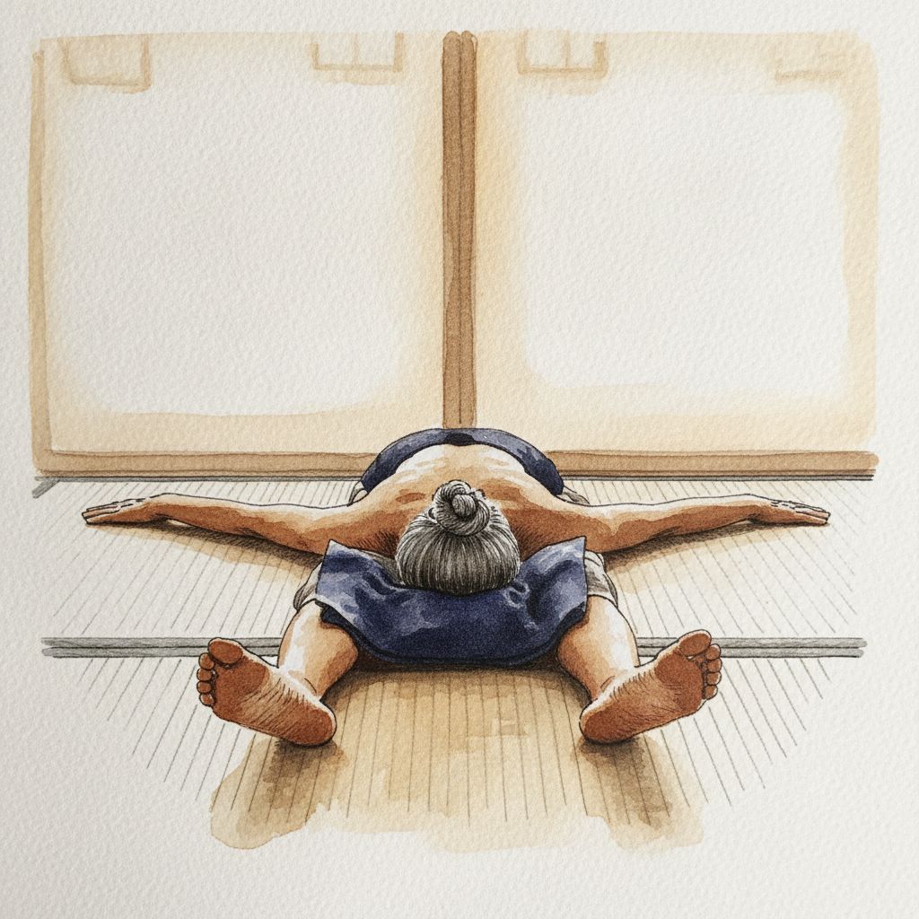
Focus for this piece
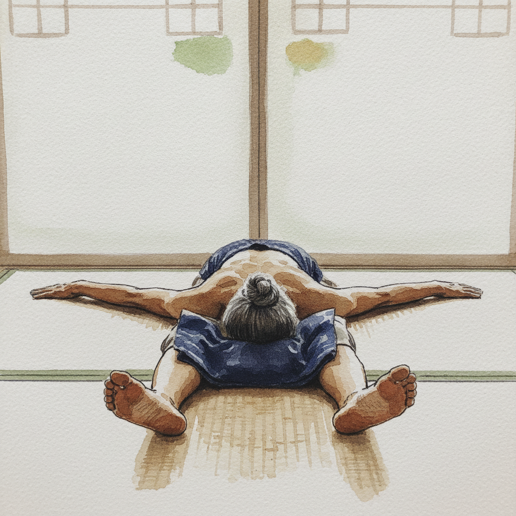
This study is perfect for developing your eye for subtle value shifts and soft anatomical modeling. Focus on how delicate, layered washes can build the gentle volume of the figure, respecting the "gentle lumbar dowager curve" and "deep release" of the pose under the "soft even wash" of light. Use varied pen line weights to define the "wide relaxed V" of the arms and the overall "sensory line" of the body, allowing the ink to provide structure while the watercolor provides form and serene atmosphere.
Piece 2 — Provencal gate after mistral, leaves piled at the foot
Pen + Watercolor · Loose pen and watercolor line-and-wash
Three takes
Focus for this piece
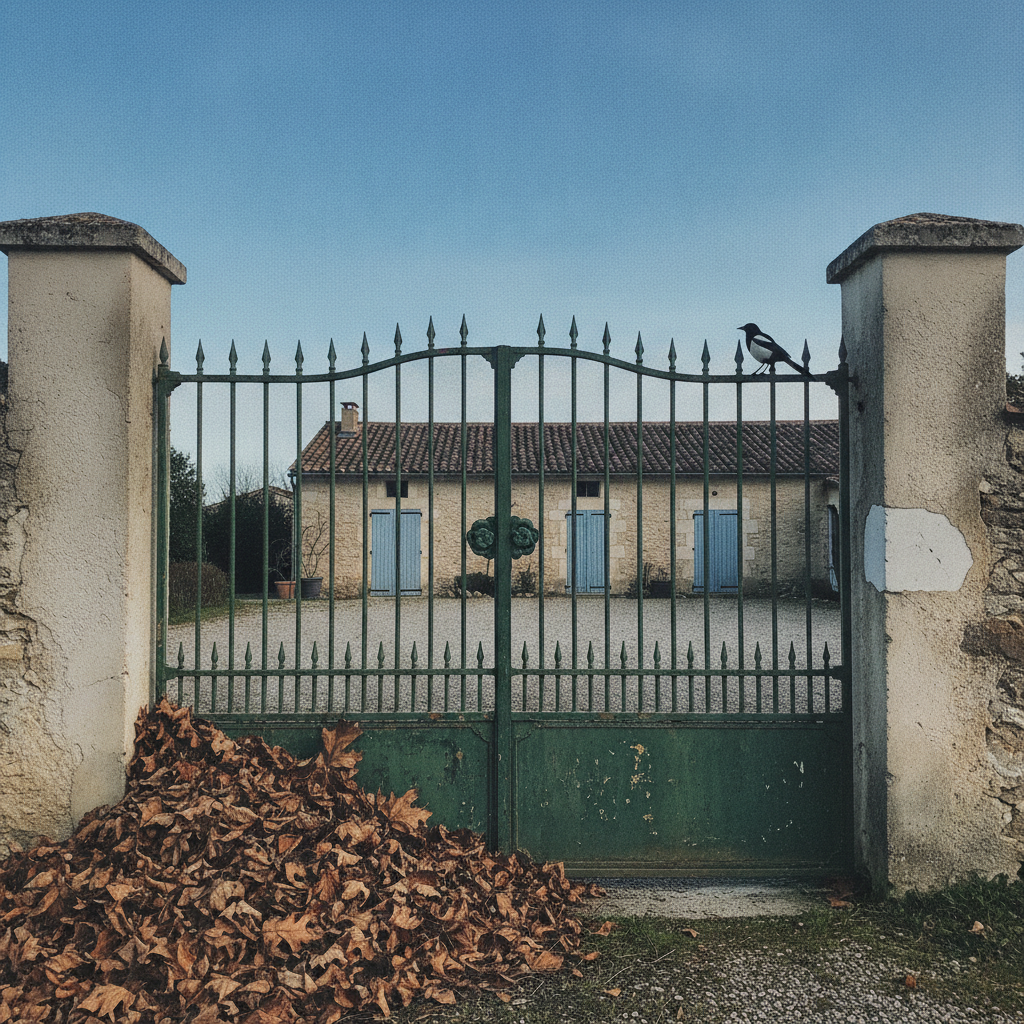
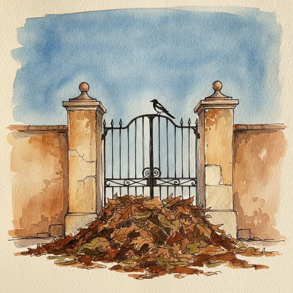
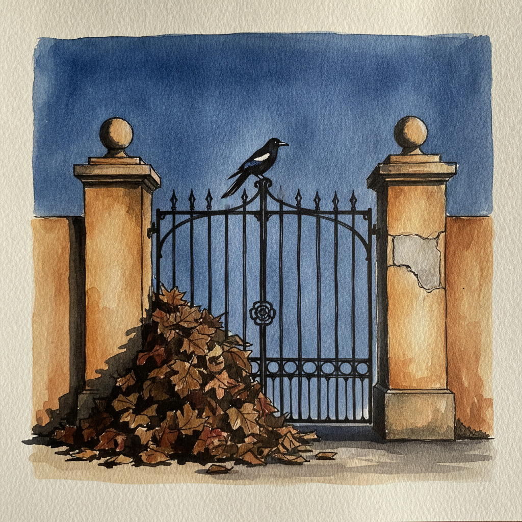
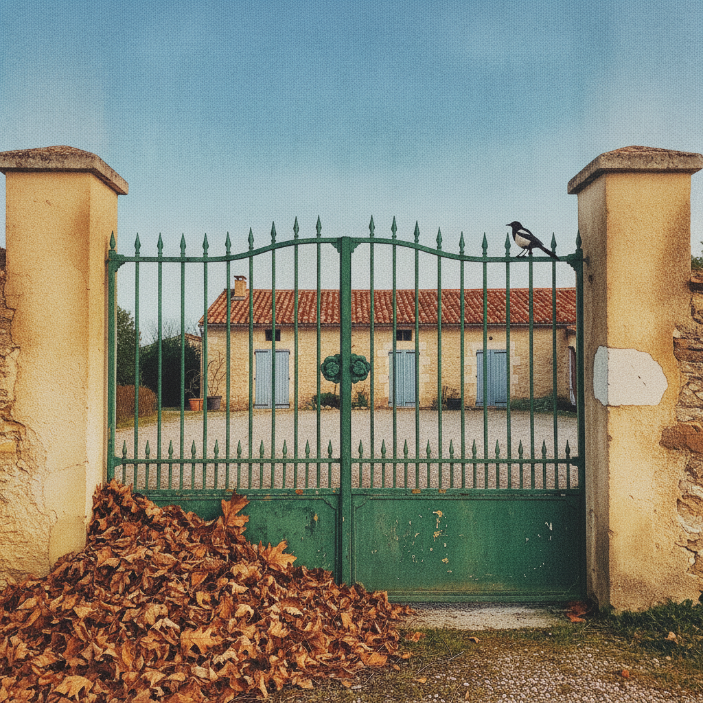
This piece is an excellent study in combining precise linear structure with organic texture and atmospheric washes. Focus on using varied pen line weights to define the crisp ironwork of the gate against the loose, textural washes suggesting the rough stucco of the pillars. Experiment with a warm, wet-on-wet wash for the deep pile of leaves, allowing the watercolor to create their volume before adding selective pen lines for definition. Finally, use a pale, lifted wash for the exposed stone on the pillar, contrasting its smoothness against the surrounding grit.
Piece 3 — Scandinavian neutral bedroom
Pen + Watercolor · Loose pen and watercolor line-and-wash
Three takes
Focus for this piece
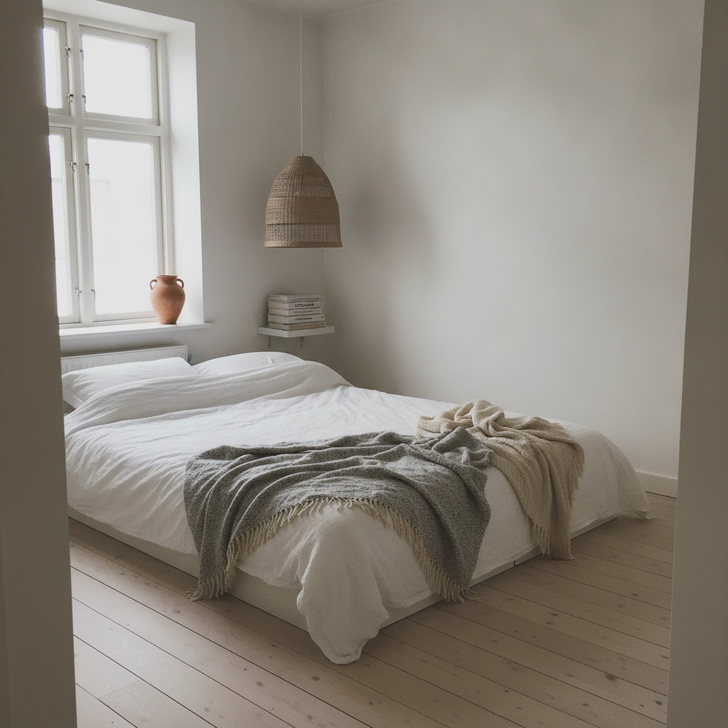
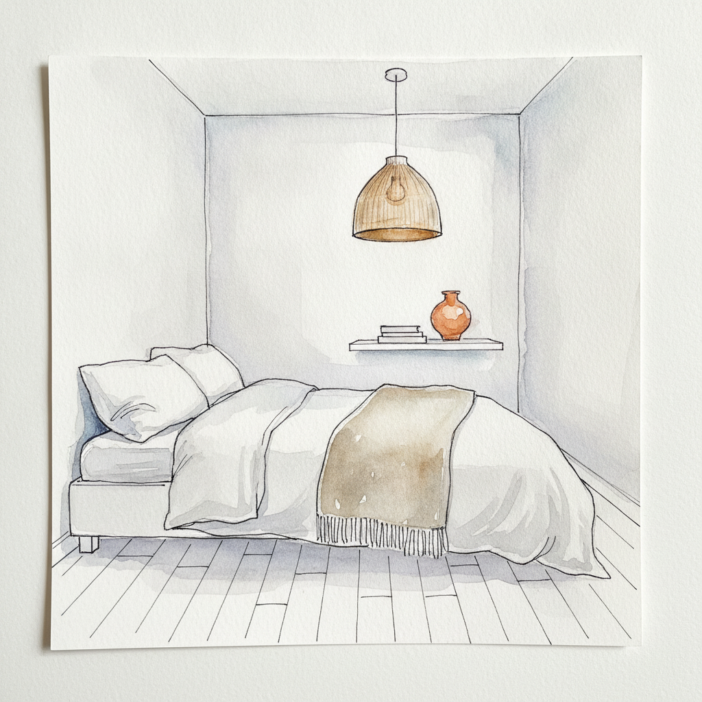
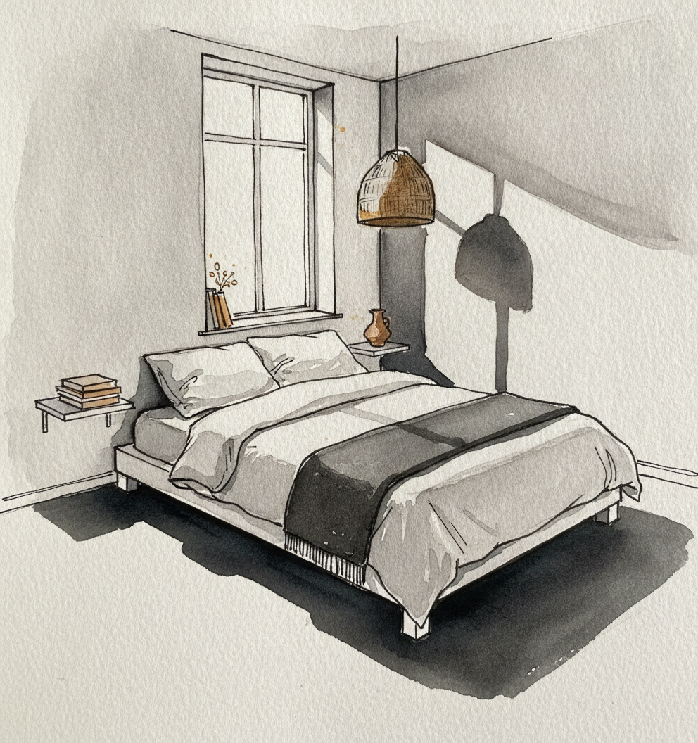
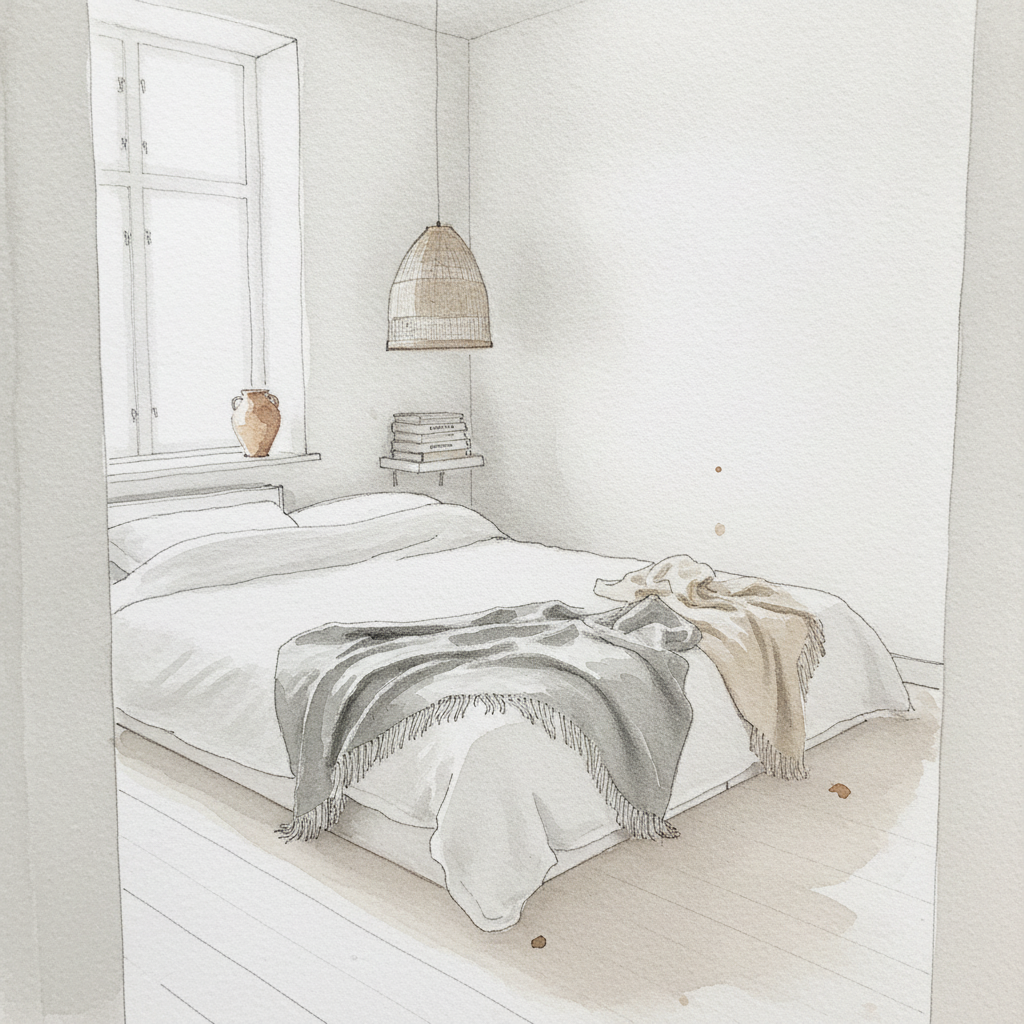
This Scandinavian bedroom, with its north light and neutral palette, is an excellent study in creating depth and form through *subtle value gradation* rather than strong shadows. Focus on applying very dilute washes of cool and warm greys to model the white linens, pale birch floor, and the woven texture of the pendant lamp. Use varied, delicate line weights to define edges and suggest materials, letting the luminous paper itself represent the brightest white values.
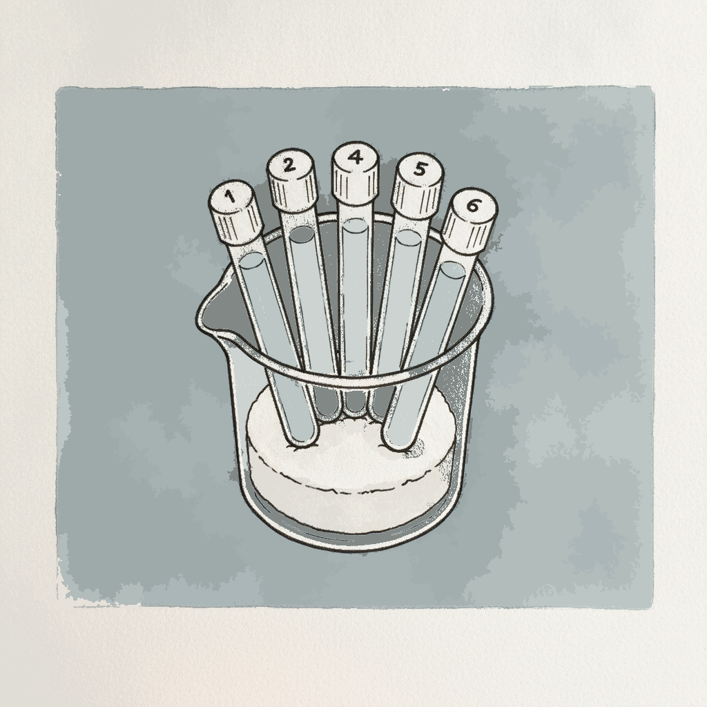
Piece 4 — NMR tubes in beaker
Pen + Watercolor · Loose pen and watercolor line-and-wash
Three takes
Focus for this piece
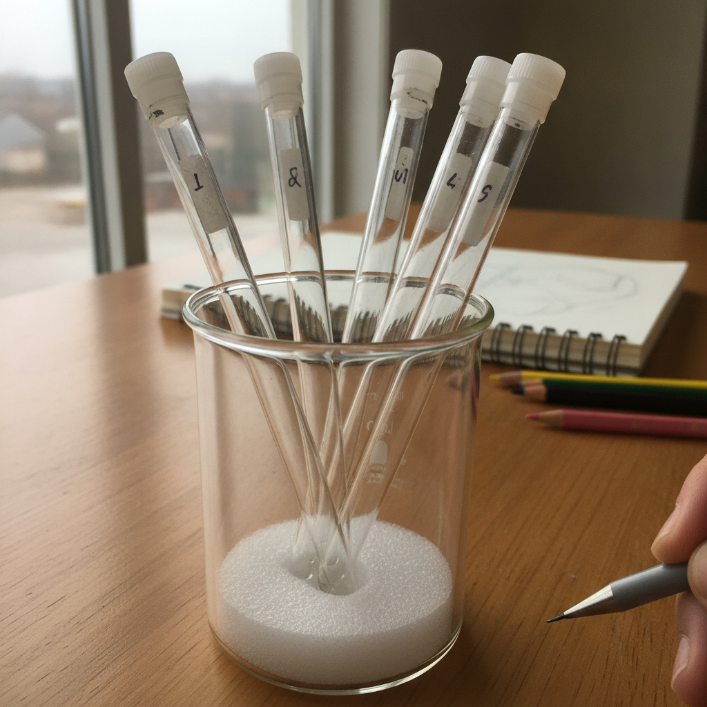
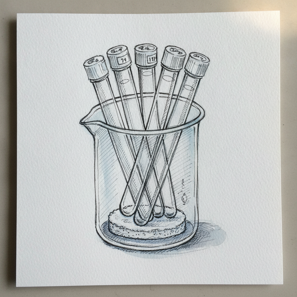
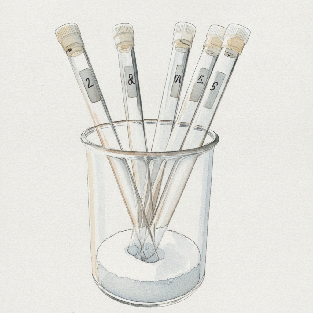
This piece is an excellent study in rendering multiple slender cylindrical forms, focusing on how subtle variations in pen line weight can define their *precise thinness* and individual structure. Pay close attention to the consistent ellipses for the tops and bottoms of the tubes and beaker, using delicate lines. Then, use very light, cool-toned watercolor washes, layered gradually, to suggest the transparency and reflections of the glass, ensuring the washes remain dilute enough to preserve your fine pen work. This will help you balance architectural precision with the atmospheric qualities of watercolor to depict reflective surfaces.
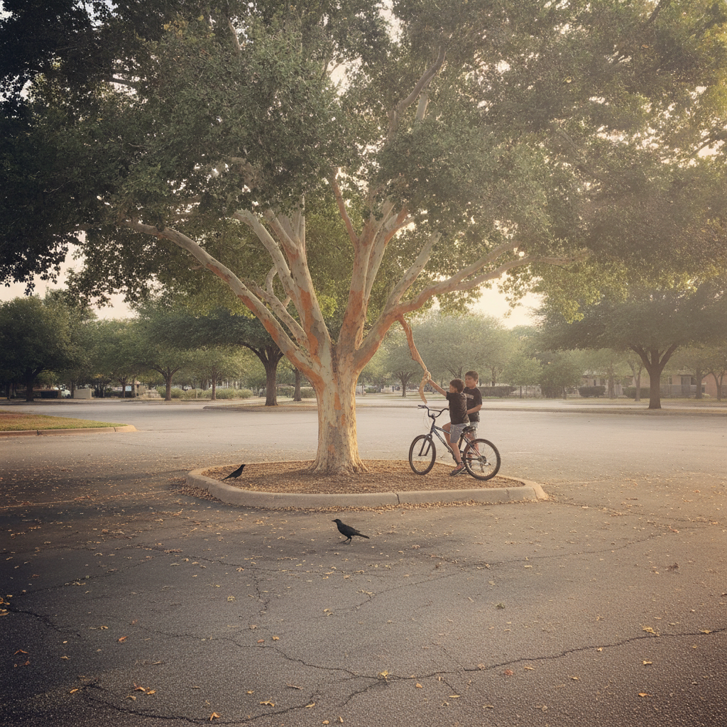
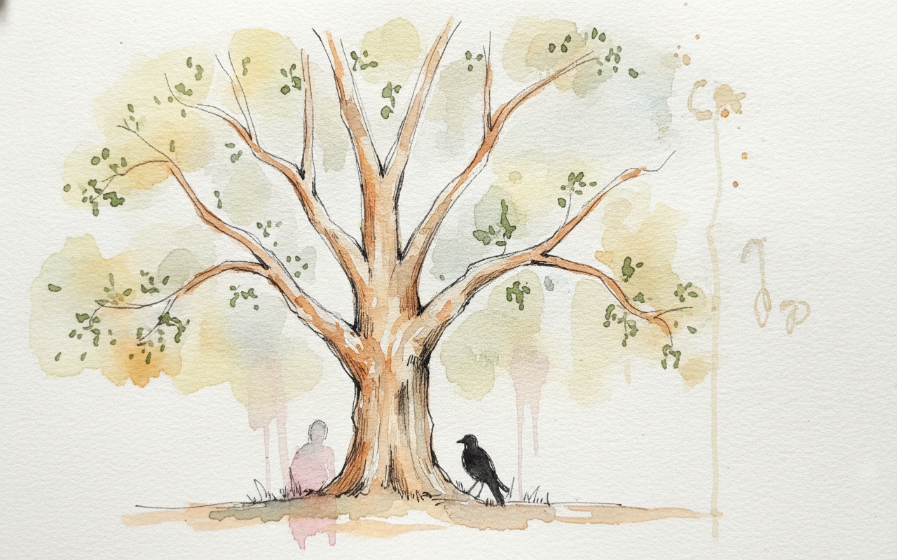
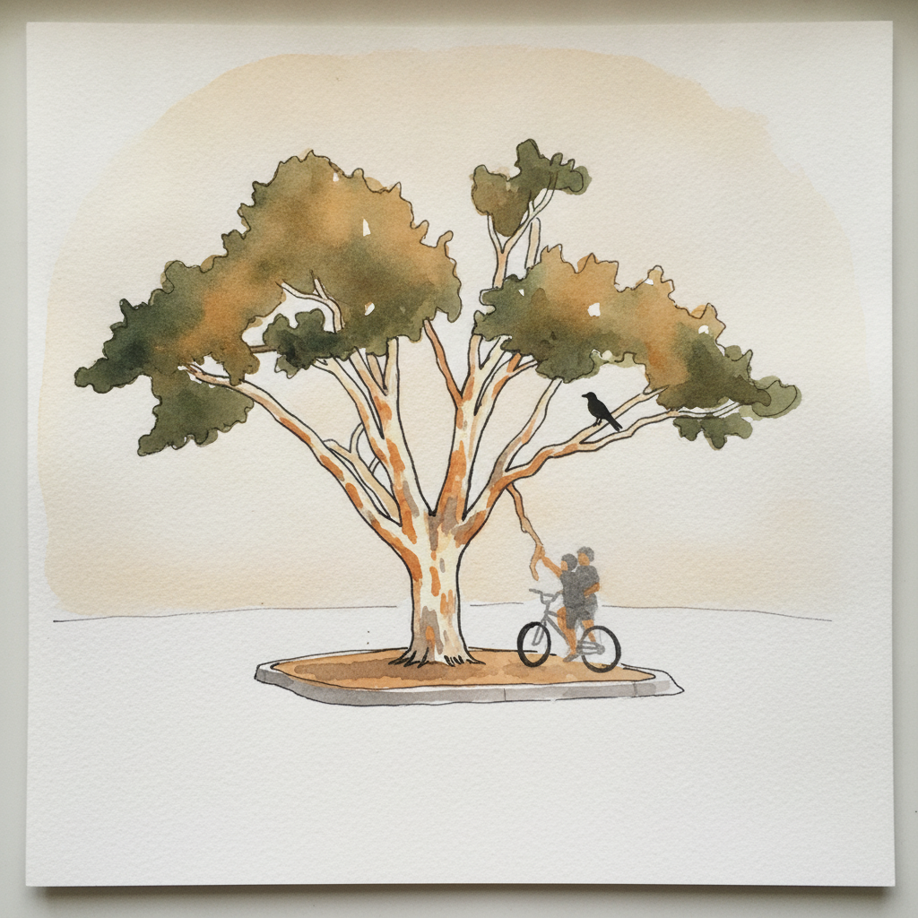
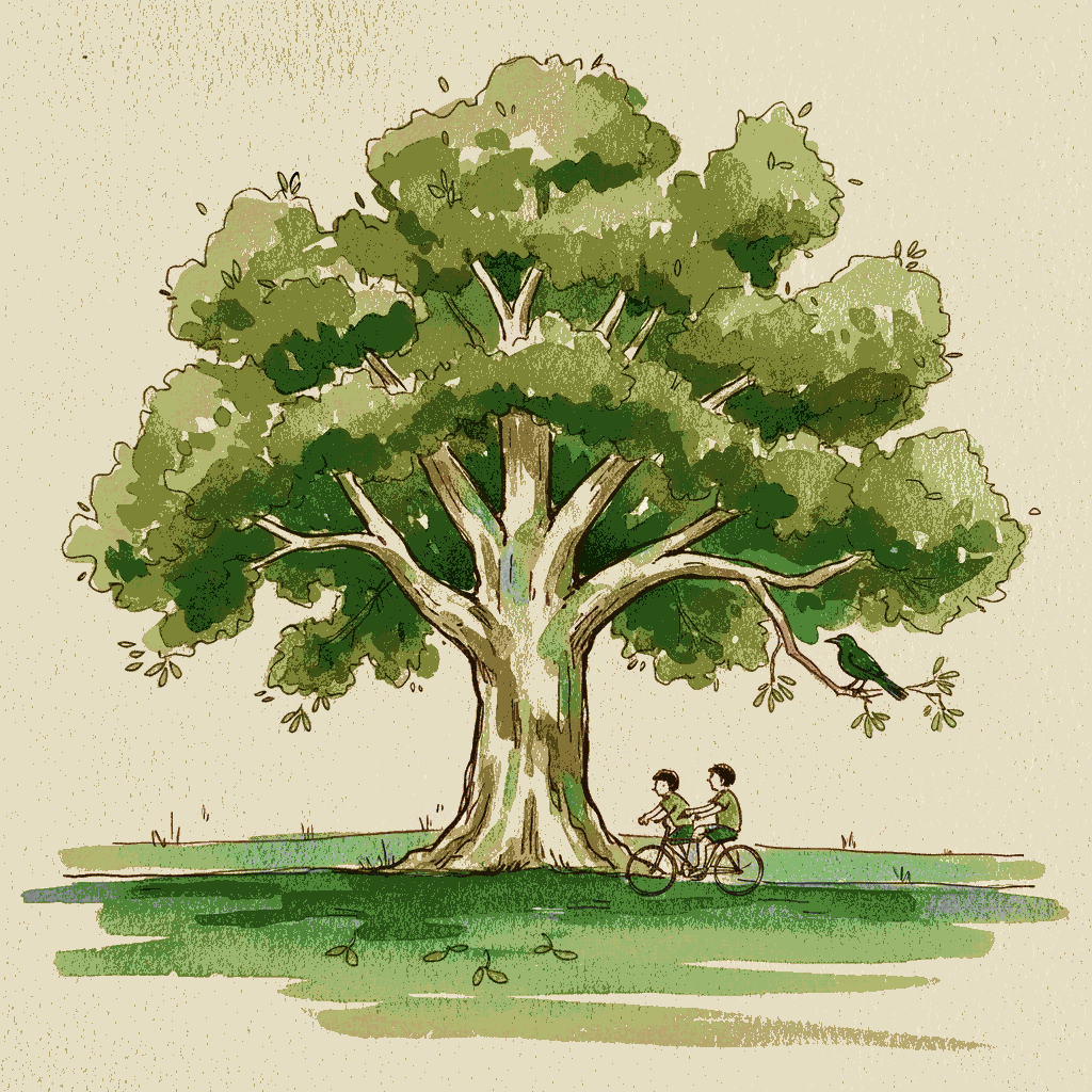
Piece 5 — Chinese (lacebark) elm
Pen + Watercolor · Loose pen and watercolor line-and-wash
Three takes

Focus for this piece
For this lacebark elm, focus on interpreting its distinctive, peeling bark by balancing soft color transitions with crisp detail. Begin with light, wet-on-wet washes of cream, orange, and grey to establish the mottled patches and suggest the bark's volume. Once dry, use varied pen line weights—fine lines for the delicate, irregular edges of peeling plates and slightly heavier lines for deeper crevices—to define the texture and structure, ensuring the ink enhances rather than redraws the watercolor.
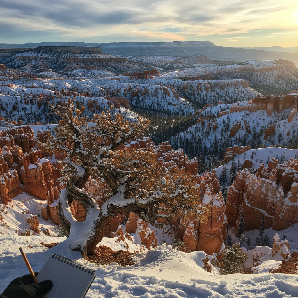
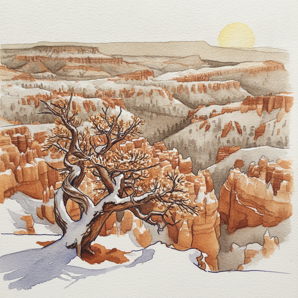
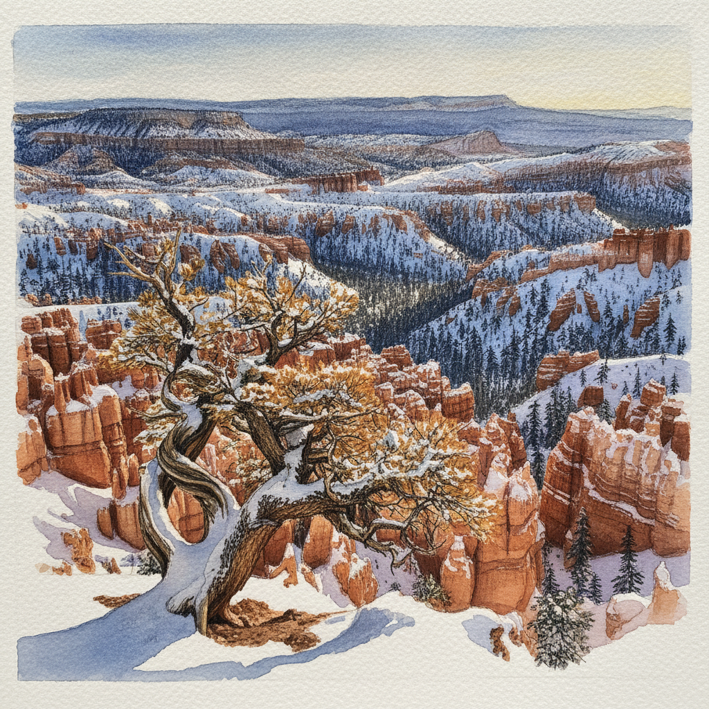
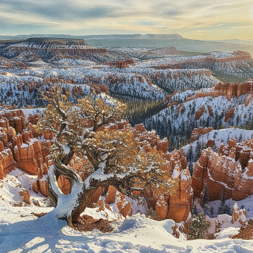
Piece 6 — Bryce Canyon Inspiration Point sunset, Utah, USA
Pen + Watercolor · Loose pen and watercolor line-and-wash
Three takes
Focus for this piece
This Bryce Canyon piece is ideal for practicing how line and wash combine to create dramatic light and atmospheric depth. Use varied line weights—bold for the foreground bristlecone pine, delicate for rim-lit hoodoos—to guide the eye, then layer warm sunset washes and cool blue shadows to define form and render the deep haze of the distant plateau. Pay particular attention to how the pen defines the strong edges of cast shadows, allowing the watercolor to fill them with luminous, cool tones.
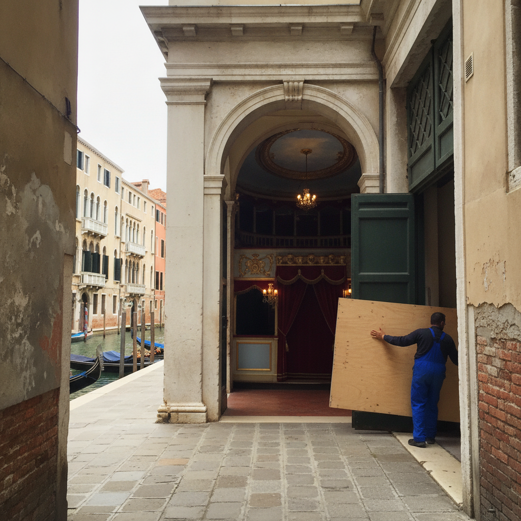
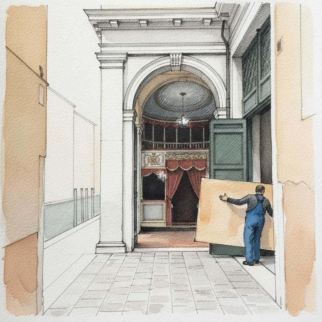
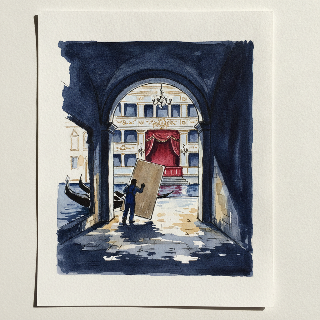
Piece 7 — La Fenice, Venice, Italy
Pen + Watercolor · Loose pen and watercolor line-and-wash
Three takes
Focus for this piece
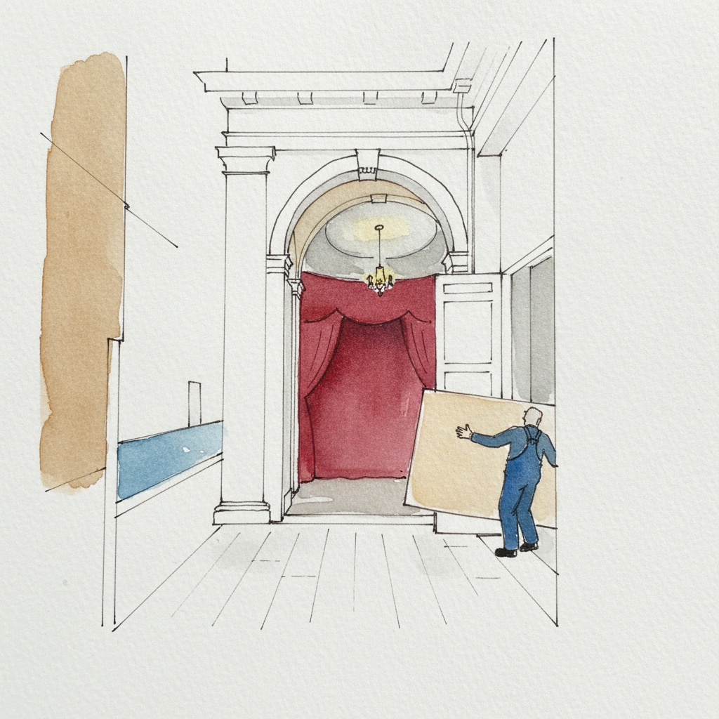
For La Fenice's narrow calle, focus on using precise pen lines to establish a strong sense of perspective and depth in a confined space. Emphasize the stuccoed walls closest to you with confident, darker line weights, gradually lightening your touch and line density as the street recedes. Then, apply atmospheric washes that hint at the diffuse light and aged textures, ensuring your architectural lines remain crisp beneath. This allows the ink to define the structure while watercolor provides the mood and atmospheric quality.
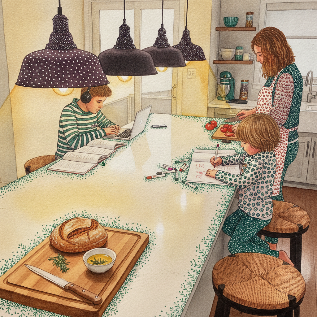
Piece 8 — Pendant light over island
Pen + Watercolor · Loose pen and watercolor line-and-wash
Three takes
Focus for this piece
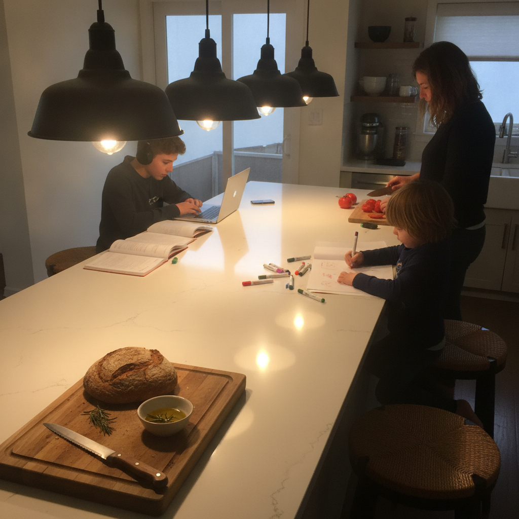
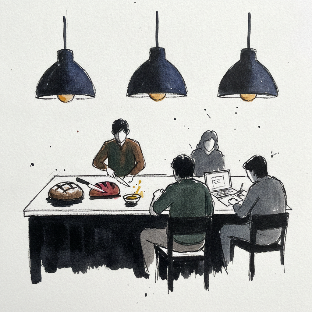
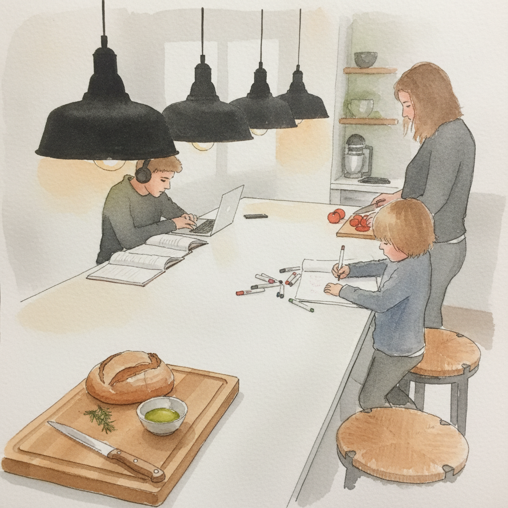
This piece offers a great opportunity to explore the interplay of definite line and atmospheric wash in rendering light. Focus on using varied ink line weights to define the hard, industrial forms of the matte black pendants, then employ controlled wet-on-wet watercolor washes to create the soft, warm luminosity of the Edison bulbs and their reflections on the white island. Notice how the contrast between crisp ink lines and fluid washes effectively captures both structure and the inviting glow of the scene.