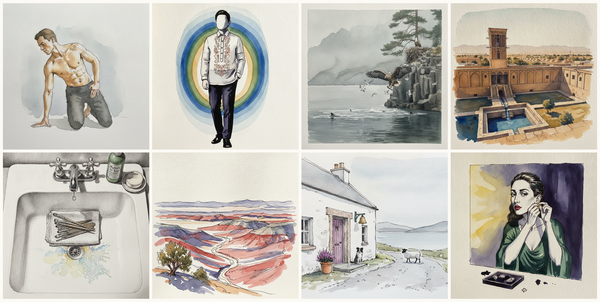
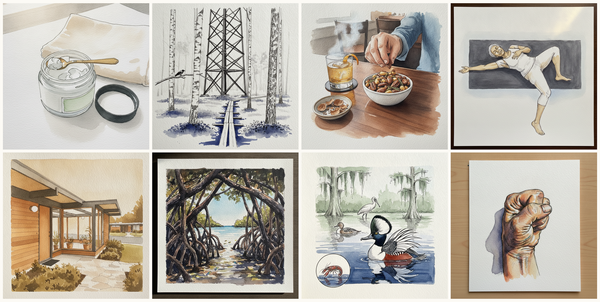
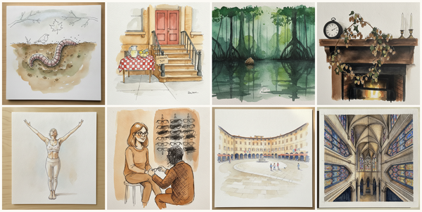
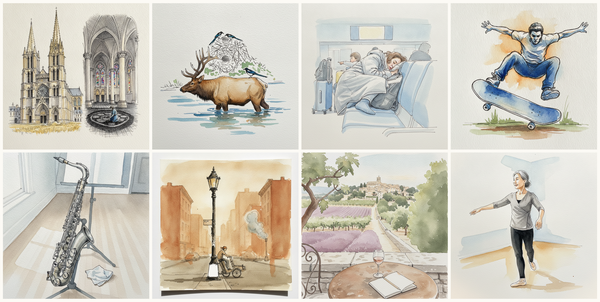
Sommelier's setup with decanter, tastevin, white napkin draped, Tokyo Asakusa Senso-ji Approach in Rain, Squat lobster, Science fair with poster boards, and more — pen + watercolor for October 22, 2026
AI-generated daily art-practice references for pen and watercolor: Sommelier's setup with decanter, tastevin, white napkin draped, Tokyo Asakusa Senso-ji Approach in Rain, Squat lobster, Science fair with poster boards, Hadrian's Villa, Tivoli, Italy, Trellised grapevine over the gate in late Sep…
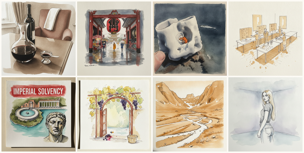
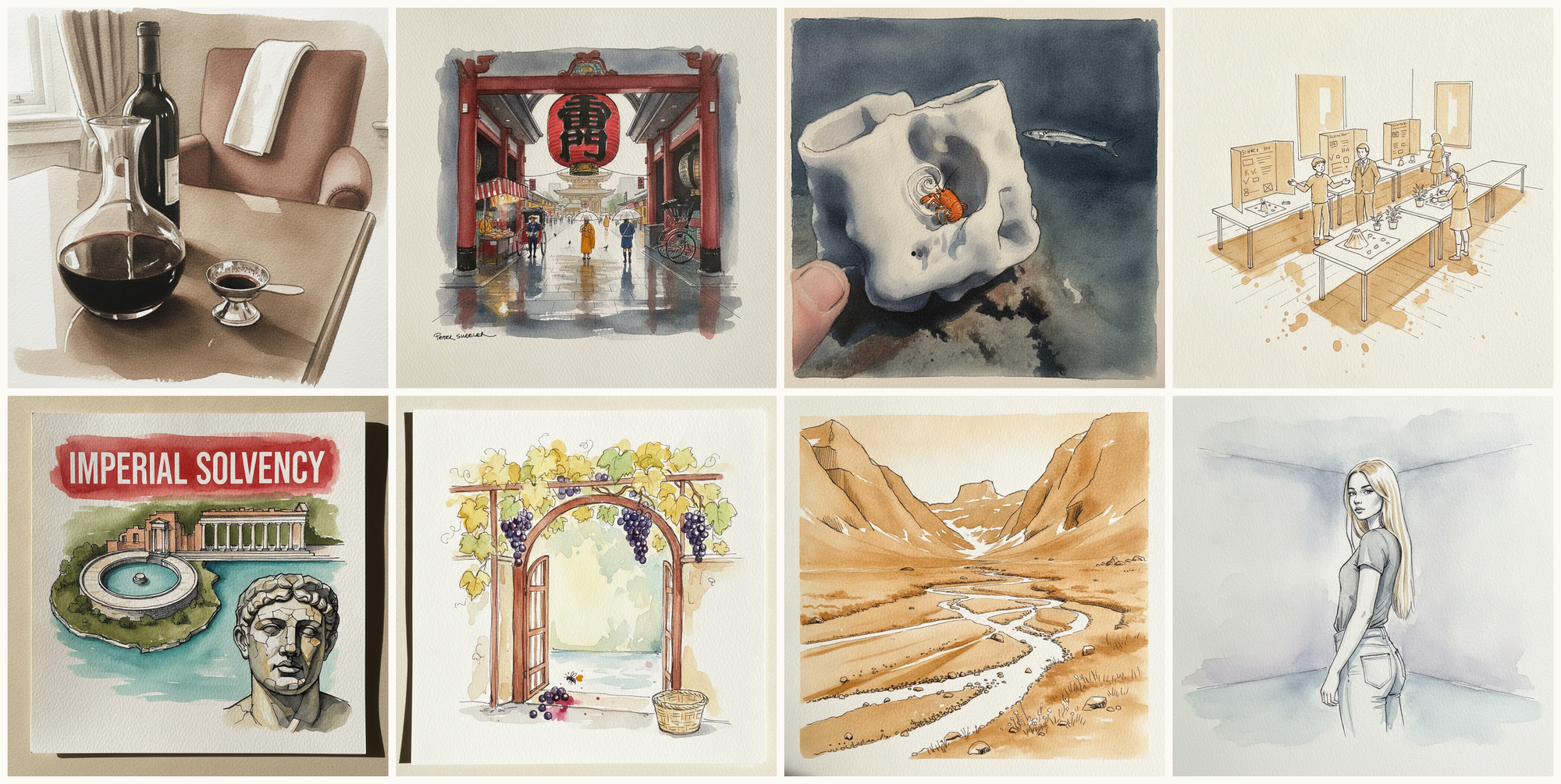
Today's 8 pen-and-watercolor pieces: Sommelier's setup with decanter, tastevin, white napkin draped, Tokyo Asakusa Senso-ji Approach in Rain, Squat lobster, Science fair with poster boards, Hadrian's Villa, Tivoli, Italy, Trellised grapevine over the gate in late September, Akshayuk Pass tundra floor, Auyuittuq National Park, Baffin Island, July, Kouros Step-Forward, Marble Studio. Each piece comes with an AI-generated photoreal reference, three AI-generated example artworks in different treatments, and a short focus paragraph naming what to study in this one.
Why these references use AI
This daily series uses AI-generated images as practice prompts, not as finished artwork to copy. Each subject starts with a synthetic photoreal reference generated with Gemini/Nano Banana, then moves into three pen-and-watercolor interpretations of the same subject.
I use AI here because daily art practice needs variety and low friction. Real life can get repetitive, busy, or visually narrow. These generated reference sets make it easier to study bodies, buildings, animals, landscapes, objects, gestures, light, palettes, and compositions that might not show up in an ordinary day.
The goal is not to reproduce any image directly. Treat each set as a starting point for observation and study: choose what interests you, change the framing, simplify the subject, alter the palette, and make your own version.
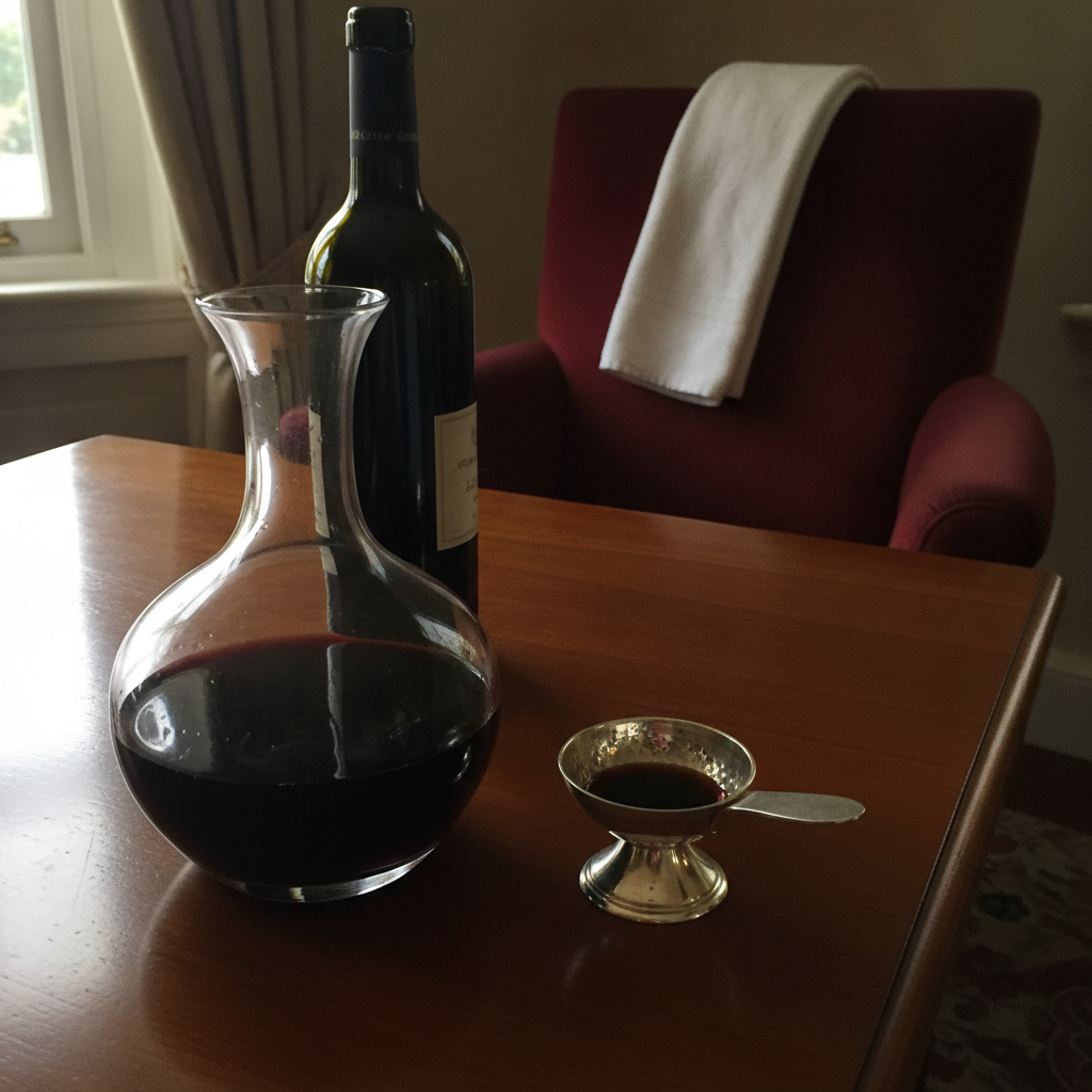
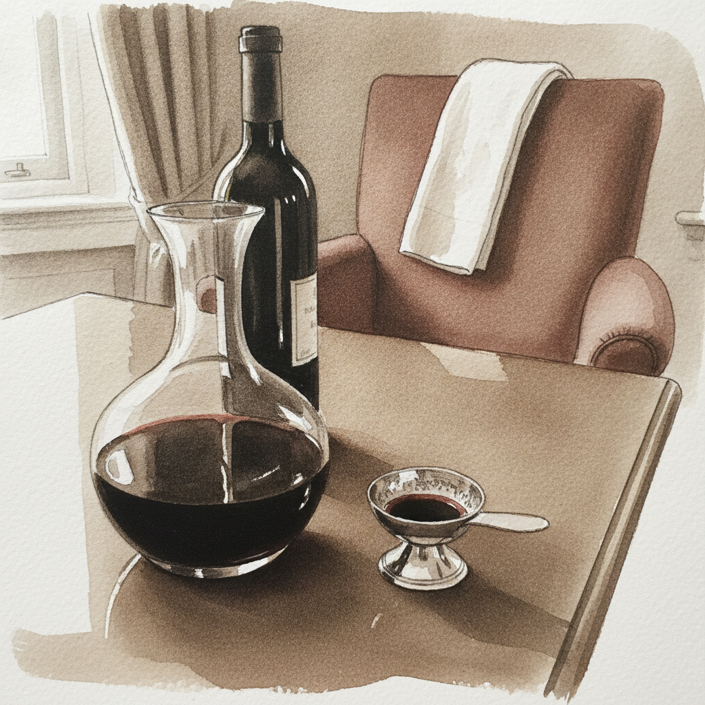
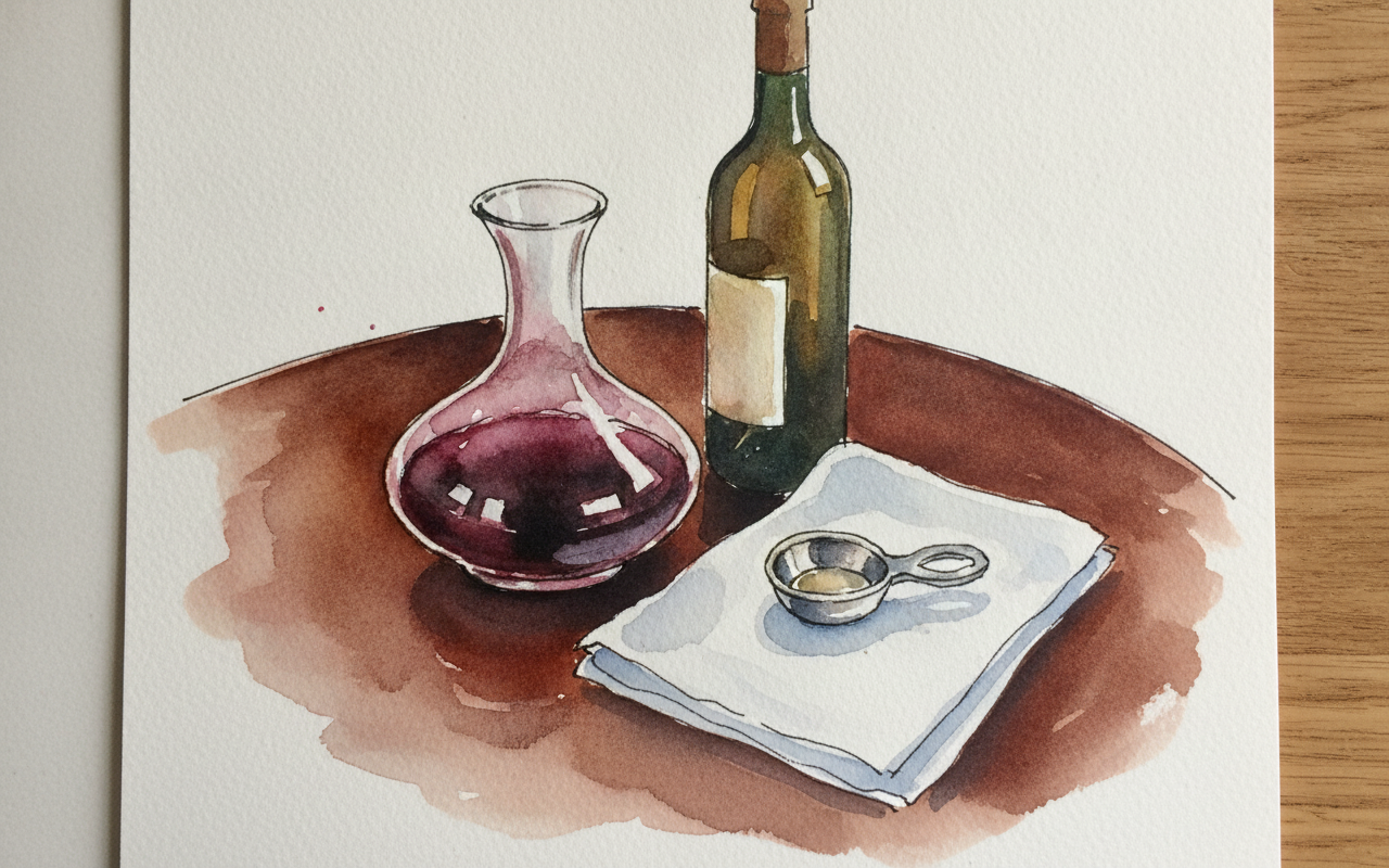
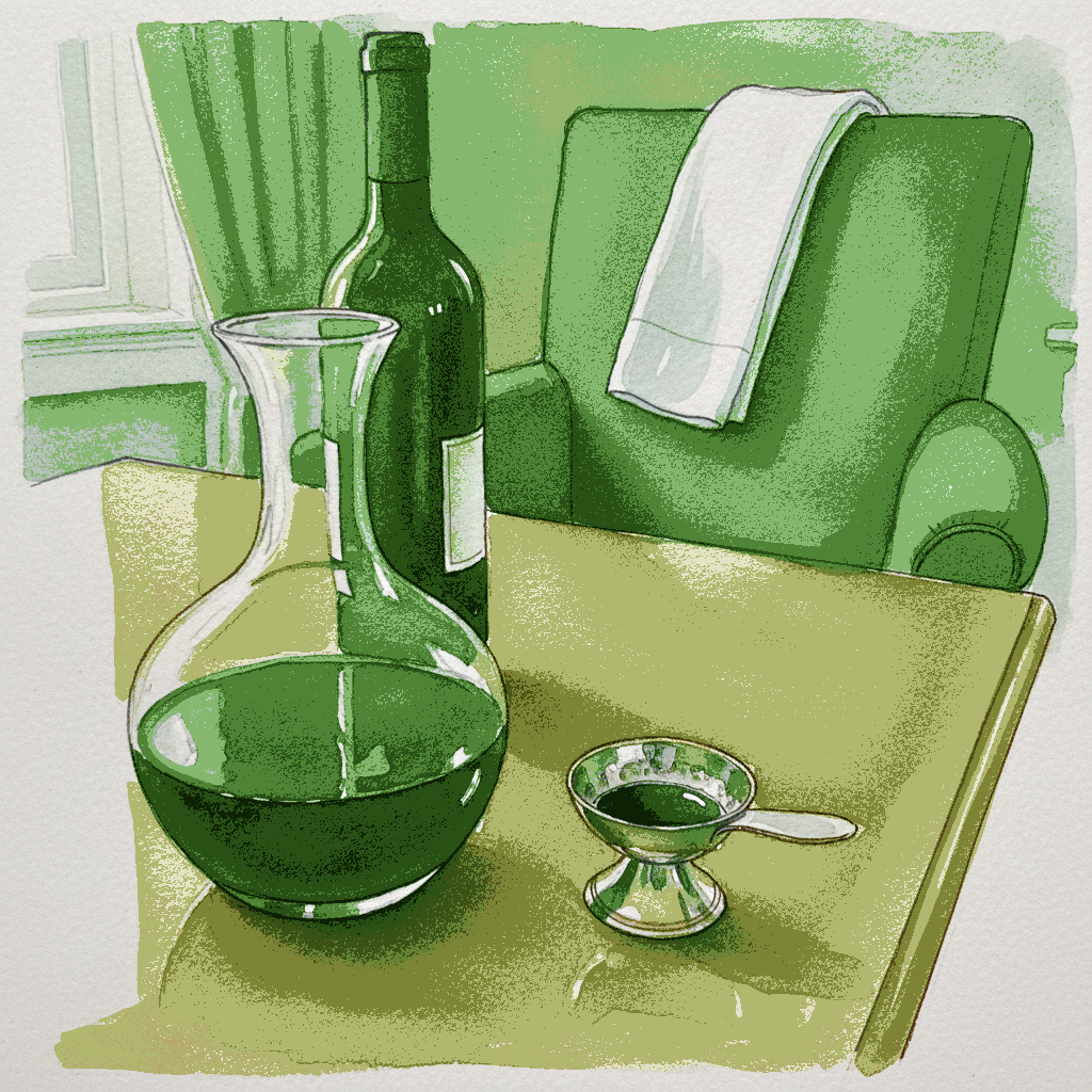
Piece 1 — Sommelier's setup with decanter, tastevin, white napkin draped
Pen + Watercolor · Loose pen and watercolor line-and-wash
Three takes

Focus for this piece
For this piece, focus on mastering the interplay of transparency and reflection across varied surfaces. Use precise, varied line weights to articulate the hard edges of the decanter and the subtle gleam of the tastevin, while relying on delicate, layered washes to capture the distortion and depth within the wine and on the polished mahogany. Pay particular attention to building form on the white linen napkin with minimal line work, letting subtle shifts in watercolor value define its drapery and folds.
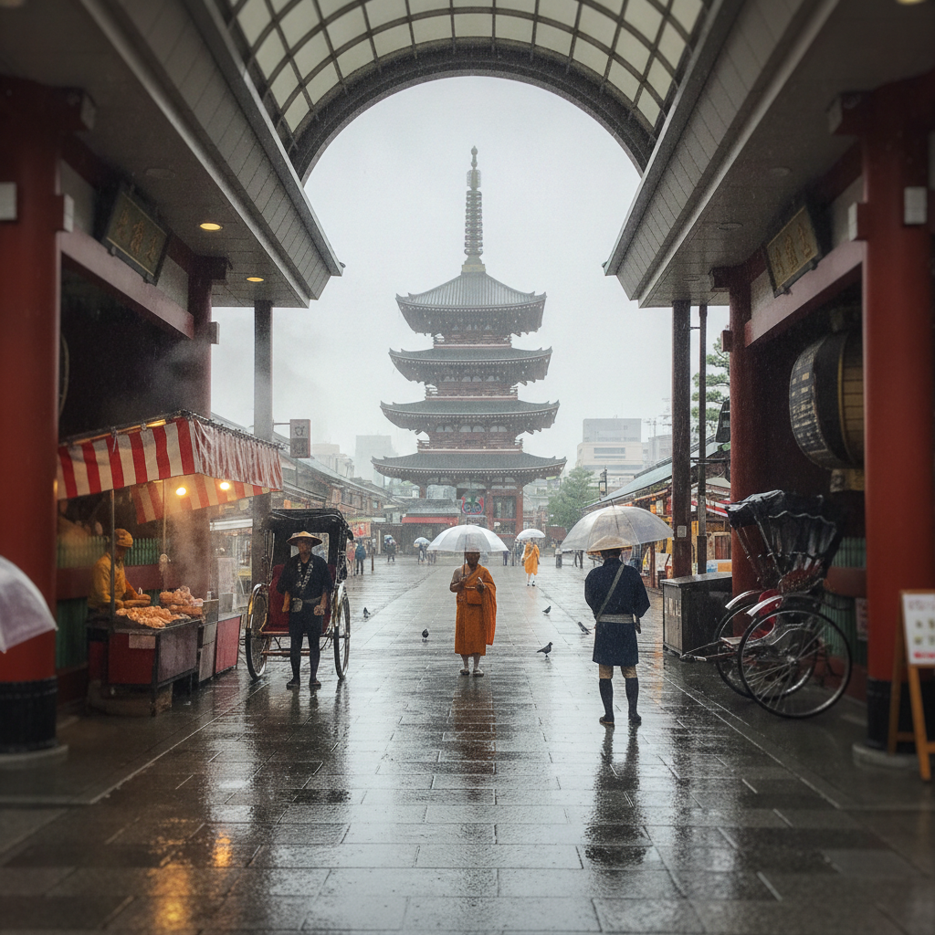
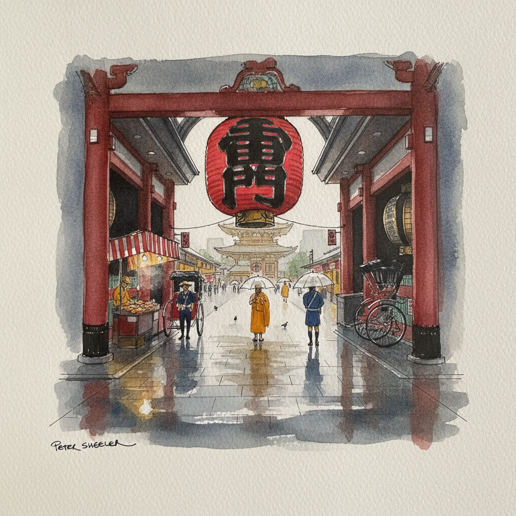
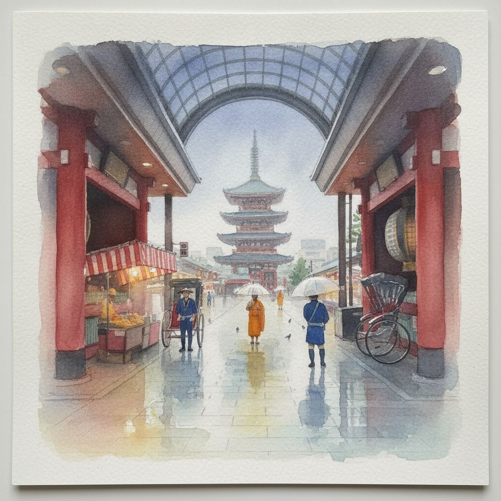
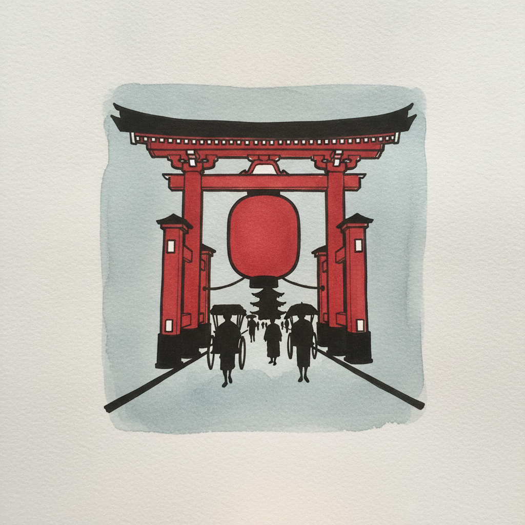
Piece 2 — Tokyo Asakusa Senso-ji Approach in Rain
Pen + Watercolor · Loose pen and watercolor line-and-wash
Three takes
Focus for this piece
This piece is an excellent study in contrasting defined structure with atmospheric effects. Use varied line weights with waterproof ink to establish the strong architectural forms of the gate and street roof, then soften the background pagoda and falling rain with dilute, wet-on-wet washes. Focus on creating luminous reflections on the wet ground, allowing the red lantern's glow to subtly bleed into the surrounding moisture while maintaining crisp foreground details.
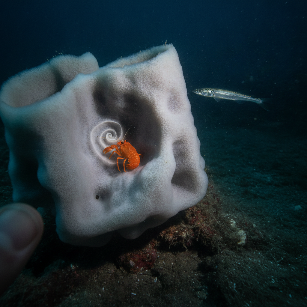
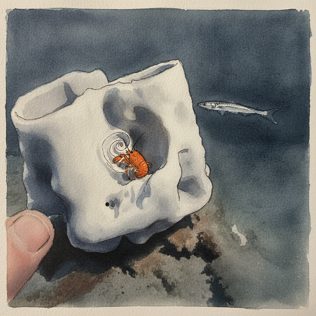
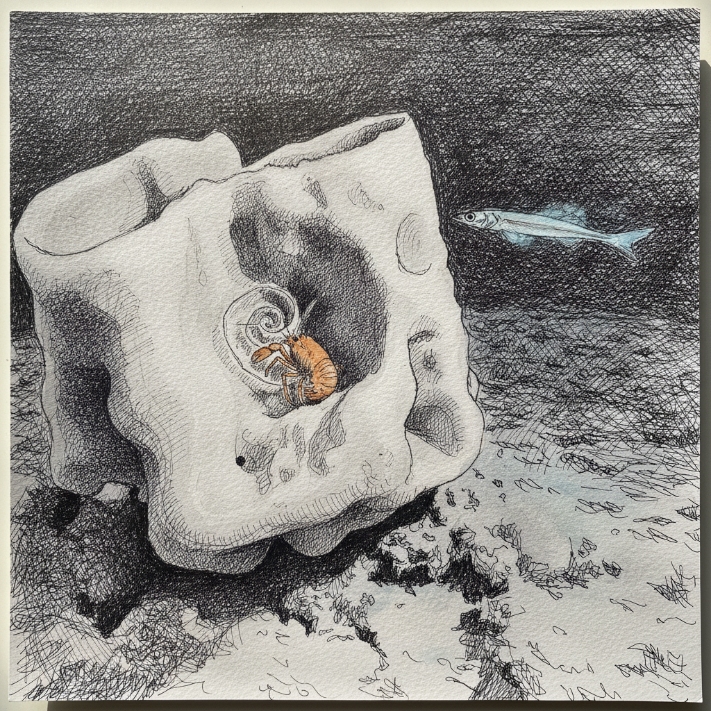
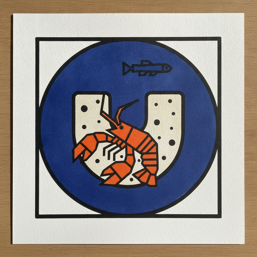
Piece 3 — Squat lobster
Pen + Watercolor · Loose pen and watercolor line-and-wash
Three takes
Focus for this piece
This piece offers an excellent study in creating a clear focal point through contrasting textures and precise value control. Use a fine-tipped pen to define the squat lobster's hard carapace and folded claws with crisp, deliberate lines, building its vibrant orange form with layered, concentrated washes. For the surrounding deep-sea sponge, employ broader, broken lines and varied wet-on-wet washes in muted blues and greys to suggest its soft, porous texture and the dim ambient light. This approach allows the bright lobster to truly stand out against its more diffuse environment.
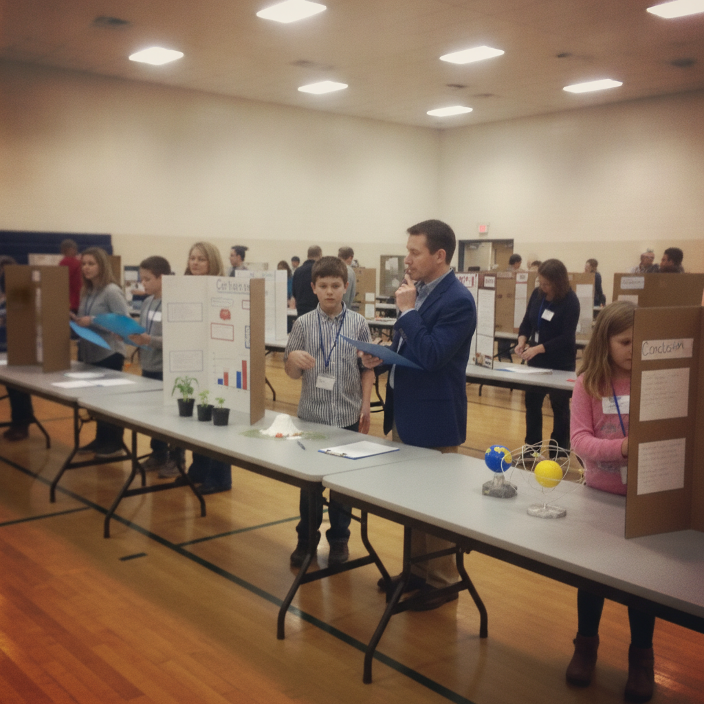
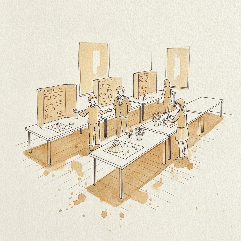
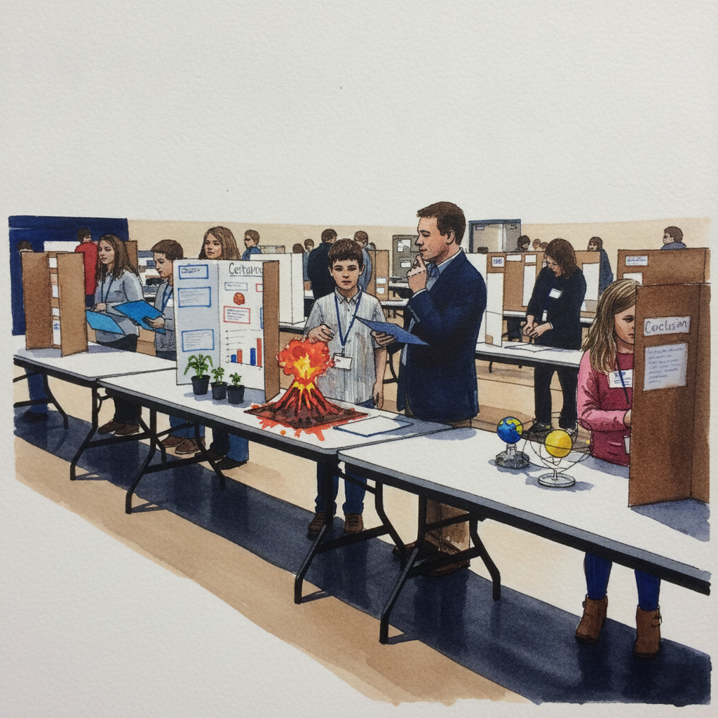
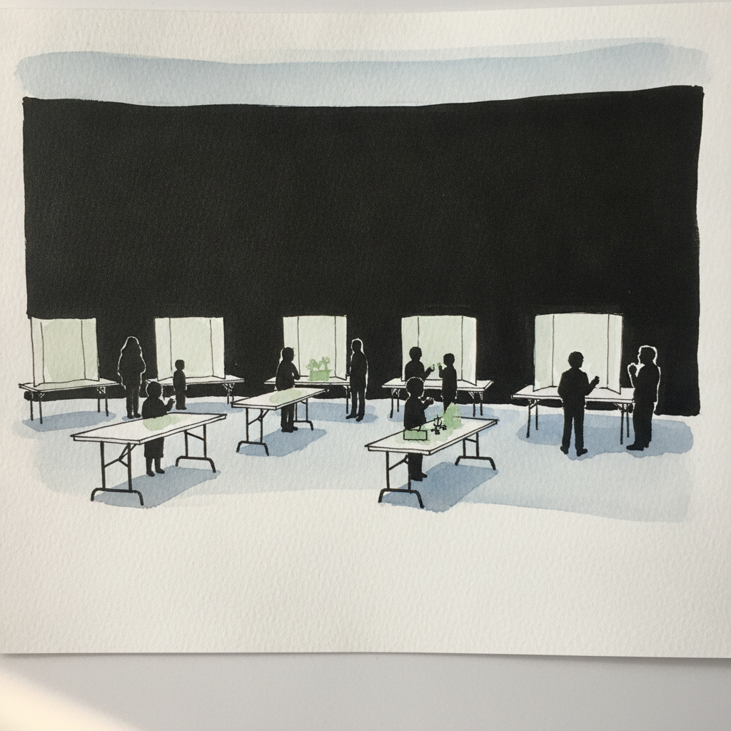
Piece 4 — Science fair with poster boards
Pen + Watercolor · Loose pen and watercolor line-and-wash
Three takes
Focus for this piece
This busy science fair is an ideal subject for practicing how to handle repeating geometric forms like the poster boards and tables while maintaining visual interest. Use varied pen line weights strategically: crisp, distinct lines for foreground projects and figures, and lighter, broken lines to suggest the receding rows. Employ broad, consistent watercolor washes to establish the overall bright gym lighting and group background elements without over-detailing. Focus on creating depth through the interplay of ink clarity and wash density rather than rendering every individual element.
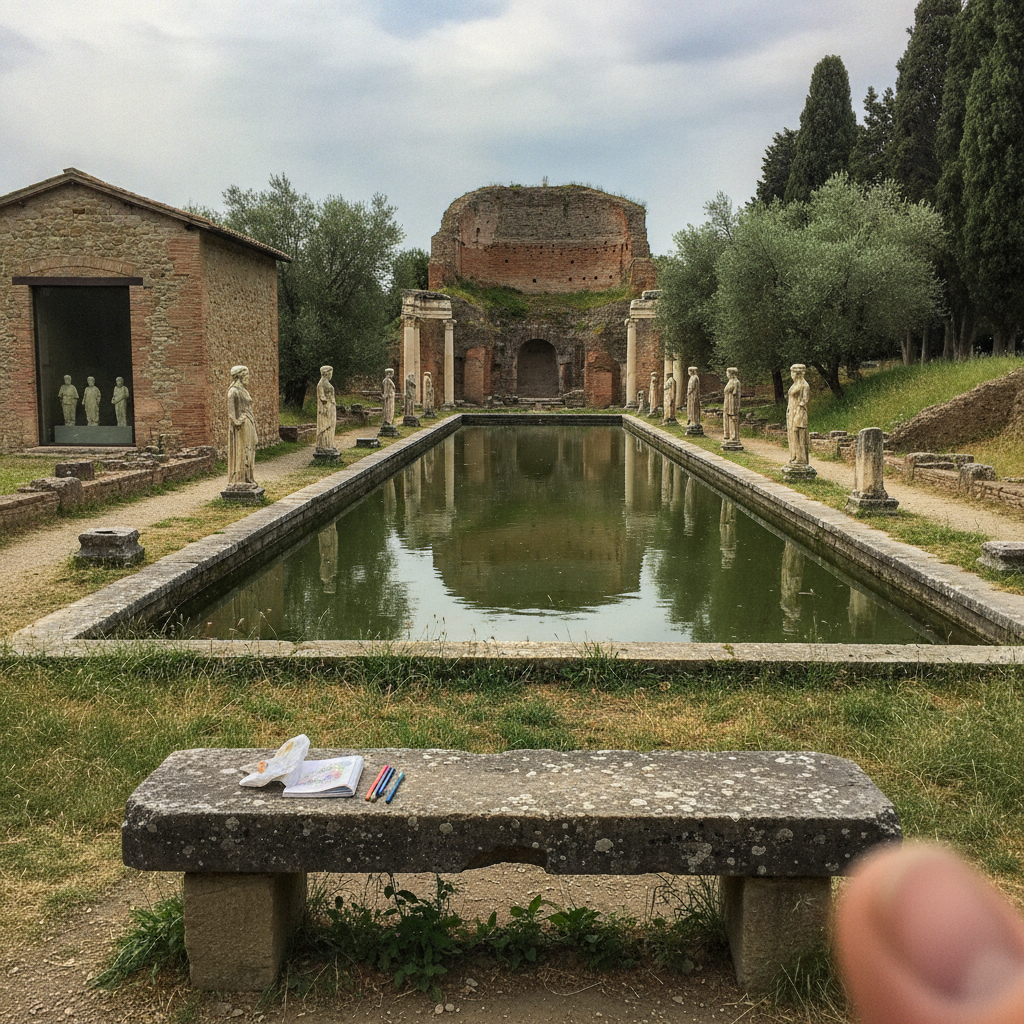
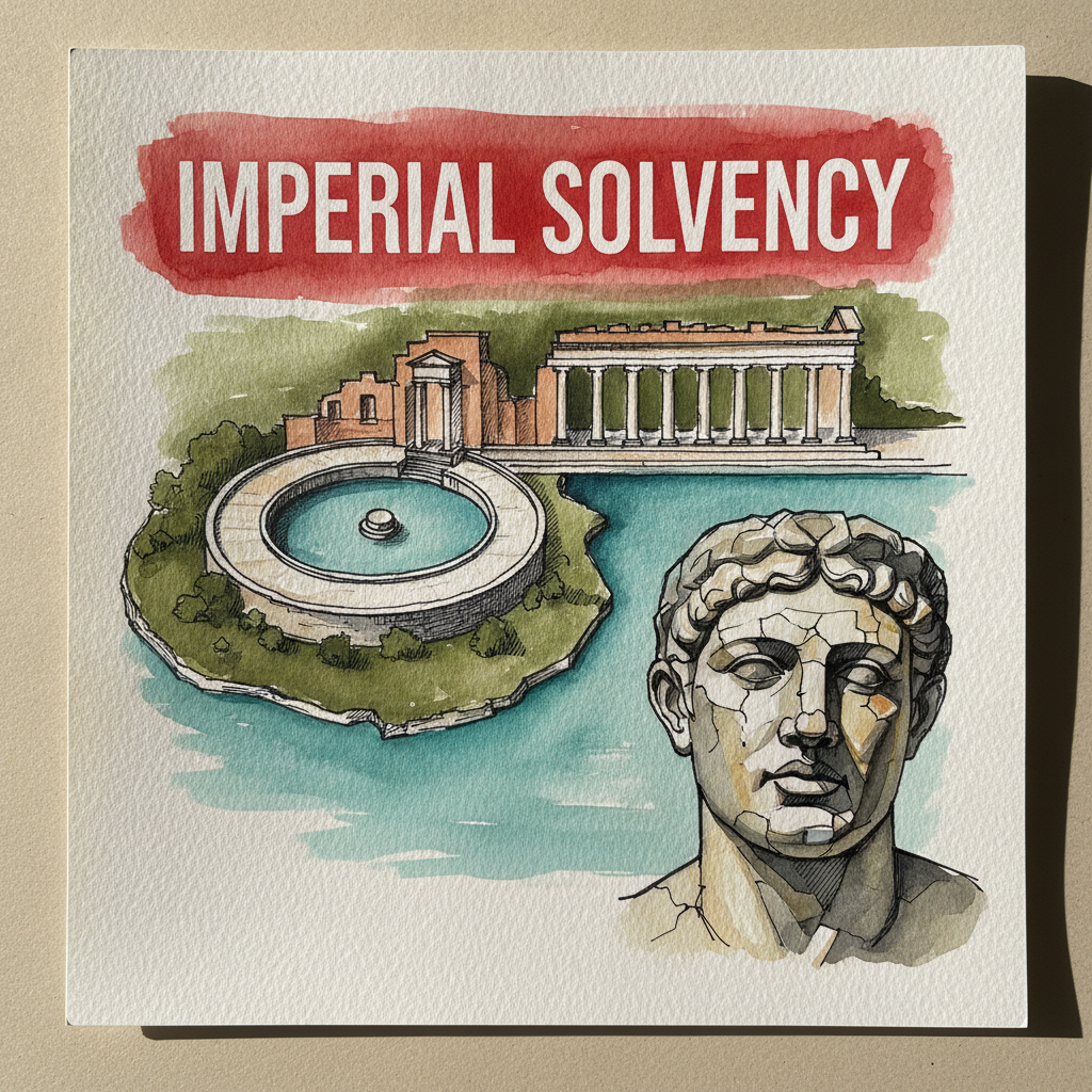
Piece 5 — Hadrian's Villa, Tivoli, Italy
Pen + Watercolor · Loose pen and watercolor line-and-wash
Three takes

Focus for this piece
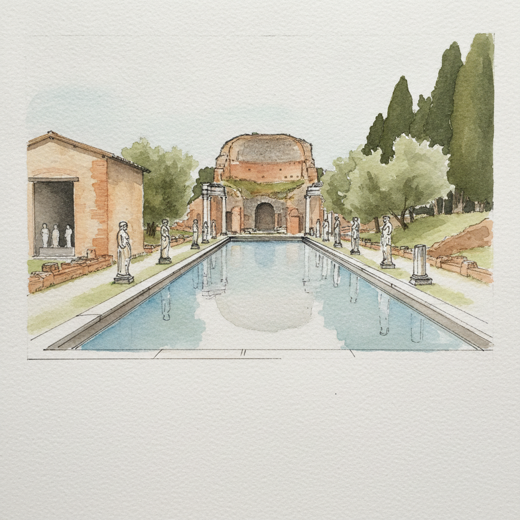
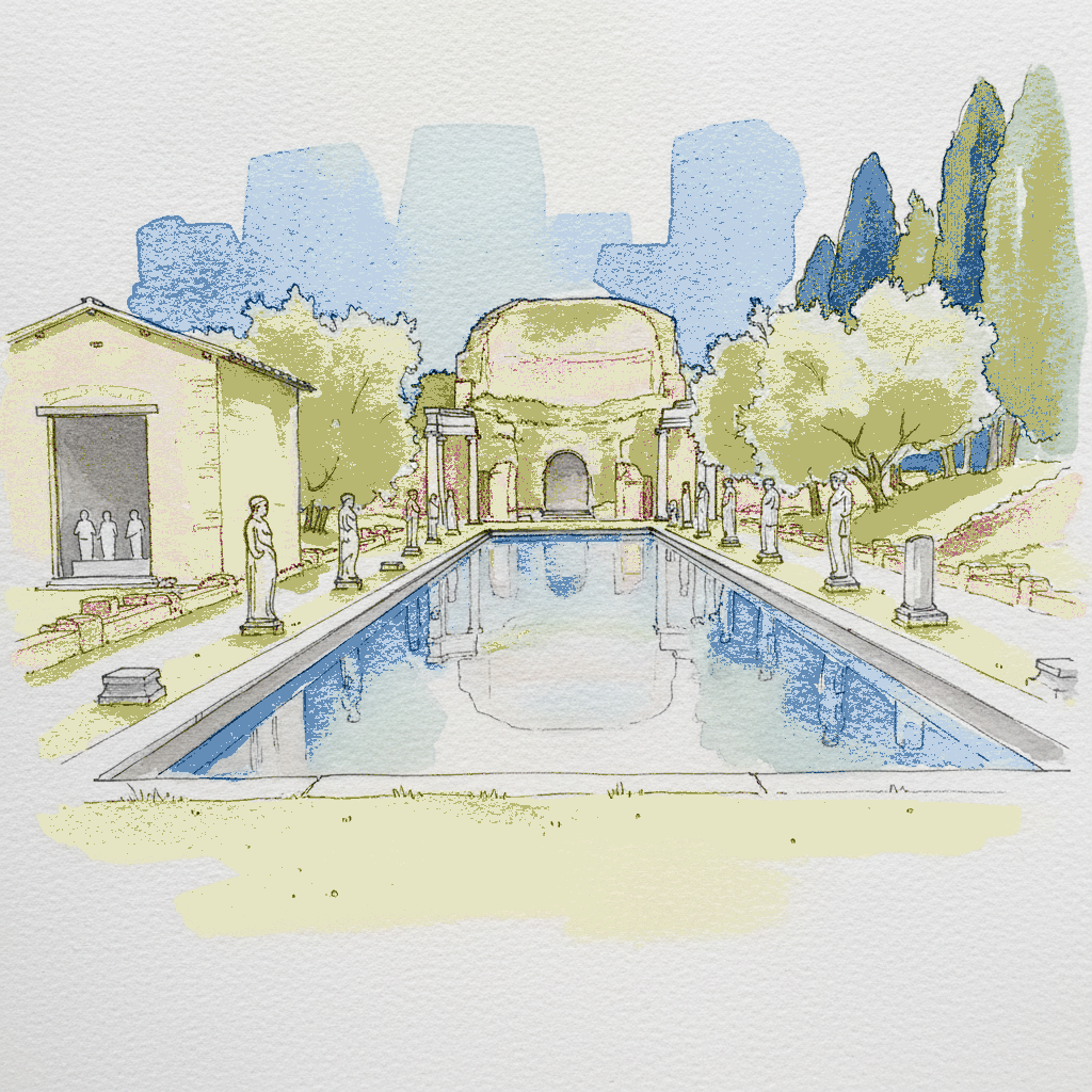
This sprawling subject is ideal for practicing the integration of precise architectural lines with atmospheric washes. Experiment with varying line weights: use crisp, defined lines for the Serapeum's half-dome and colonnades, then transition to looser, broken lines for the excavated ruins and soft, organic strokes for olive trees. Apply smooth, expansive washes for the reflecting pools, letting their soft edges contrast sharply with the structured ink work, and add texture for rough grass with a dry brush. This approach helps convey both the grandeur of the structures and the surrounding natural decay.
Piece 6 — Trellised grapevine over the gate in late September
Pen + Watercolor · Loose pen and watercolor line-and-wash
Three takes

Focus for this piece
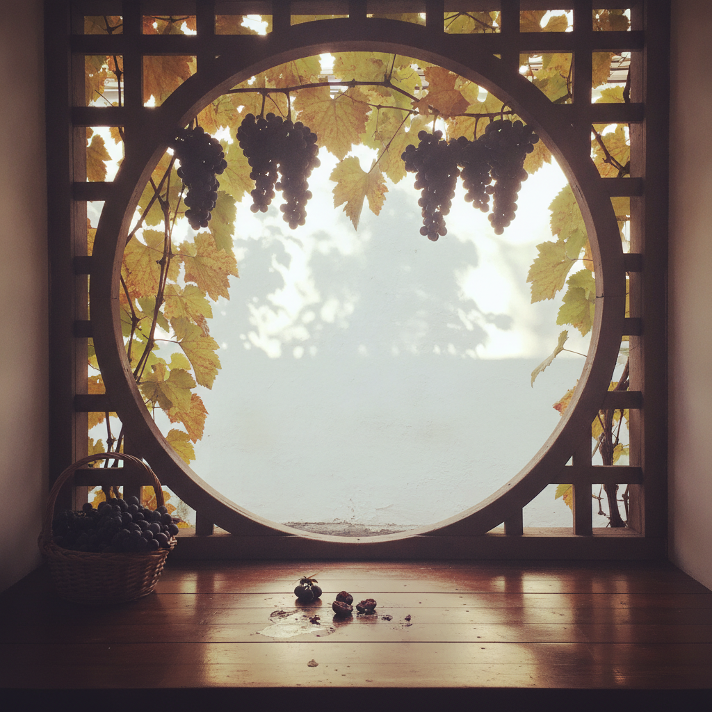
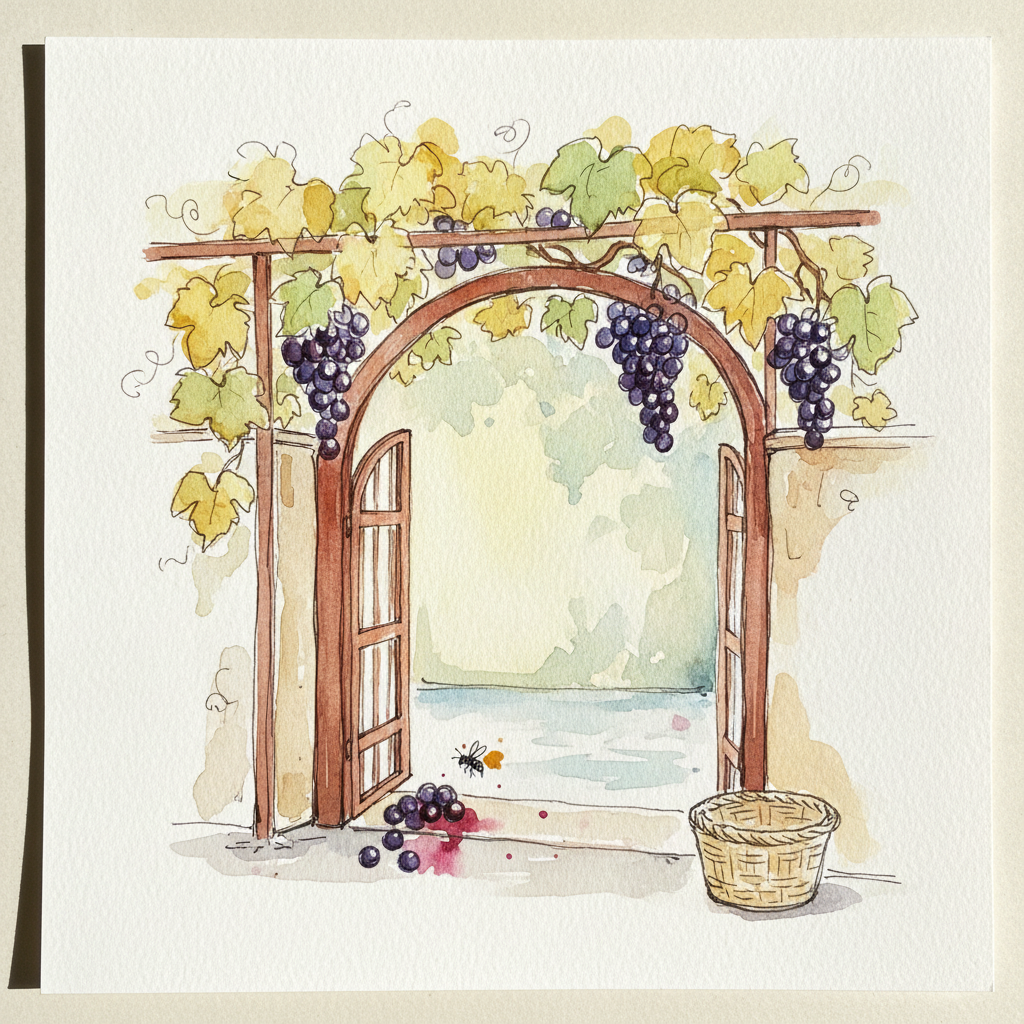
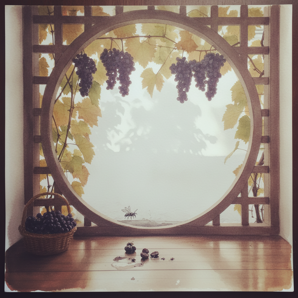
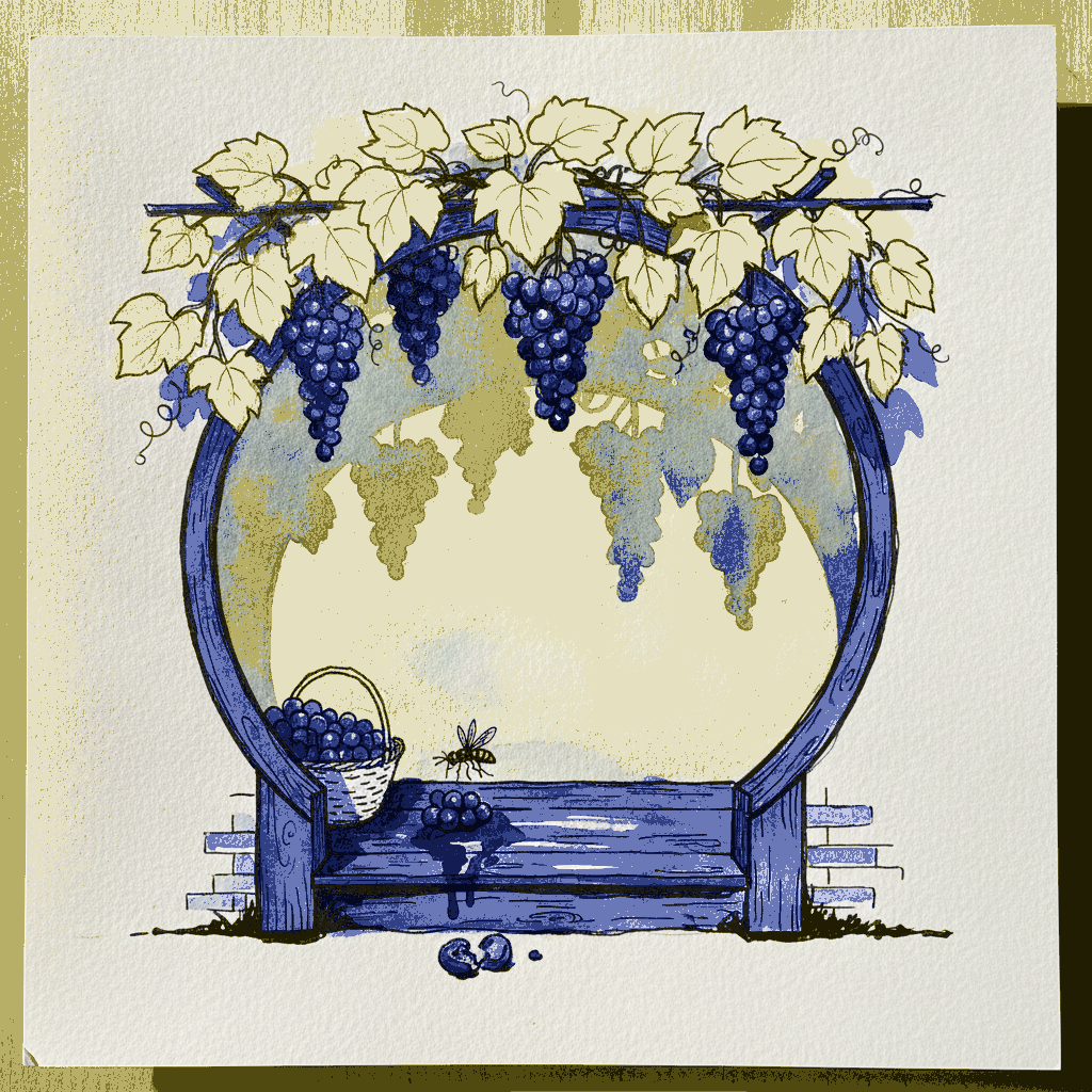
This piece offers a superb opportunity to practice differentiating foreground detail from atmospheric background using line weight and wash intensity. Employ strong, confident lines for the geometric structure of the moon gate and the sharp brick rim, contrasting these with lighter, more broken ink lines and diffused wet-on-wet washes for the dappled light and leaf-shadow in the courtyard beyond. Observe how a concentrated application of deep purple and yellow-ochre pigment can convey the rich texture of the grapes and their fallen juice stains, anchoring the eye to the foreground action while the background remains soft and suggestive.
Piece 7 — Akshayuk Pass tundra floor, Auyuittuq National Park, Baffin Island, July
Pen + Watercolor · Loose pen and watercolor line-and-wash
Three takes

Focus for this piece
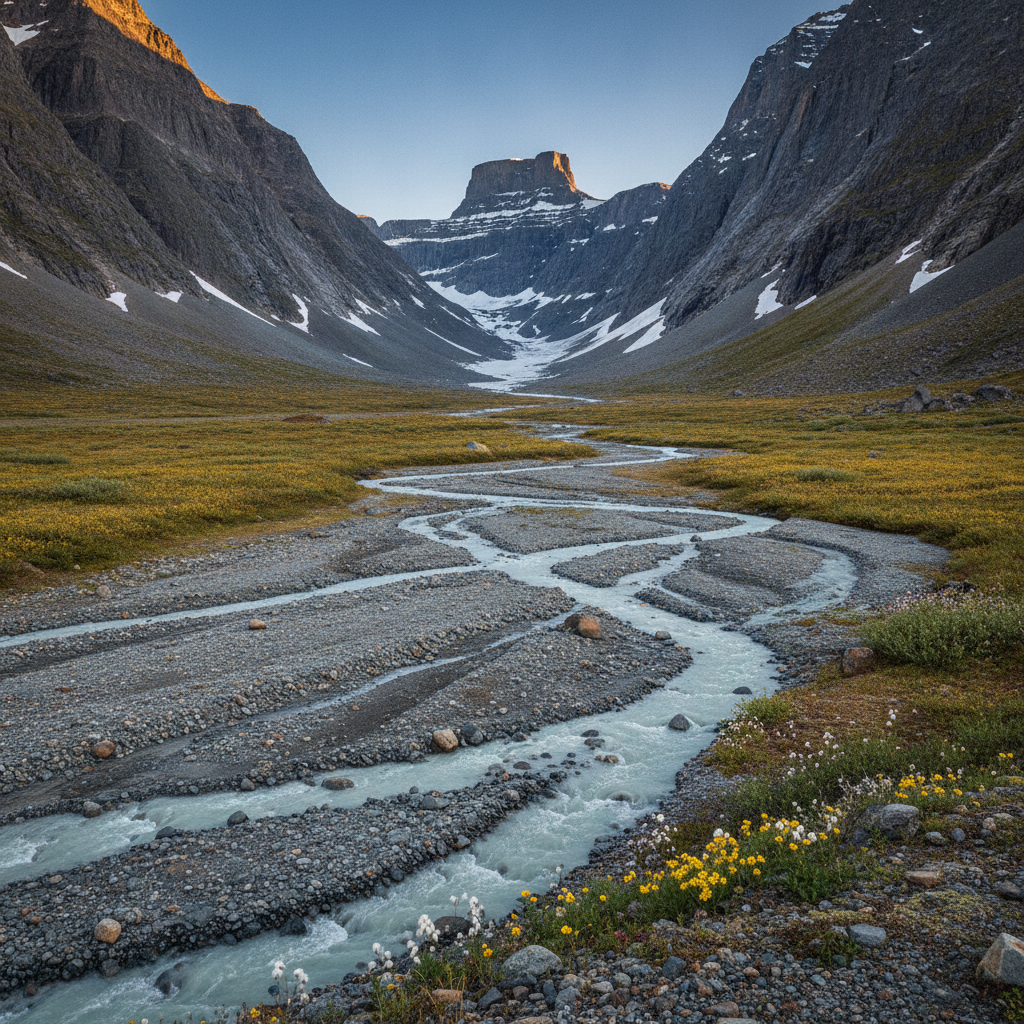
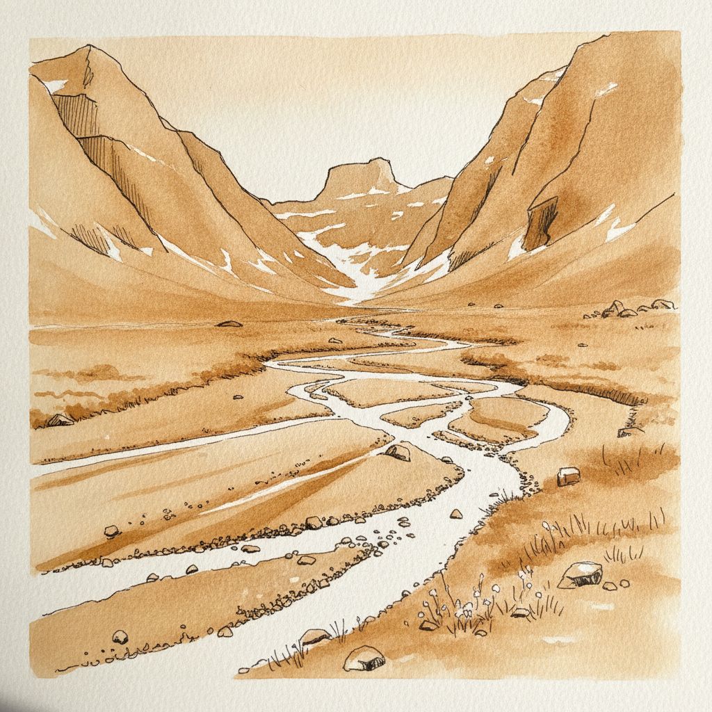
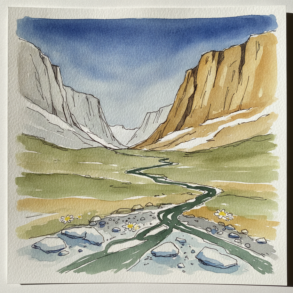
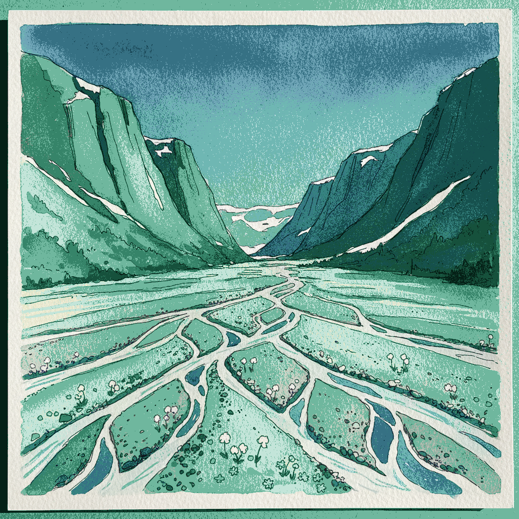
This piece offers an excellent opportunity to master conveying vast spatial depth through varied line weight and watercolor intensity. Use fine, crisp pen lines and vibrant washes to define the foreground's braided meltwater channels and delicate arctic cotton. As you move back to the golden tundra and colossal granite walls, progressively soften your lines and use lighter, broader washes. Let the deep blue sky be a single, smooth wash with minimal ink to push the background further, emphasizing the scale of the valley.
Piece 8 — Kouros Step-Forward, Marble Studio
Pen + Watercolor · Loose pen and watercolor line-and-wash
Three takes
Focus for this piece
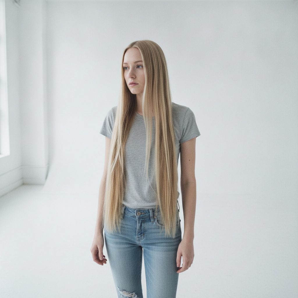
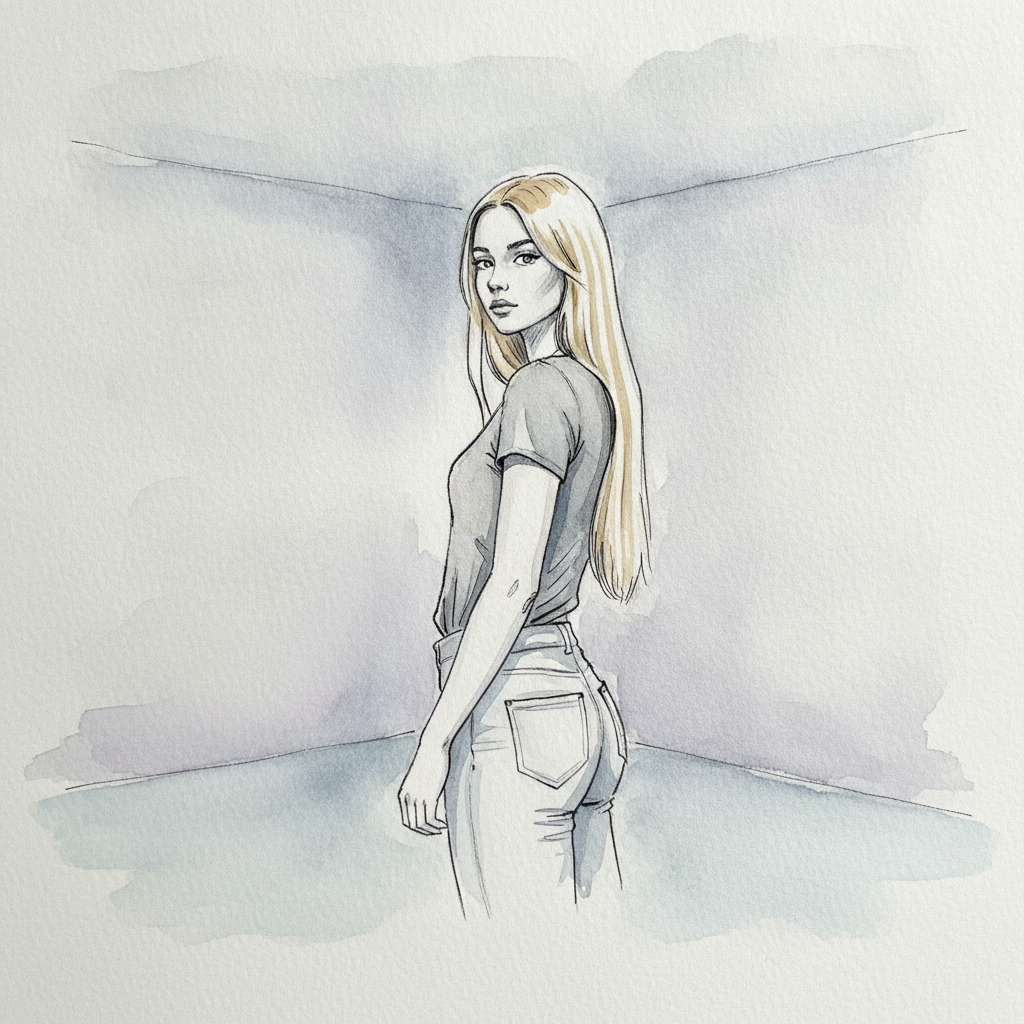
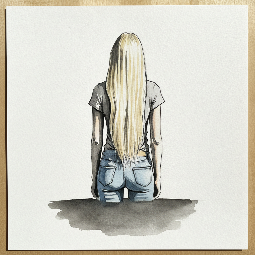
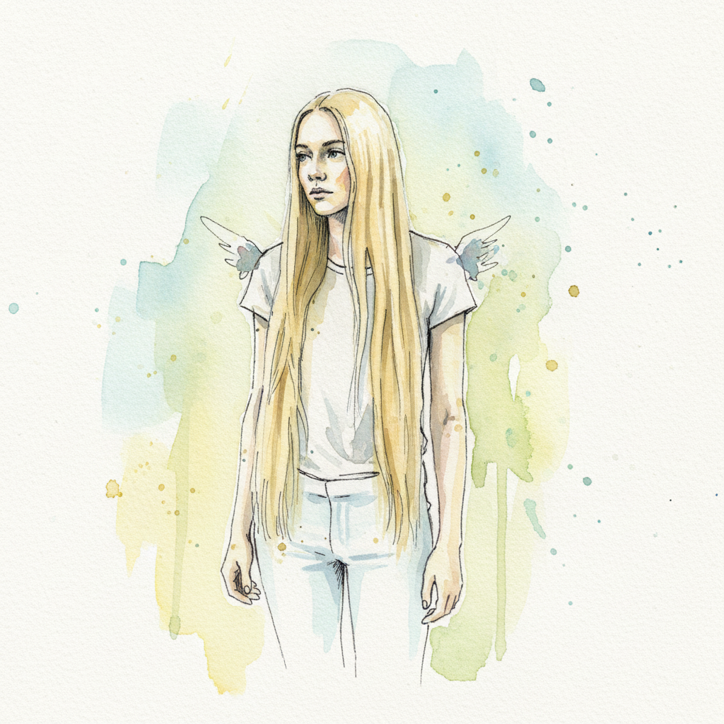
This study is an excellent exercise in using a single strong vertical line to anchor a figure composition and define subtle form. Focus on the deliberate, unbroken line weight of the hair, allowing its clean edges to carve the figure's soft contours from the white of the paper. Employ nuanced, cool washes to model the willowy physique and gentle S-curve, making the luminous hair the undisputed focal point.