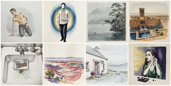
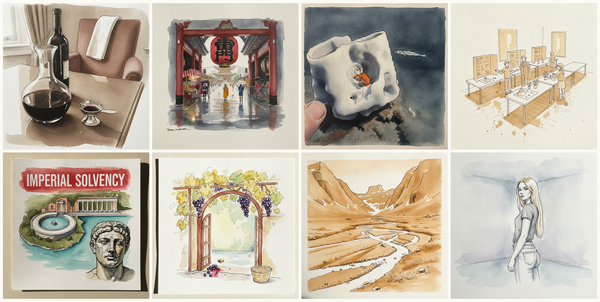
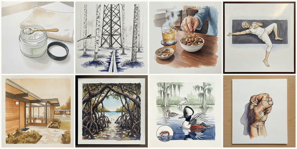
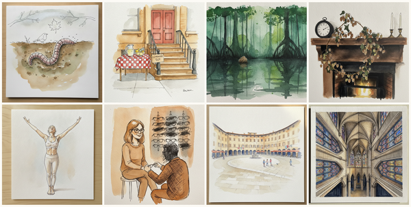
Mid-Renovation Patched Asphalt, Swallow-tailed kite, Baby sleeping in crib, Sugar cone and mint sprigs beside the pot, and more — pen + watercolor for July 12, 2026
AI-generated daily art-practice references for pen and watercolor: Mid-Renovation Patched Asphalt, Swallow-tailed kite, Baby sleeping in crib, Sugar cone and mint sprigs beside the pot, Woman, late 20s, Black, tall lean build, hand on the corner of a grand piano, Valbona Valley, Albanian Alps, Te…
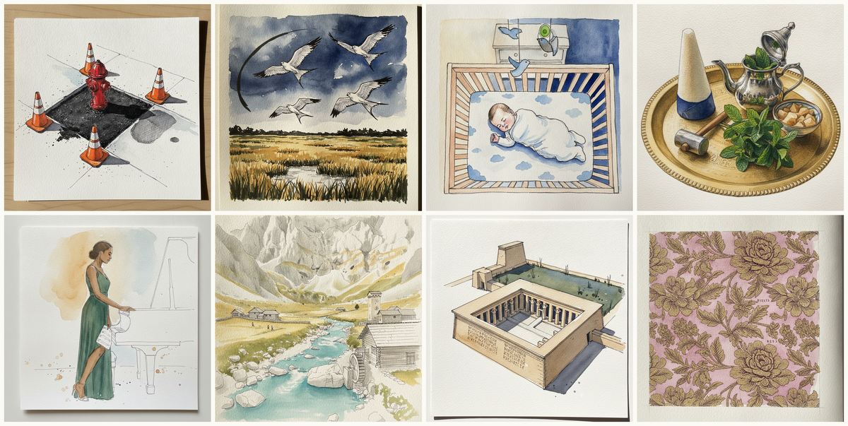
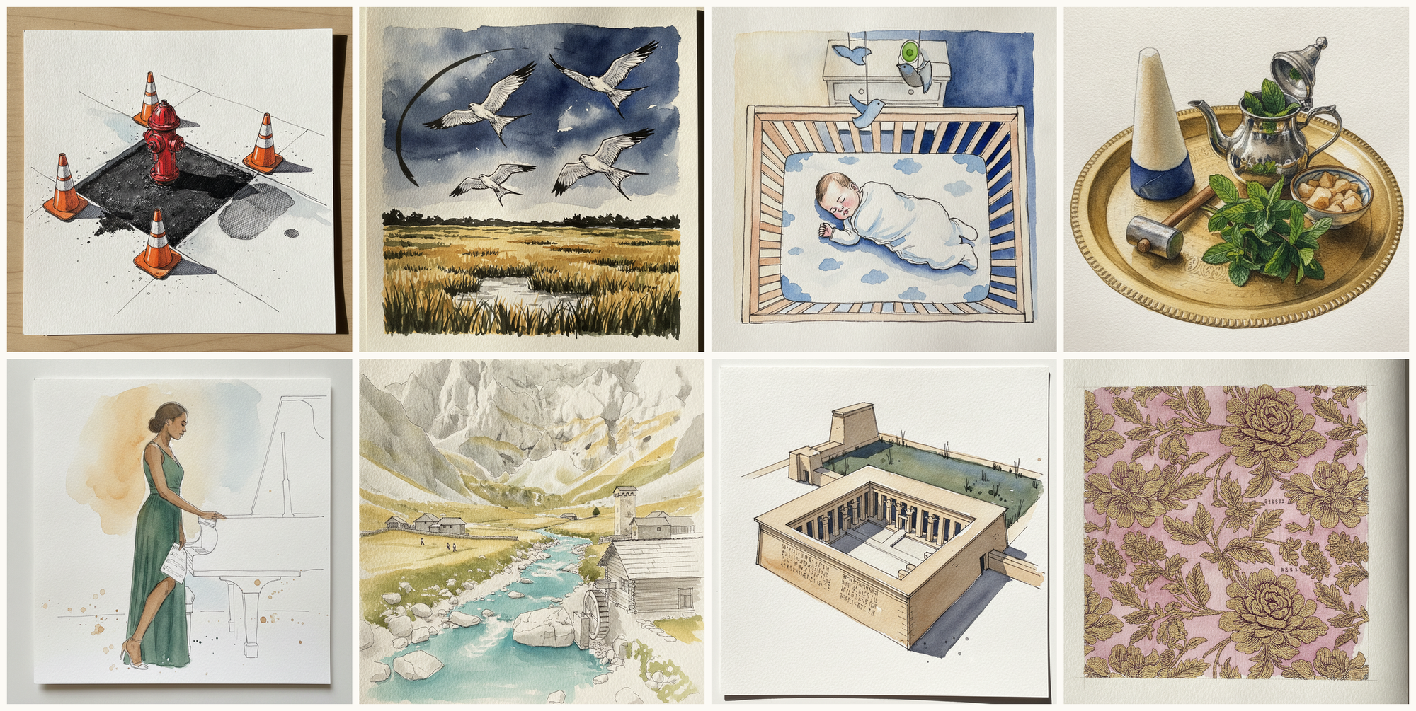
Today's 8 pen-and-watercolor pieces: Mid-Renovation Patched Asphalt, Swallow-tailed kite, Baby sleeping in crib, Sugar cone and mint sprigs beside the pot, Woman, late 20s, Black, tall lean build, hand on the corner of a grand piano, Valbona Valley, Albanian Alps, Temple of Seti I, Abydos, Egypt, Brocade Floral. Each piece comes with an AI-generated photoreal reference, three AI-generated example artworks in different treatments, and a short focus paragraph naming what to study in this one.
Why these references use AI
This daily series uses AI-generated images as practice prompts, not as finished artwork to copy. Each subject starts with a synthetic photoreal reference generated with Gemini/Nano Banana, then moves into three pen-and-watercolor interpretations of the same subject.
I use AI here because daily art practice needs variety and low friction. Real life can get repetitive, busy, or visually narrow. These generated reference sets make it easier to study bodies, buildings, animals, landscapes, objects, gestures, light, palettes, and compositions that might not show up in an ordinary day.
The goal is not to reproduce any image directly. Treat each set as a starting point for observation and study: choose what interests you, change the framing, simplify the subject, alter the palette, and make your own version.
Piece 1 — Mid-Renovation Patched Asphalt
Pen + Watercolor · Loose pen and watercolor line-and-wash
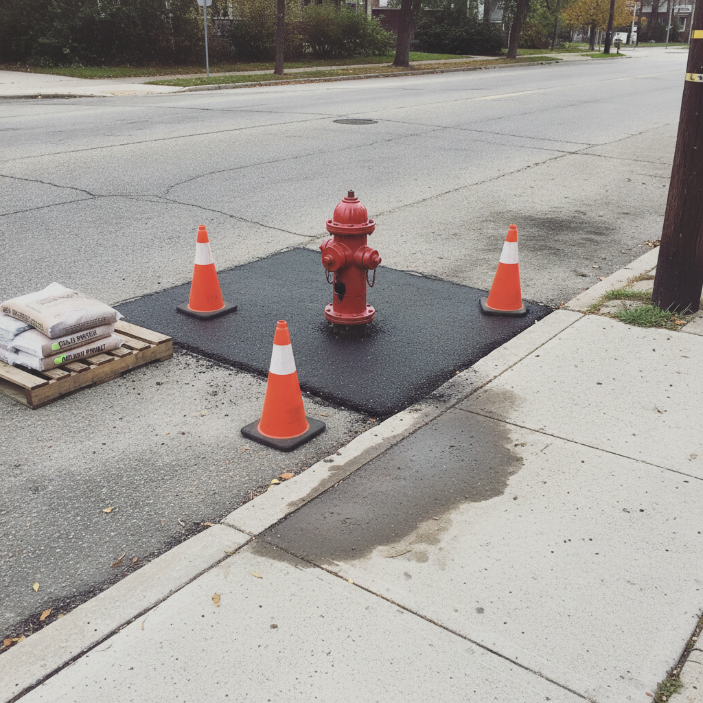
Three takes
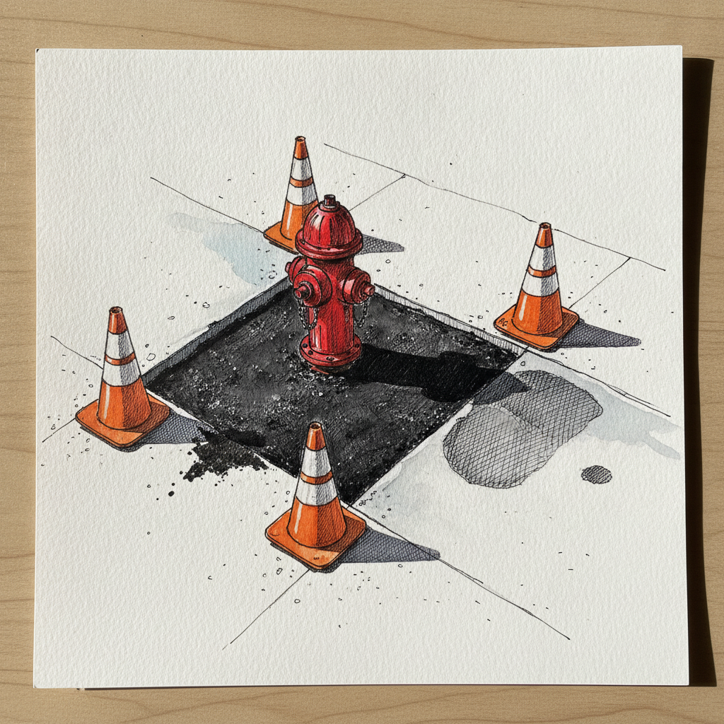
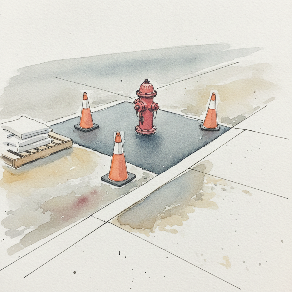
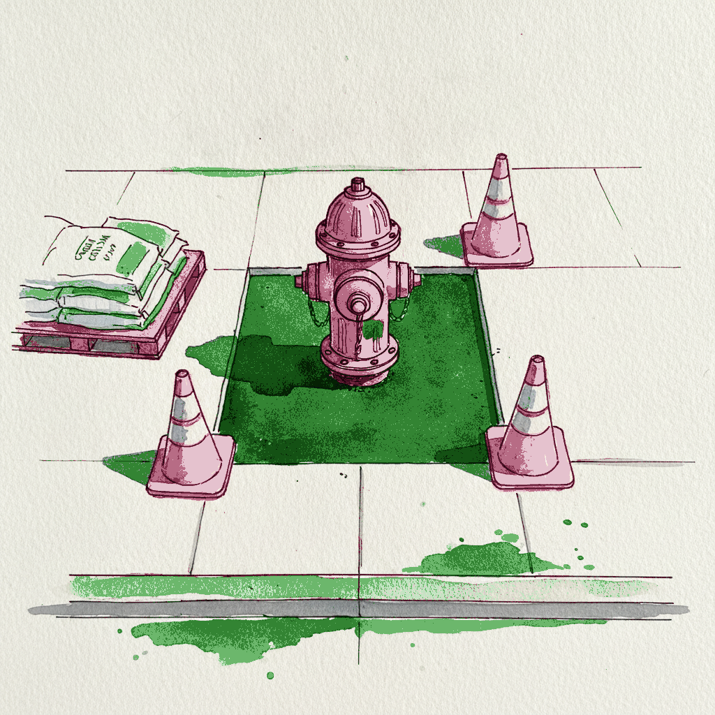

Focus for this piece
This piece offers a prime opportunity to master the interplay of hard and soft edges using both pen and wash. Employ crisp, continuous ink lines for the saw-cut asphalt patch and new curb, reinforcing their sharp forms and contrast against the softer surroundings. Then, use broken, textural pen marks and wet-into-wet watercolor for the older asphalt and damp concrete to capture their worn textures and more organic, less defined edges. Finally, use the bright red of the hydrant and orange cones as precise, high-value color anchors against the predominantly muted grays.
Piece 2 — Swallow-tailed kite
Pen + Watercolor · Loose pen and watercolor line-and-wash
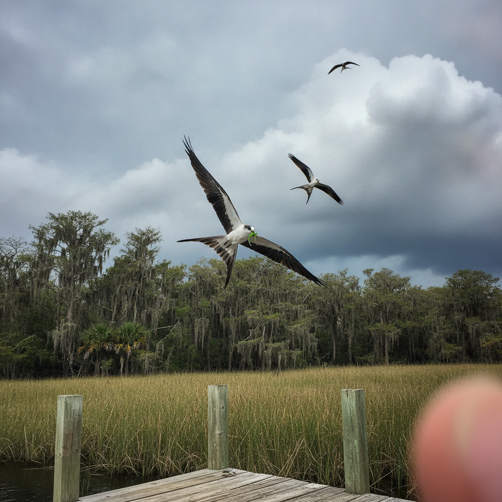
Three takes
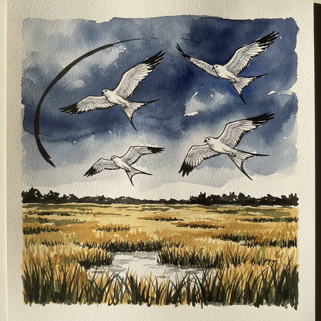
Focus for this piece
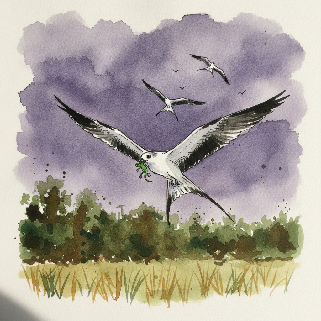
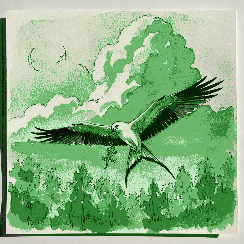
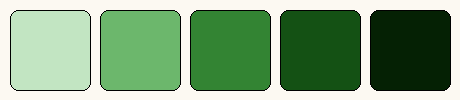
This piece offers a compelling study in using the decisive nature of ink to define a subject's form against atmospheric watercolor washes. Focus on rendering the kite's sharp, graphic shape and distinct black-and-white plumage with varied line weights, allowing these crisp elements to anchor the fluid, humid sky created by delicate wet-on-wet washes. Observe how this interplay between definite line and suggestive wash brings both structure and atmosphere to your composition.
Piece 3 — Baby sleeping in crib
Pen + Watercolor · Loose pen and watercolor line-and-wash

Three takes
Focus for this piece
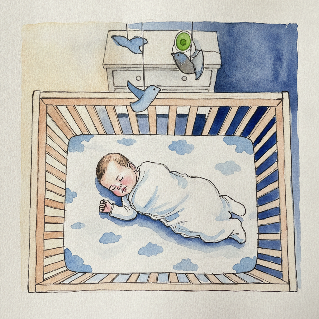
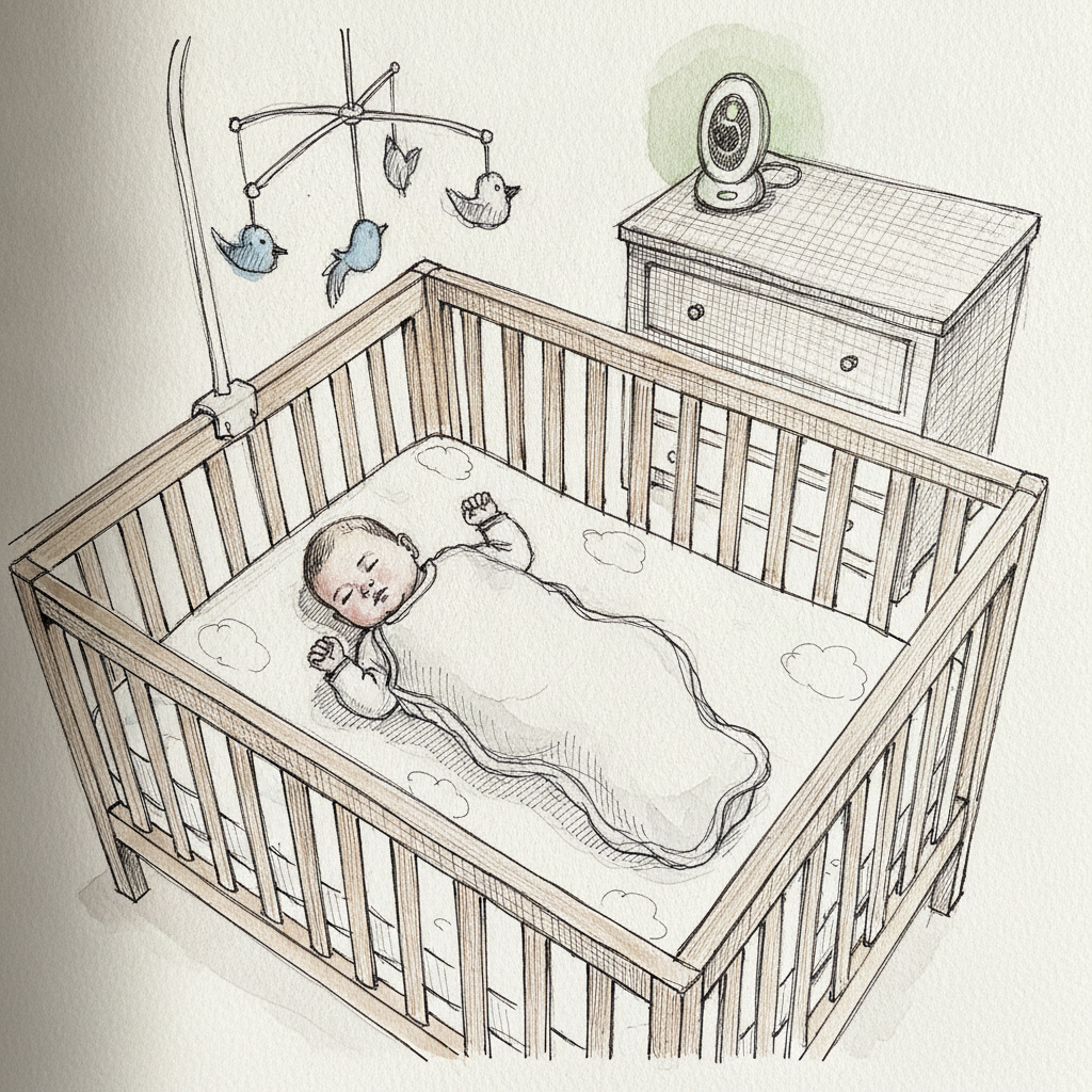
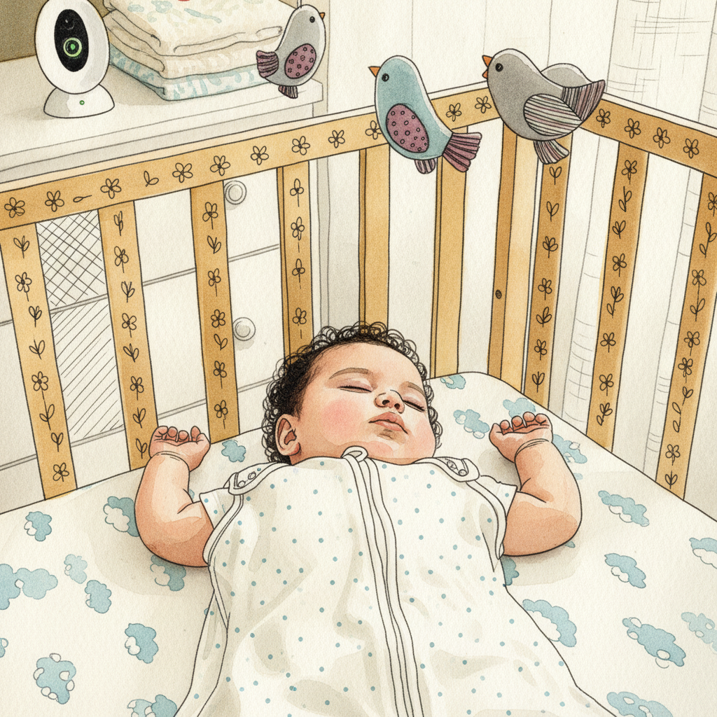
This piece offers an excellent opportunity to practice contrasting delicate, organic shapes—like the baby's rounded face and tiny hands—with the crisp, linear geometry of the slatted wooden crib. Use varied pen weights to define the crib's structure precisely, then employ soft, layered washes to build the baby's volume and the subtle shadows on the white sleep sack. Focus on how the soft afternoon light defines form through gentle value shifts, utilizing pale washes to maintain the luminosity of the whites and imply the gauzy curtains.
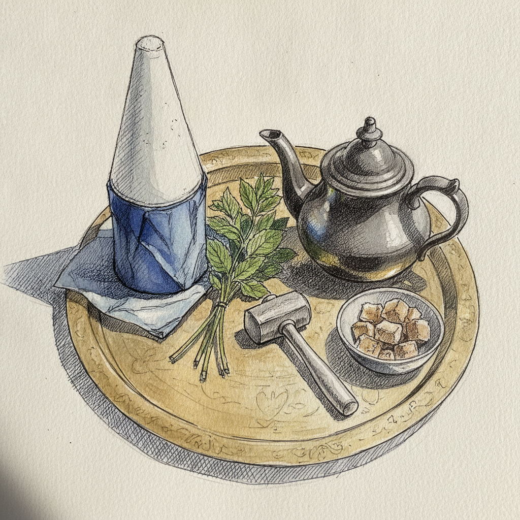
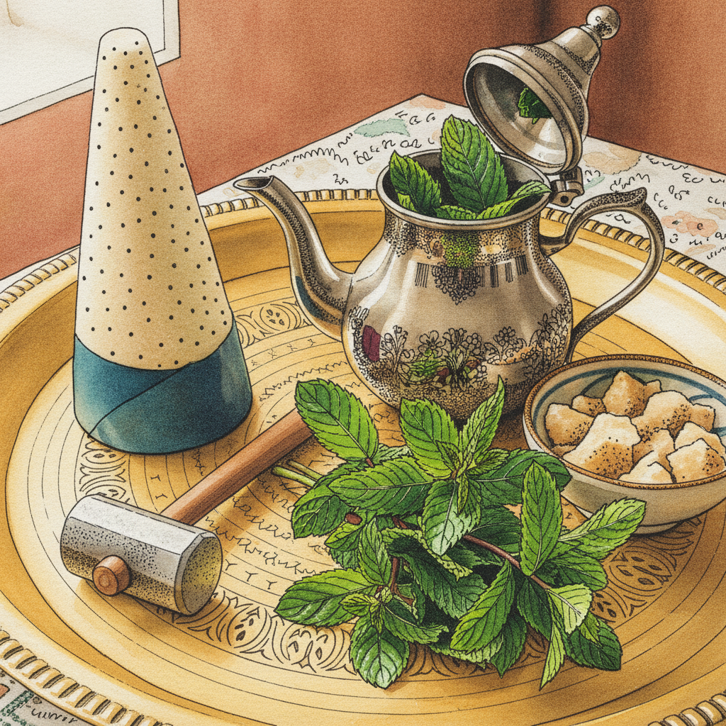
Piece 4 — Sugar cone and mint sprigs beside the pot
Pen + Watercolor · Loose pen and watercolor line-and-wash
Three takes
Focus for this piece
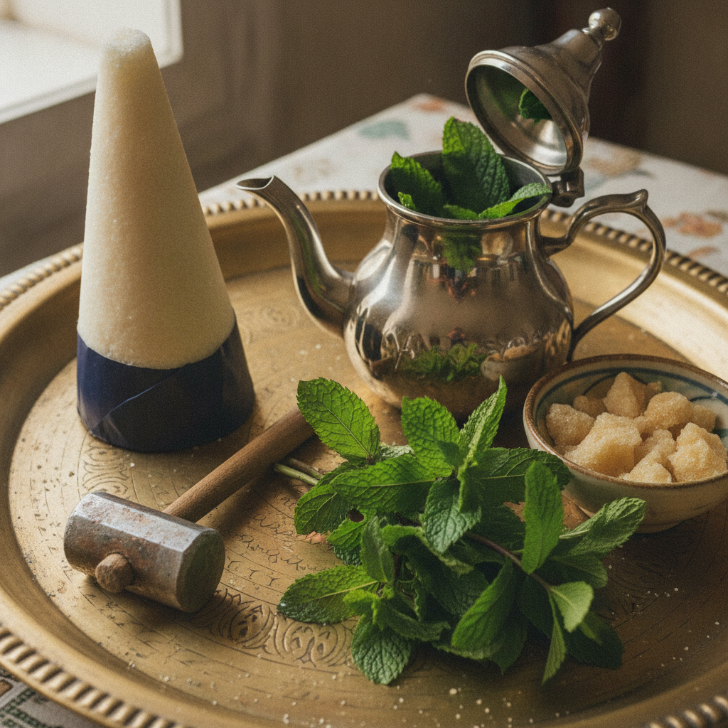
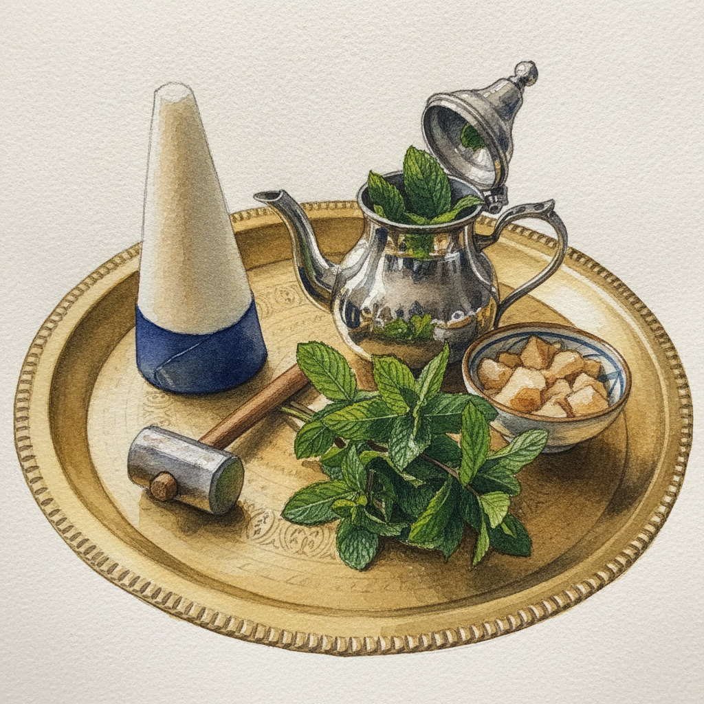
This composition offers a dynamic study in rendering diverse textures and forms through intentional line-and-wash contrast. Employ crisp, varying line weights to define the geometric structure of the sugar cone and the intricate arabesques of the brass tray, using controlled washes to suggest their distinct surface qualities—pale and smooth versus worn and reflective. In contrast, allow for softer, more gestural pen lines and fluid wet-into-wet washes to capture the organic freshness and vibrant greens of the mint sprigs, highlighting their natural volume against the manufactured elements. Focus on how the *timing* of your watercolor washes interacts with the ink lines to achieve these different material qualities.
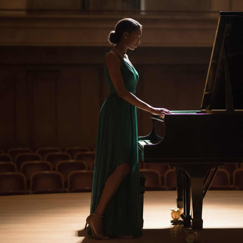
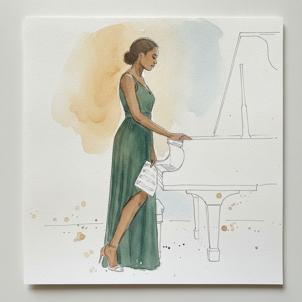
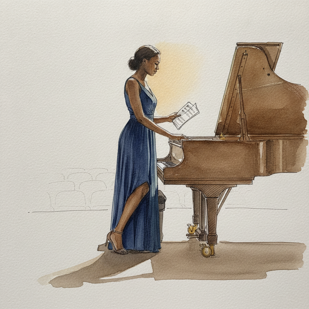
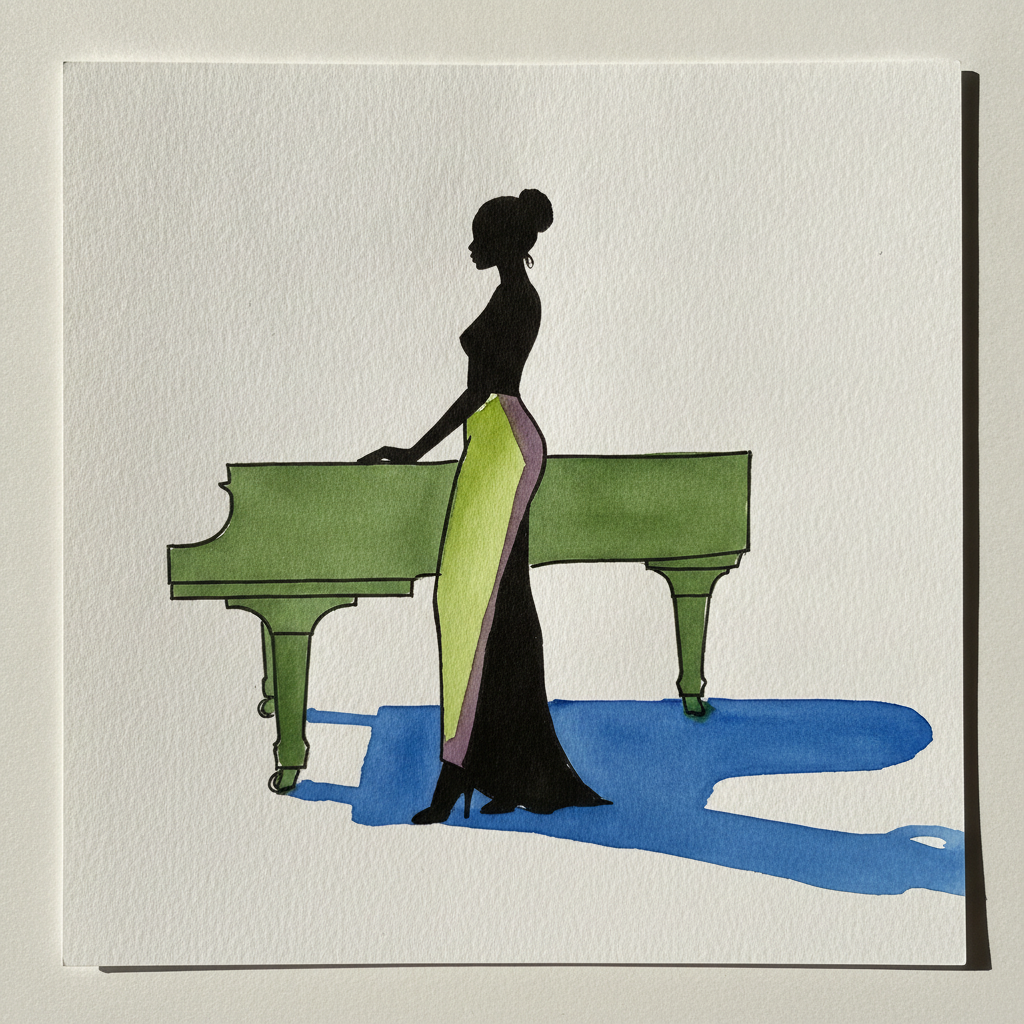
Piece 5 — Woman, late 20s, Black, tall lean build, hand on the corner of a grand piano
Pen + Watercolor · Loose pen and watercolor line-and-wash
Three takes
Focus for this piece
This piece offers a superb study in rendering the complex surfaces of a grand piano, particularly its polished, curved lid and reflective qualities. Focus on building deep, rich values for the piano's form with layered washes of Payne's Gray or Indigo, observing how the warm spotlight creates specific highlights and reflections that demand careful lifting or reserving. Use a soft, thirsty brush to blend these reflective passages into the dark surface, then reserve your crispest, fine pen lines to define the piano's hard edges and the sharper glints of light on its curves.
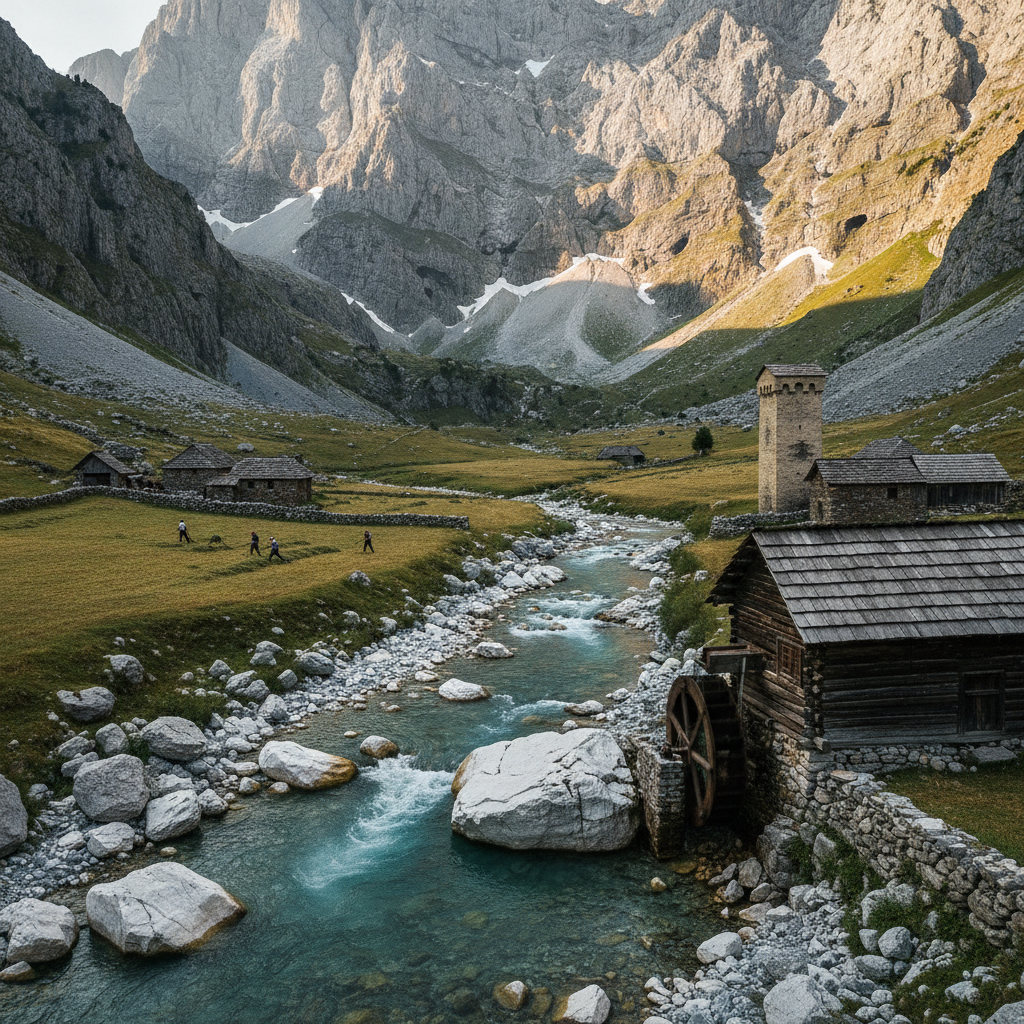
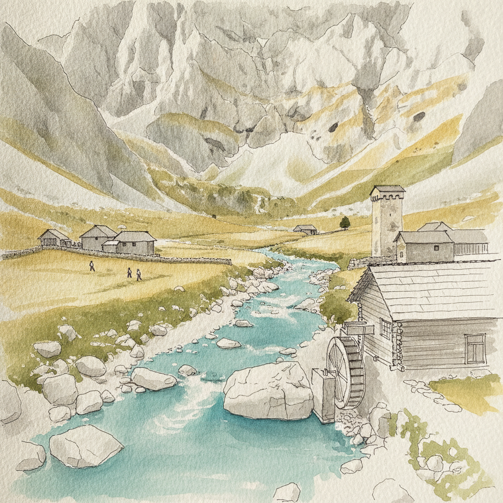
Piece 6 — Valbona Valley, Albanian Alps
Pen + Watercolor · Loose pen and watercolor line-and-wash
Three takes
Focus for this piece
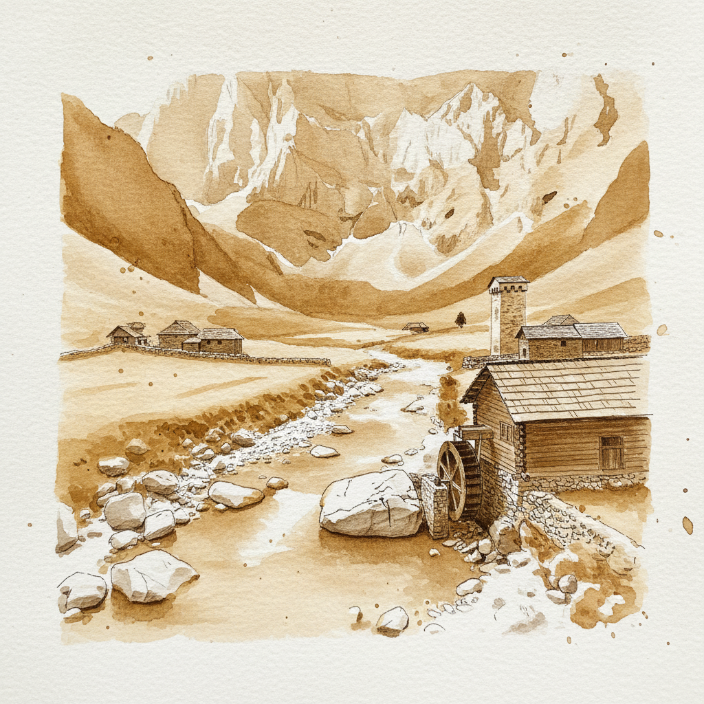
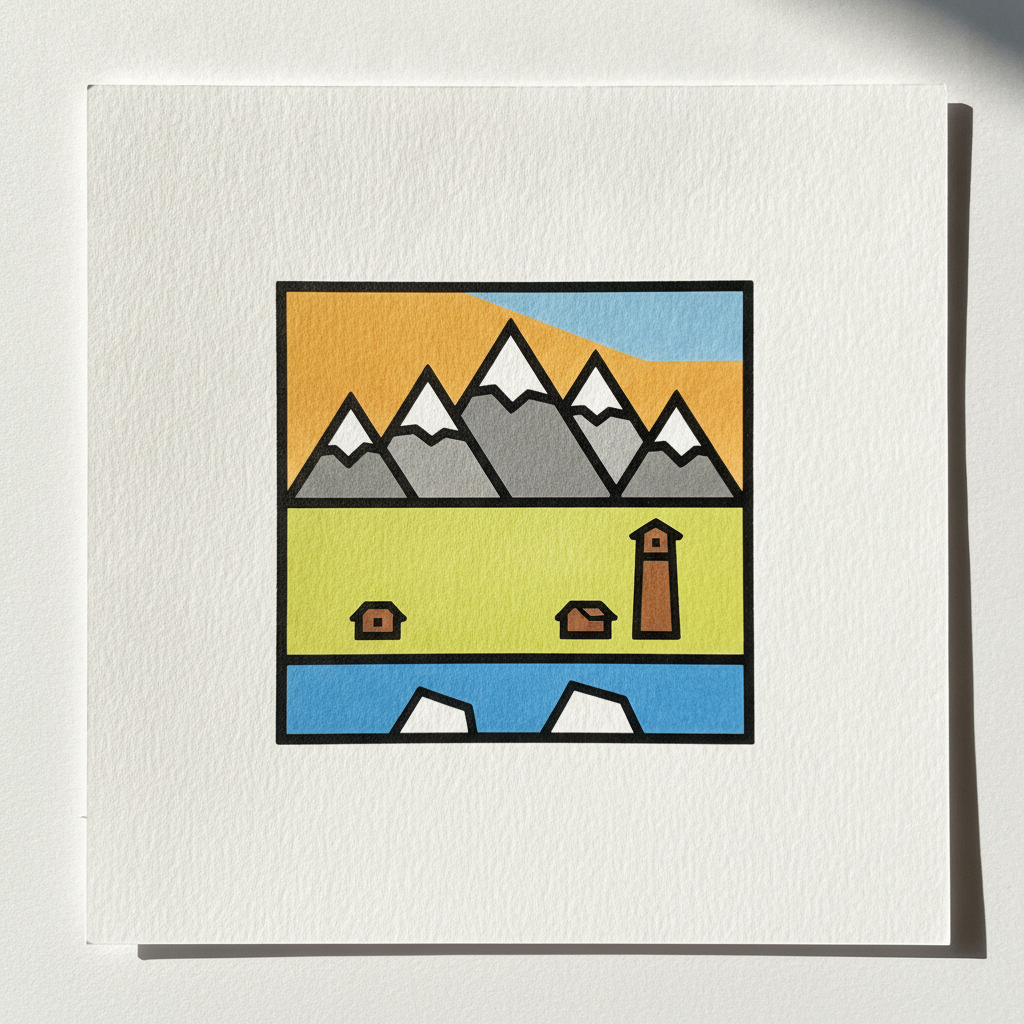
For Valbona Valley, focus on establishing deep spatial recession through deliberate line weight and atmospheric washes. Use bold, descriptive lines and richer, more textured washes for the foreground mill and boulders to bring them forward. Conversely, render the distant, sheer limestone walls with lighter, broken lines and soft, cool wet-on-wet washes to make them recede into the atmosphere, allowing for subtle suggestions of karst caves and snow patches. Pay attention to how the warm afternoon light illuminates the hay meadows and western mountain face, contrasting with cool shadow tones.
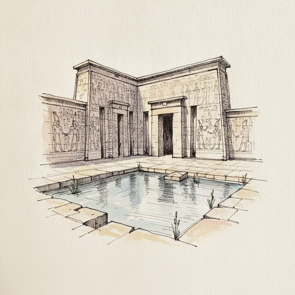
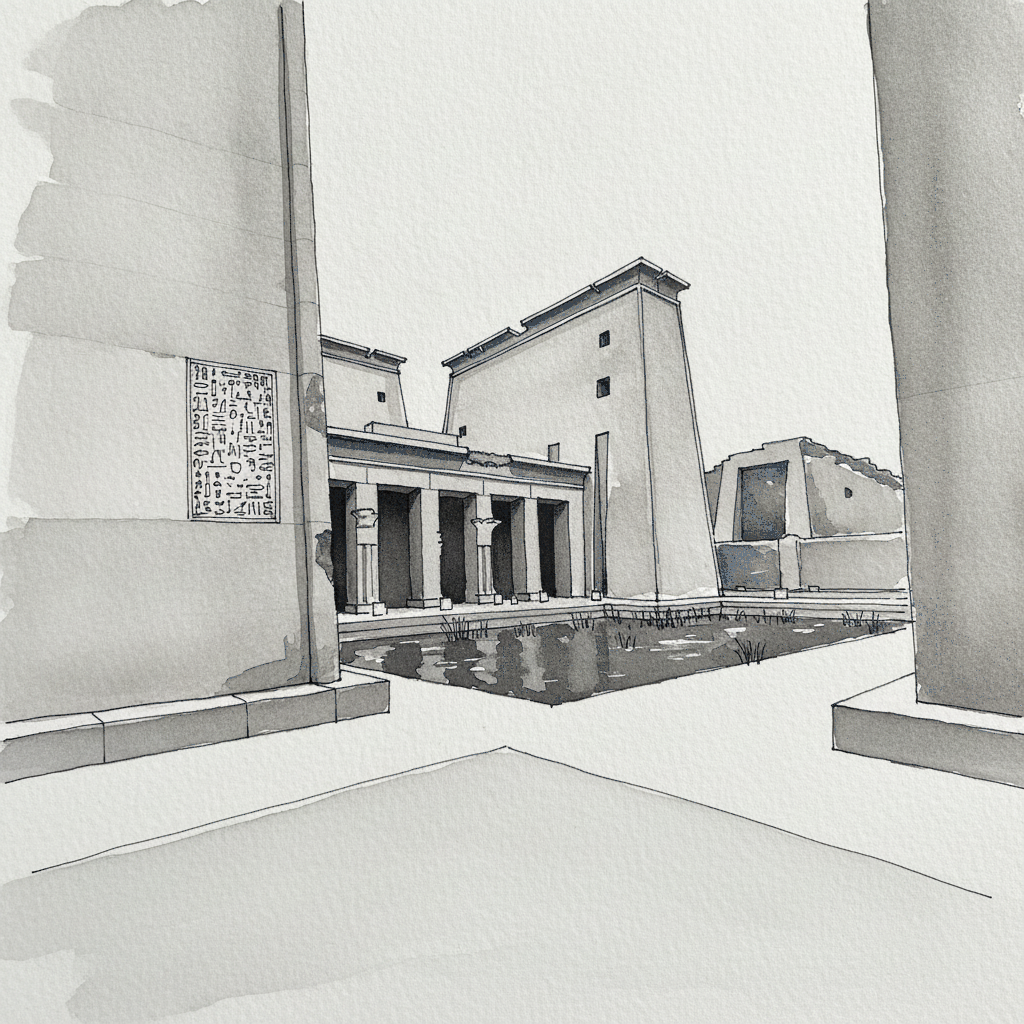
Piece 7 — Temple of Seti I, Abydos, Egypt
Pen + Watercolor · Loose pen and watercolor line-and-wash
Three takes

Focus for this piece
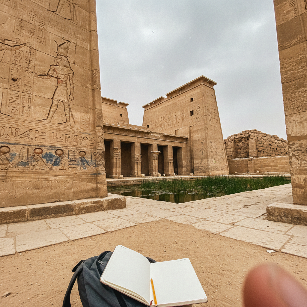
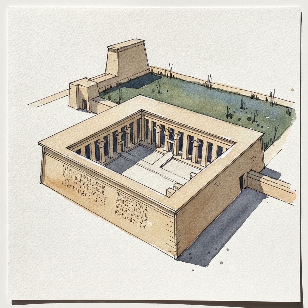
This piece is an excellent study in contrasting controlled structural line work with fluid atmospheric washes. Use varied, crisp waterproof ink lines to articulate the precise architectural forms of the temple and its detailed relief carvings, establishing its crisp edges and three-dimensional planes. Then, employ soft, wet-on-wet watercolor techniques for the partially flooded Osireion and reeds, allowing for natural blending and suggestive reflections to create an ethereal, organic atmosphere that complements the stone.
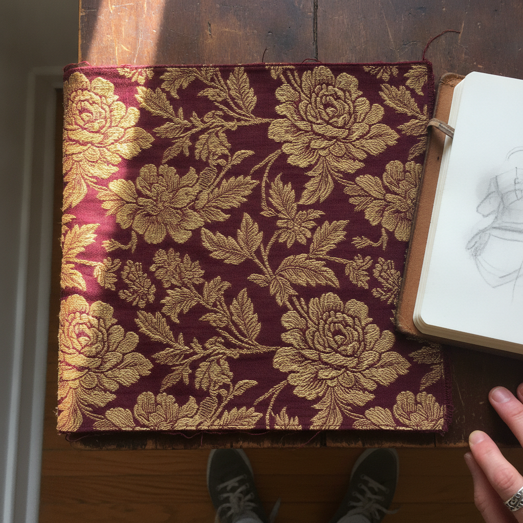
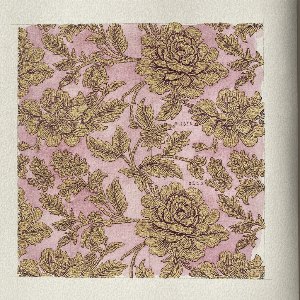
Piece 8 — Brocade Floral
Pen + Watercolor · Loose pen and watercolor line-and-wash
Three takes
Focus for this piece
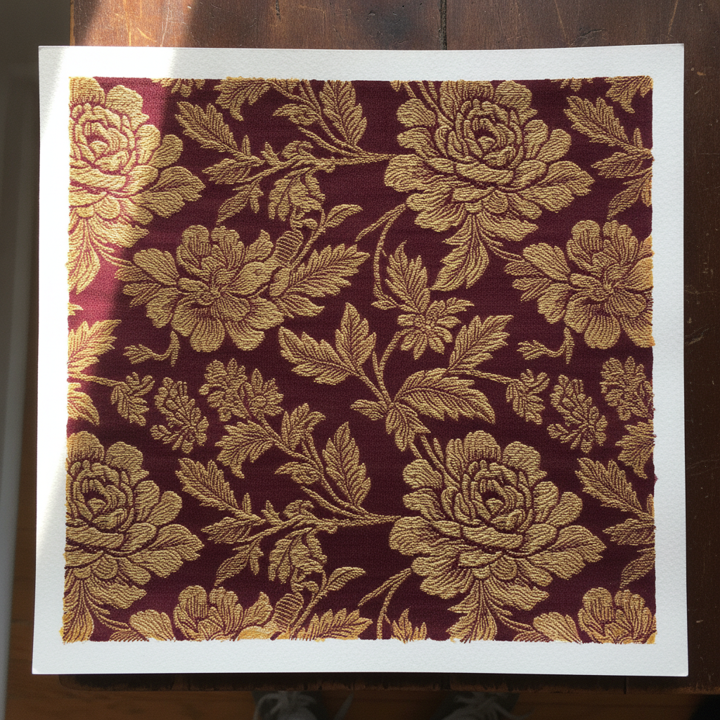
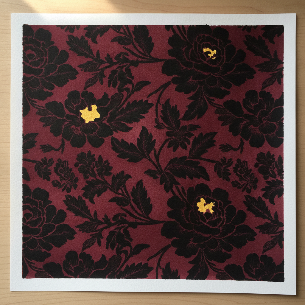
This piece offers a focused study in rendering the dimensionality of raised patterns. Use varied pen line weights: heavier, unbroken lines for the outer edges of the raised gold motifs, and lighter, broken lines to suggest the individual threads and where they tuck back into the ground. With watercolor, establish the deep burgundy ground with smooth, even washes, then build the luminous gold motifs using layered warm yellow and orange tones, emphasizing value shifts to model their three-dimensional form. Pay particular attention to the subtle cool shadows beneath the raised elements to enhance their projection from the flat silk.