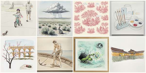
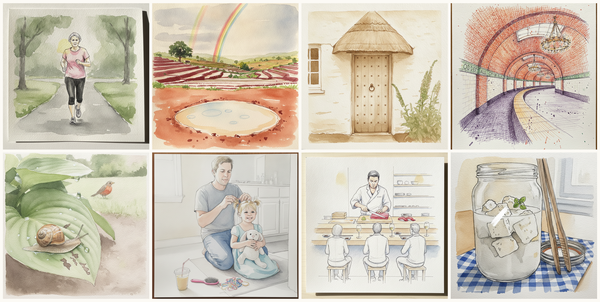
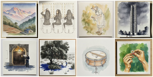
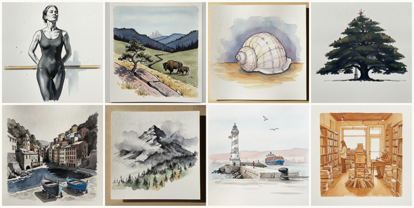
Dust Storm, Wood floor, knees to chest, hugged, Süleymaniye Hamamı, Istanbul, Turkey, Furniture store with sofas, and more — pen + watercolor for August 21, 2026
AI-generated daily art-practice references for pen and watercolor: Dust Storm, Wood floor, knees to chest, hugged, Süleymaniye Hamamı, Istanbul, Turkey, Furniture store with sofas, Boston brownstone study, Side-striped jackal, Rowan branch with orange berries, Torne river aurora, Jukkasjärvi area…
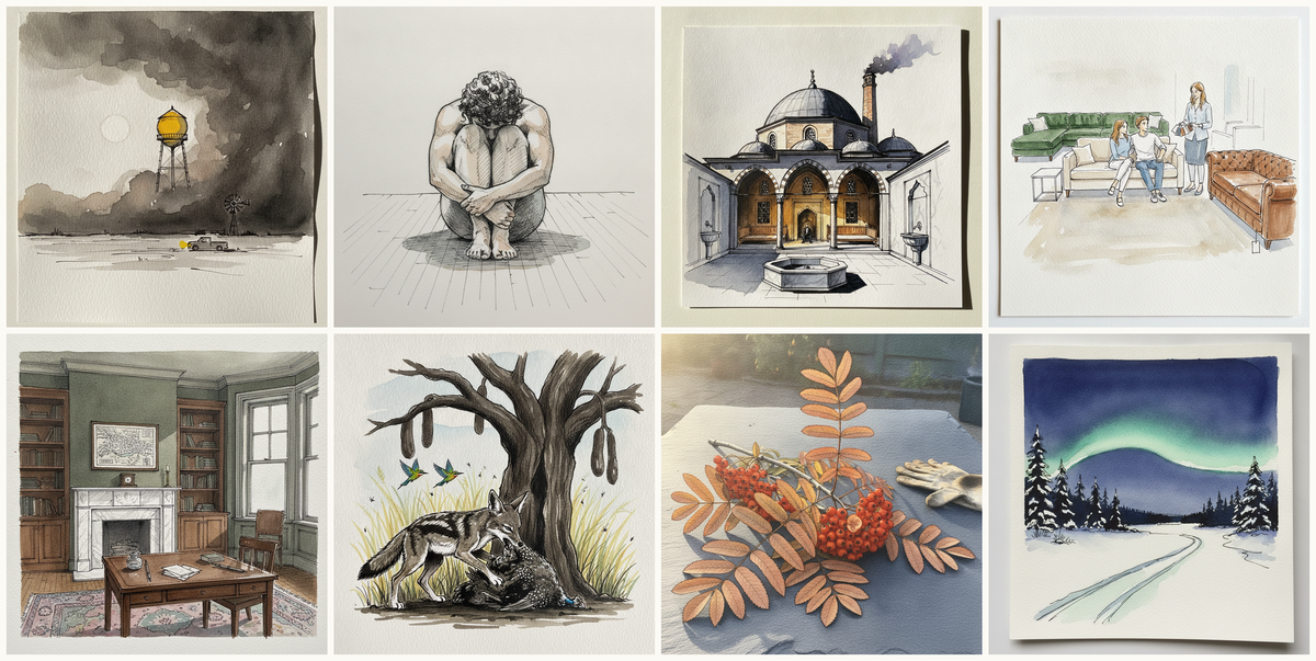
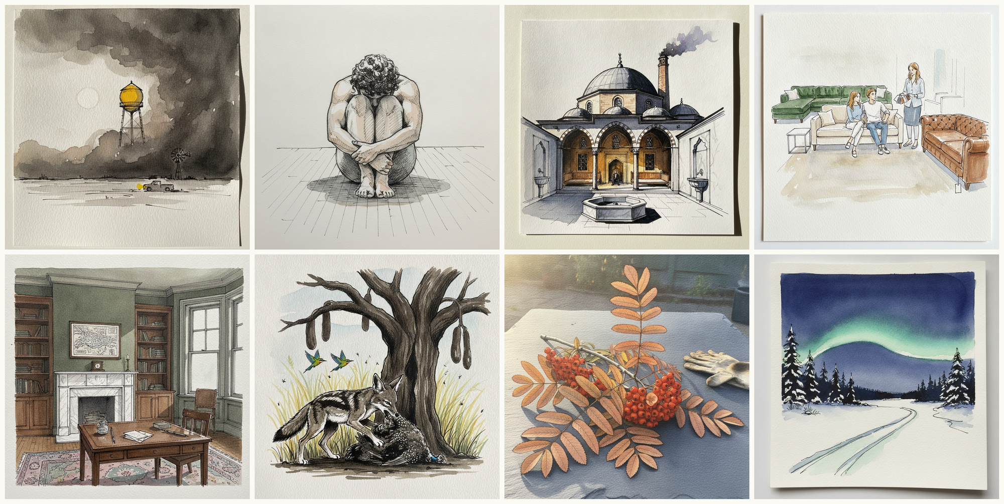
Today's 8 pen-and-watercolor pieces: Dust Storm, Wood floor, knees to chest, hugged, Süleymaniye Hamamı, Istanbul, Turkey, Furniture store with sofas, Boston brownstone study, Side-striped jackal, Rowan branch with orange berries, Torne river aurora, Jukkasjärvi area, Sweden. Each piece comes with an AI-generated photoreal reference, three AI-generated example artworks in different treatments, and a short focus paragraph naming what to study in this one.
Why these references use AI
This daily series uses AI-generated images as practice prompts, not as finished artwork to copy. Each subject starts with a synthetic photoreal reference generated with Gemini/Nano Banana, then moves into three pen-and-watercolor interpretations of the same subject.
I use AI here because daily art practice needs variety and low friction. Real life can get repetitive, busy, or visually narrow. These generated reference sets make it easier to study bodies, buildings, animals, landscapes, objects, gestures, light, palettes, and compositions that might not show up in an ordinary day.
The goal is not to reproduce any image directly. Treat each set as a starting point for observation and study: choose what interests you, change the framing, simplify the subject, alter the palette, and make your own version.
Piece 1 — Dust Storm
Pen + Watercolor · Loose pen and watercolor line-and-wash
Three takes
Focus for this piece
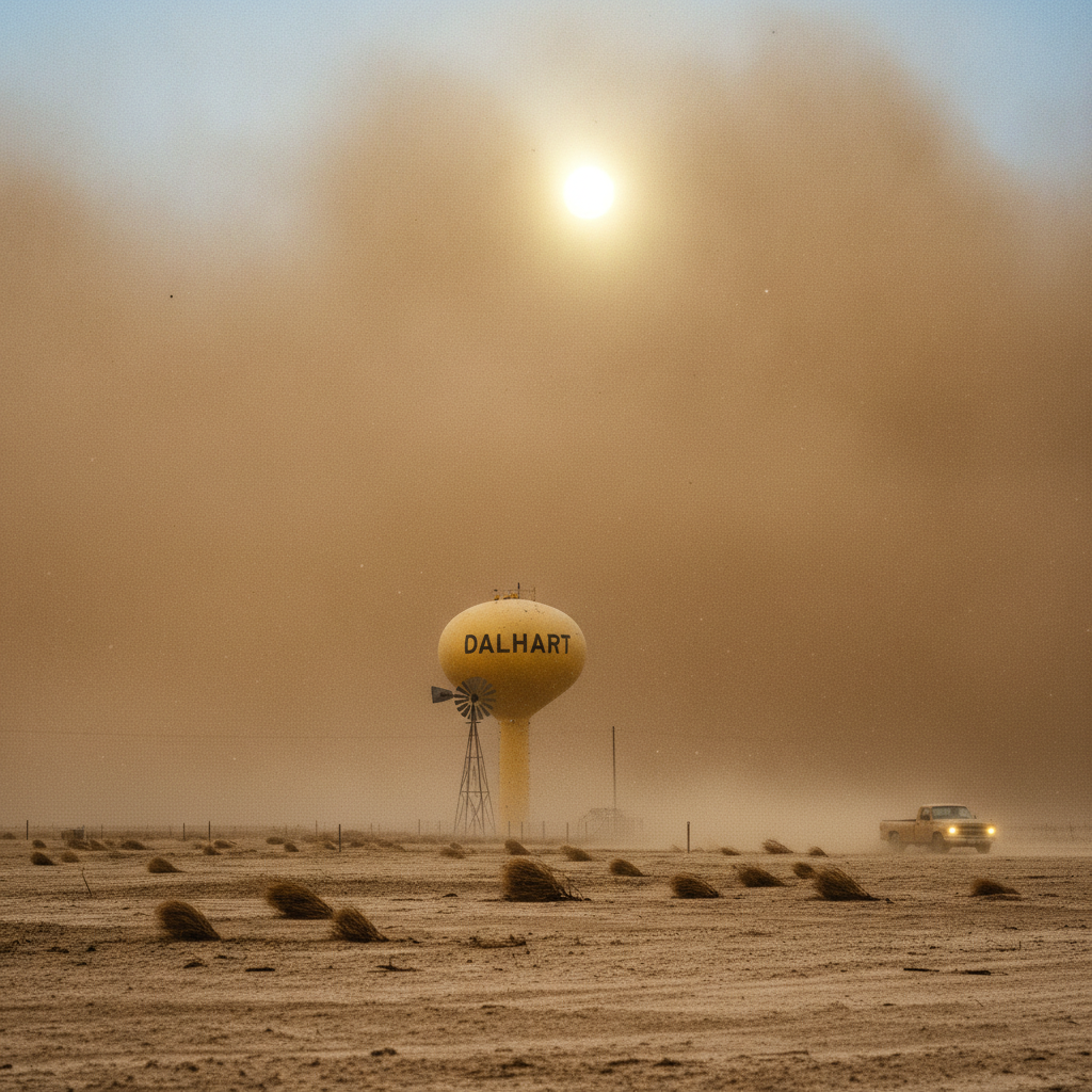
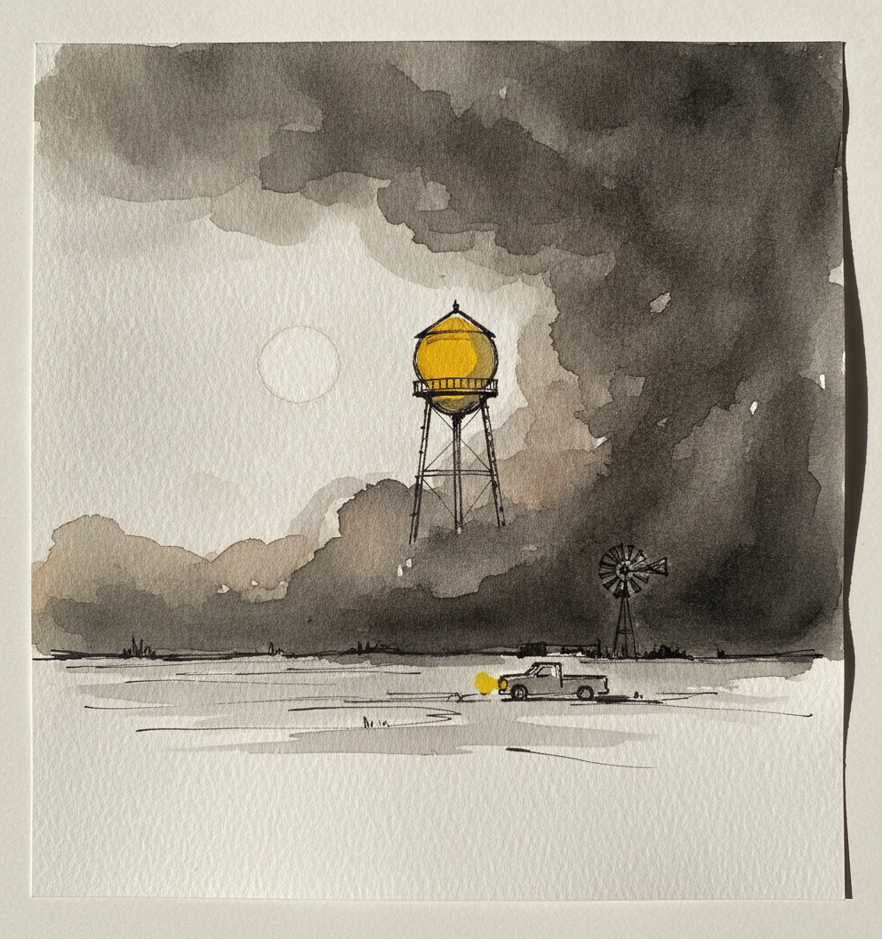
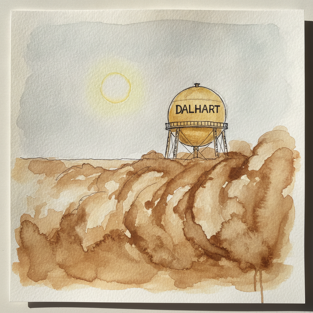
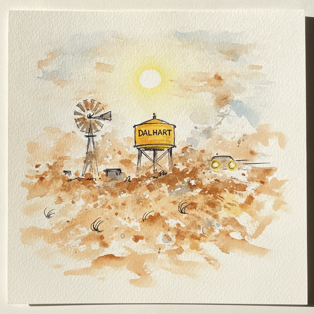
This dust storm scene is ideal for practicing the contrast between precise structure and fluid atmosphere. Use strong, consistent pen lines to define the spheroid tank and its crisp DALHART lettering above the dust, but transition to softer, varied line weights for elements like the blurred windmill or racing tumbleweeds. Employ broad, layered wet-on-wet washes in a limited palette of caramel and lemon hues for the dust wall, letting the watercolor create the vast, indistinct murk of the haboob.
Piece 2 — Wood floor, knees to chest, hugged
Pen + Watercolor · Loose pen and watercolor line-and-wash

Three takes
Focus for this piece
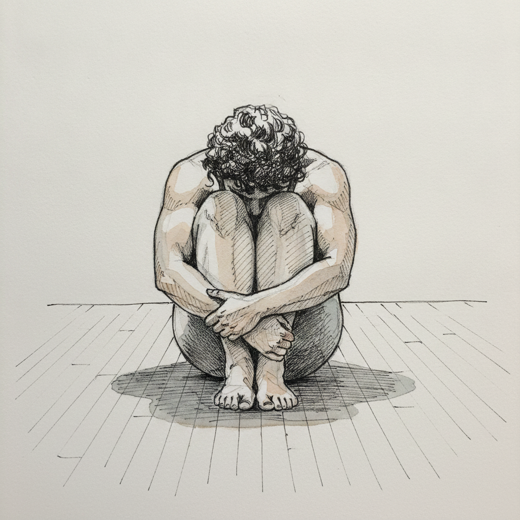
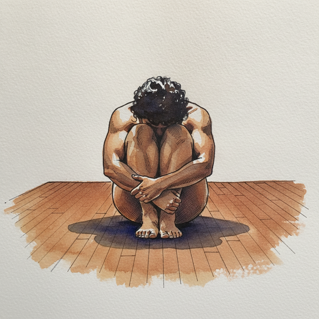
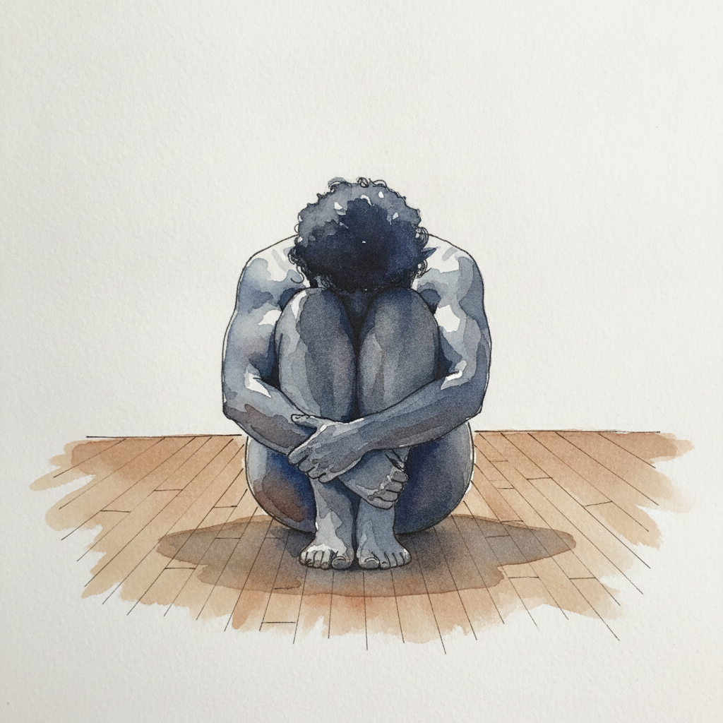
This piece offers a compelling study in rendering extreme foreshortening and compact, spherical forms using varied line weight and layered washes. Emphasize depth by thickening pen lines for the overlapping curves of the legs, while using softer, cooler washes for the deep shadow cast beneath the figure. Pay close attention to how the sharp rim light along the spine contrasts with the soft underside and the texture of the floorboards, guiding the eye around the curled form.
Piece 3 — Süleymaniye Hamamı, Istanbul, Turkey
Pen + Watercolor · Loose pen and watercolor line-and-wash
Three takes

Focus for this piece
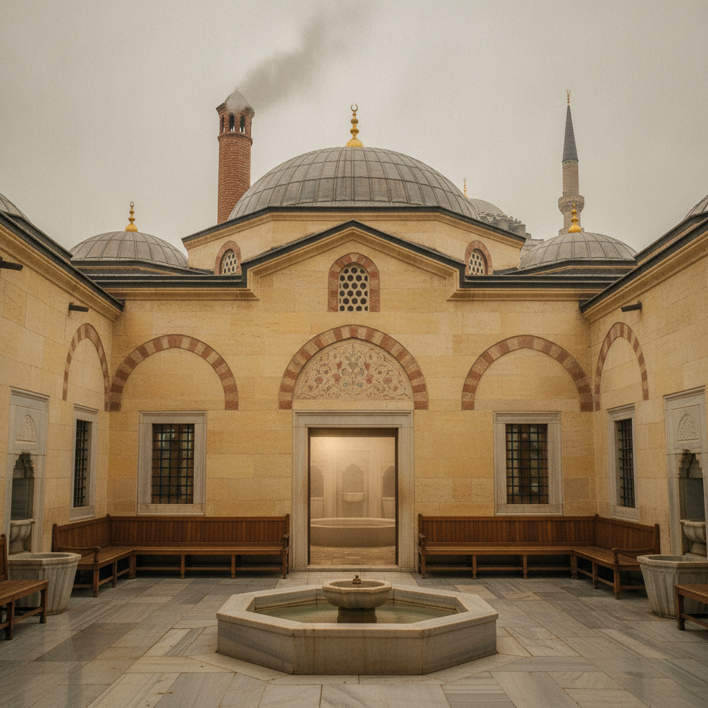
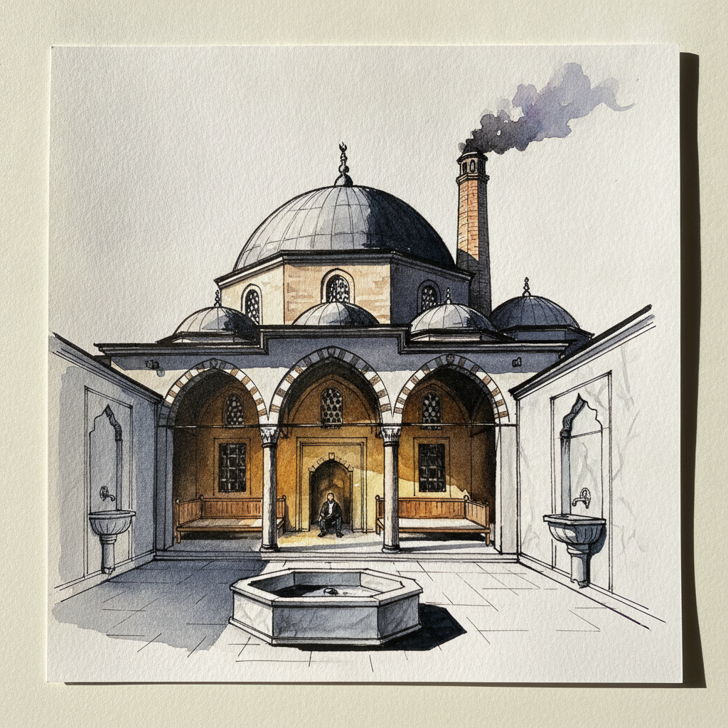
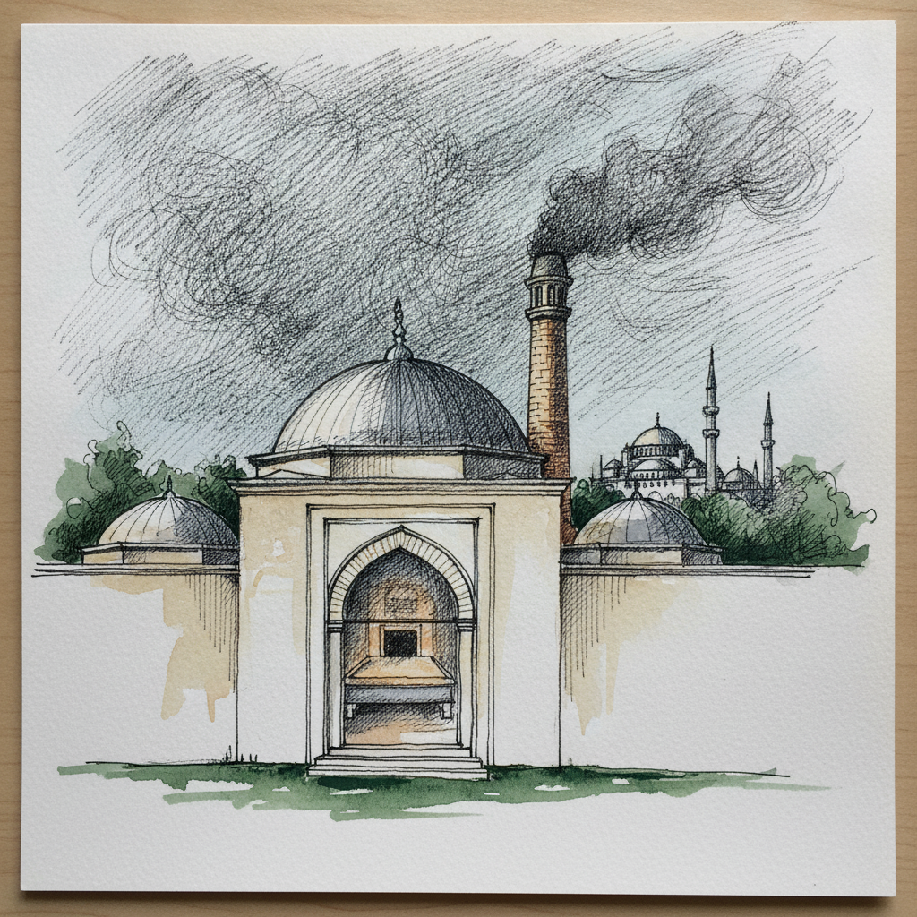
For the Süleymaniye Hamamı, focus on how varied line weights can articulate architectural details, like the göbektaşı's low profile or the sharp edges of marble basins, against the broader, softer forms of the plain stone walls and dome. Practice building the subtle volume and texture of these pale surfaces with very delicate, layered washes using a limited, neutral palette, letting watercolor suggest light while your pen defines the structure.
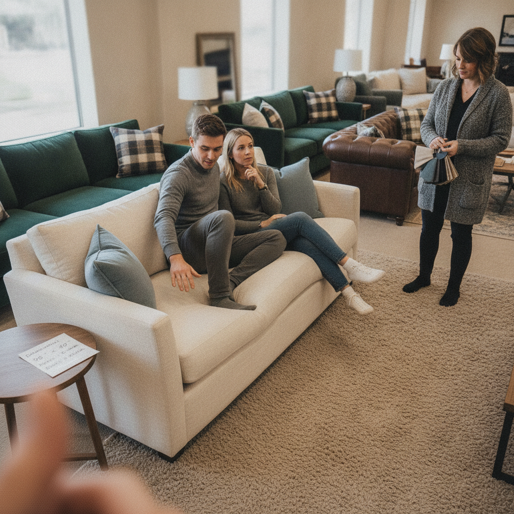
Piece 4 — Furniture store with sofas
Pen + Watercolor · Loose pen and watercolor line-and-wash
Three takes
Focus for this piece
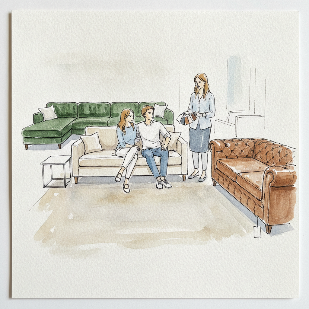
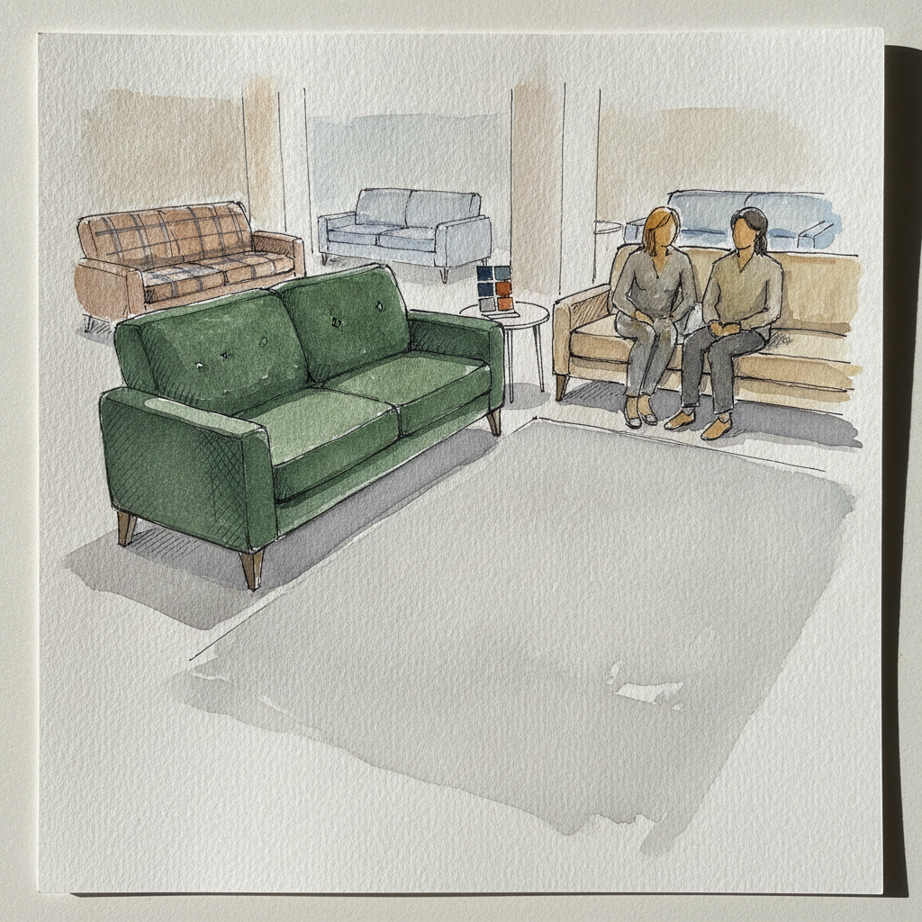
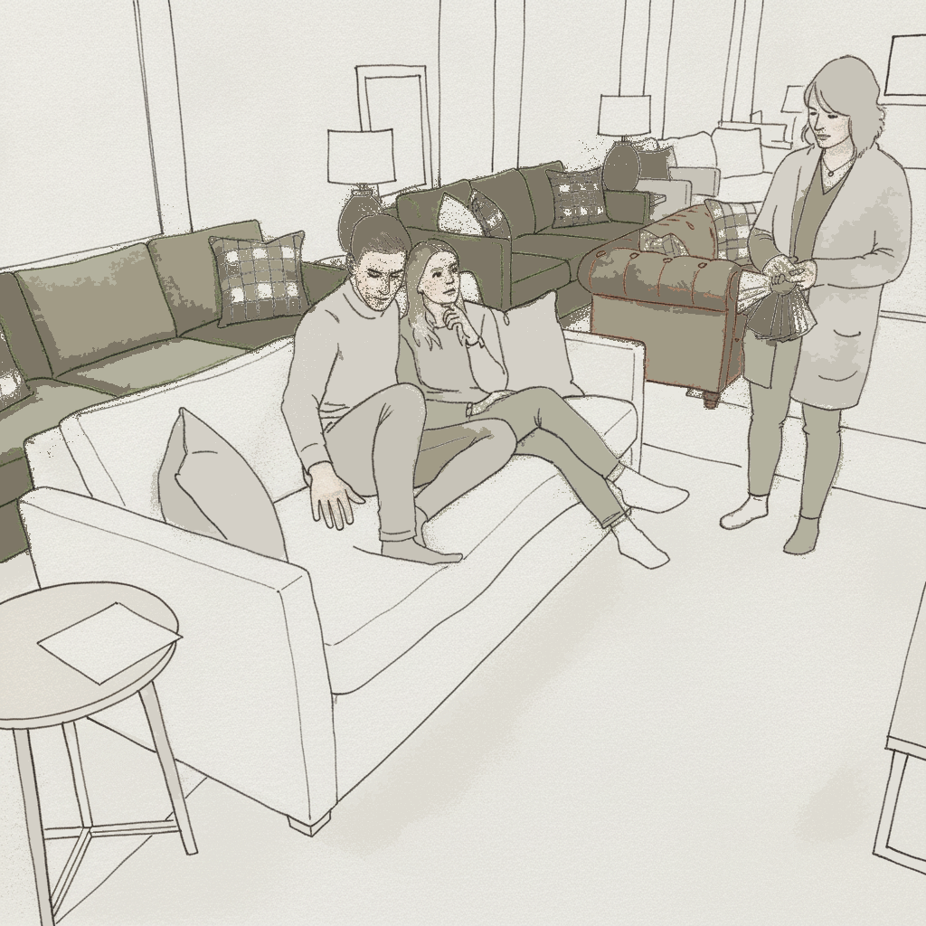
This study is excellent for exploring how diverse textures and materials, from the structured forms of tufted leather to the soft contours of velvet, can be rendered with both line and wash. Use varied pen weights—a firmer line for architectural edges, a lighter touch for fabric folds—and combine these with specific wash techniques like a dry brush for the plush carpet and wet-into-wet for the soft linen upholstery. This interplay will allow you to differentiate surfaces and add tactile richness to the showroom's inviting atmosphere.
Piece 5 — Boston brownstone study
Pen + Watercolor · Loose pen and watercolor line-and-wash
Three takes
Focus for this piece
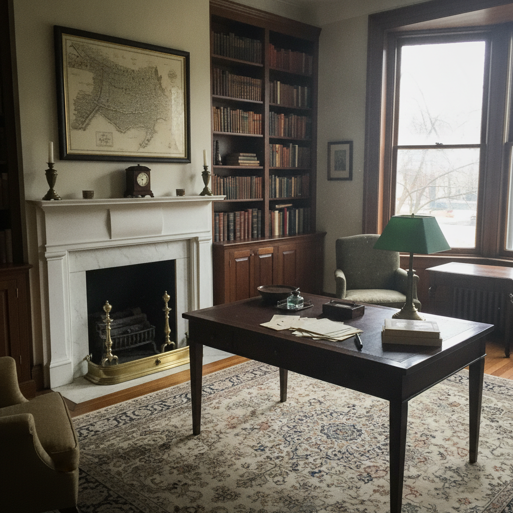
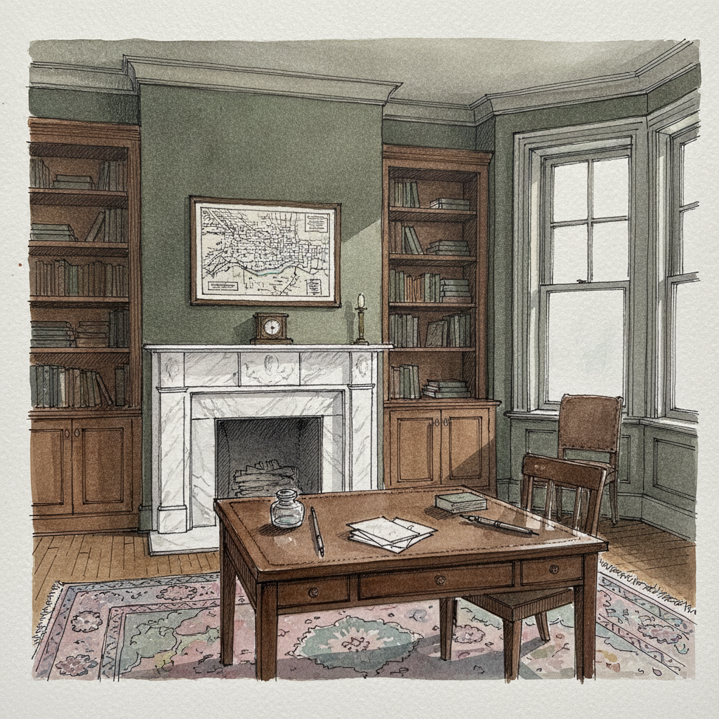
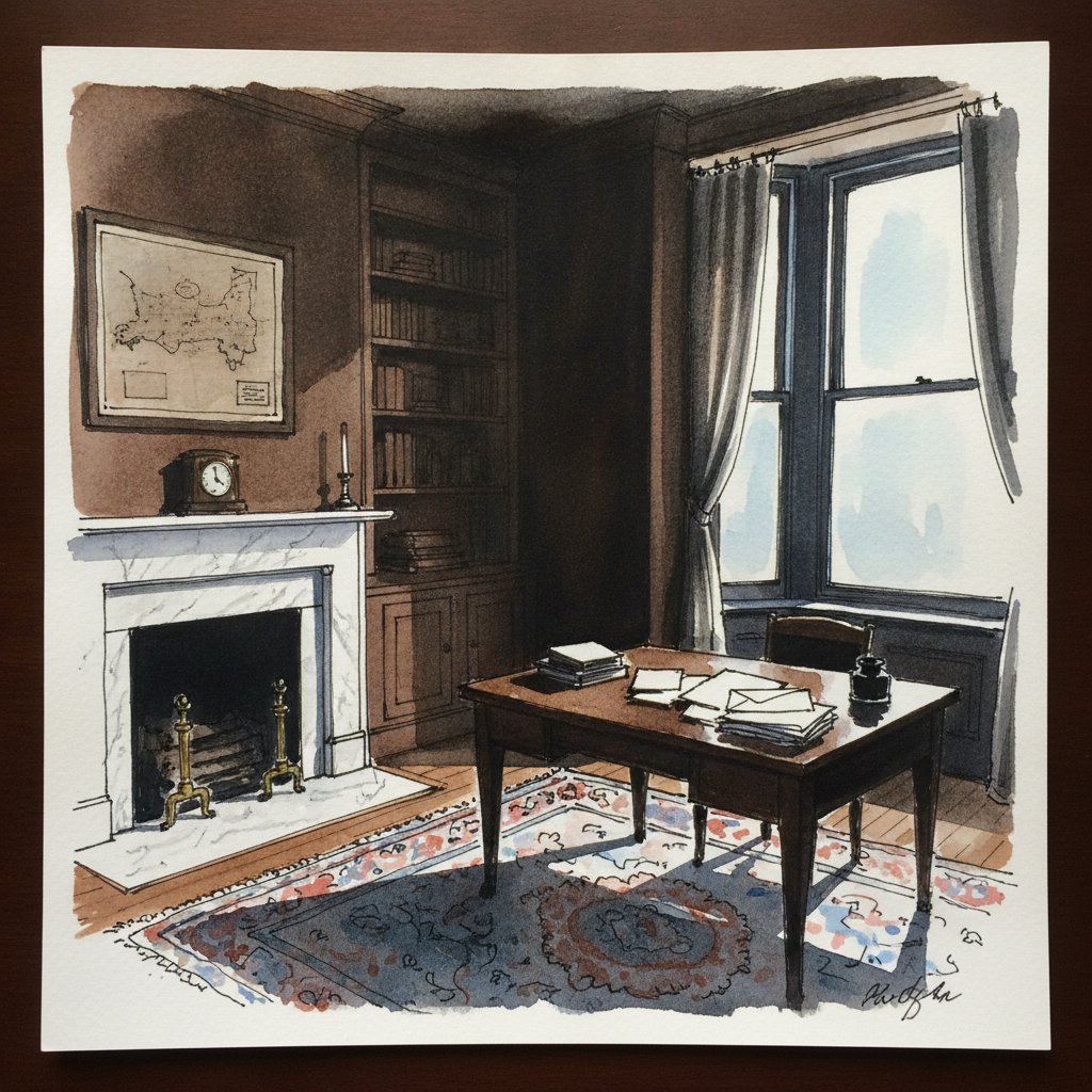
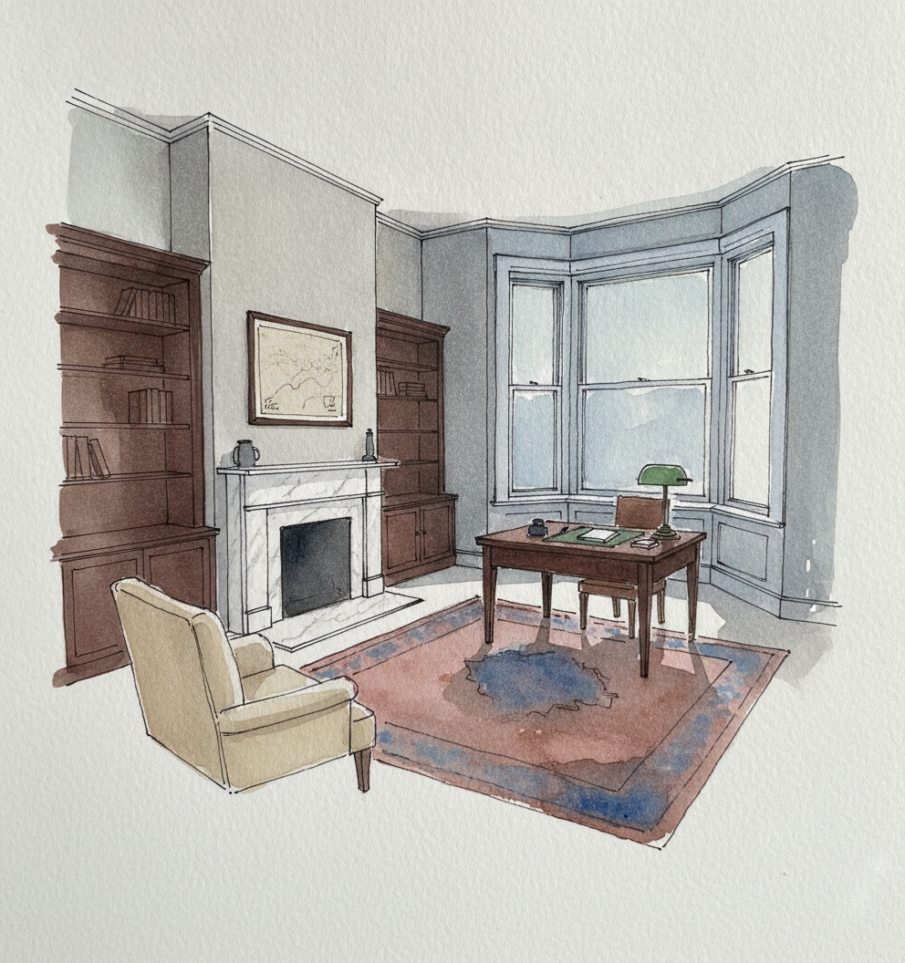
Focus on using precise, varied ink lines for crisp details like the inkwell and lamp, contrasting them with broader, wet-on-wet watercolor washes to capture the overall atmospheric depth of the room. Pay particular attention to how the cool light from the bay window interacts with the darker, textured surfaces of the walnut and leather, building volume through layered glazes rather than relying solely on line.
Piece 6 — Side-striped jackal
Pen + Watercolor · Loose pen and watercolor line-and-wash
Three takes

Focus for this piece
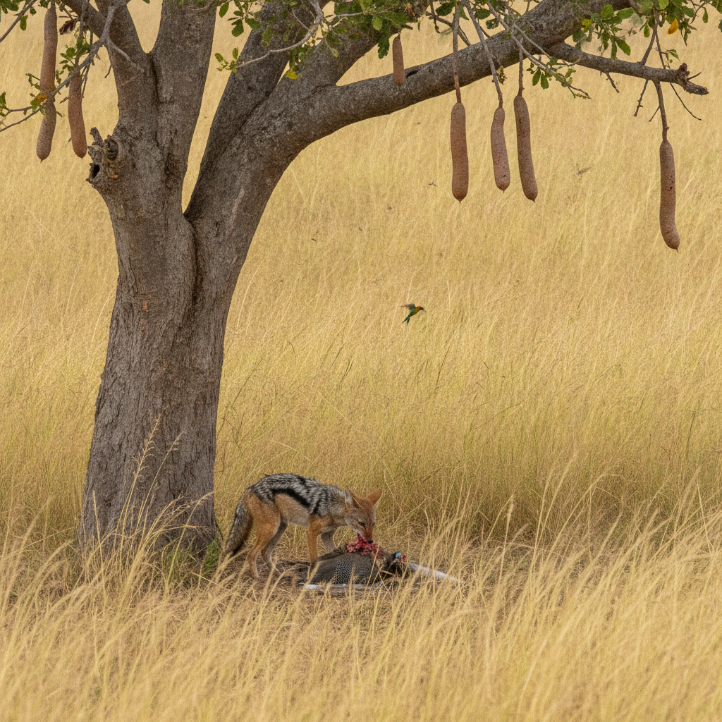
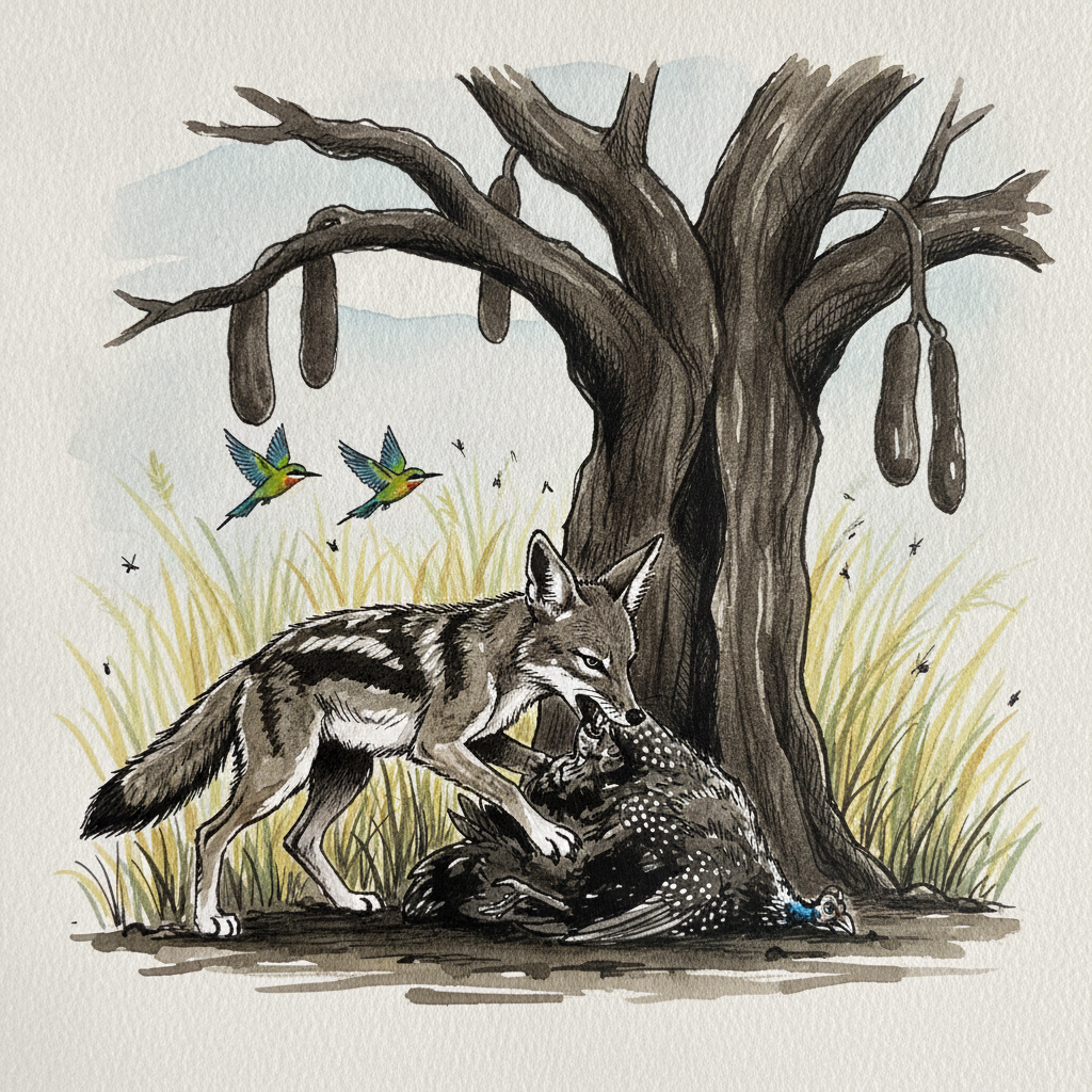
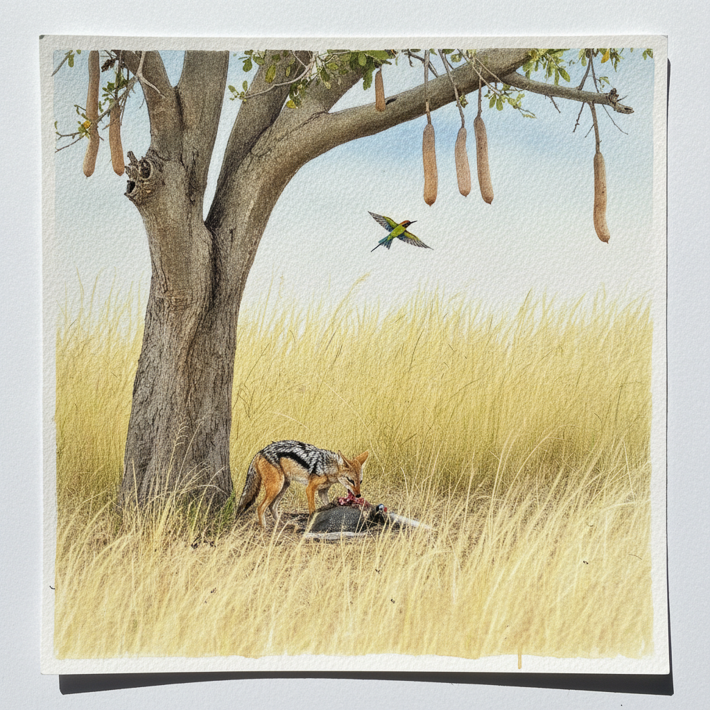
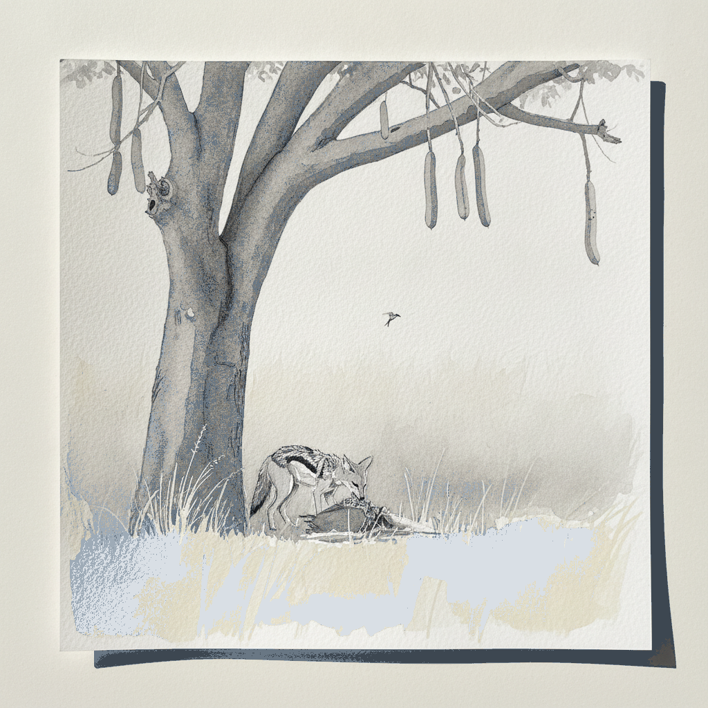
For this jackal study, concentrate on conveying movement and camouflage by integrating the animal's form with the surrounding elephant grass. Use a light, broken line for the individual grass blades and varied line weights to suggest texture and depth, ensuring the jackal's pale flank stripe provides a crisp focal point. Practice wet-on-wet washes to create soft background blur and the atmospheric effect of hot afternoon light, letting these loose applications contrast with more defined ink work on the jackal itself.
Piece 7 — Rowan branch with orange berries
Pen + Watercolor · Loose pen and watercolor line-and-wash
Three takes

Focus for this piece
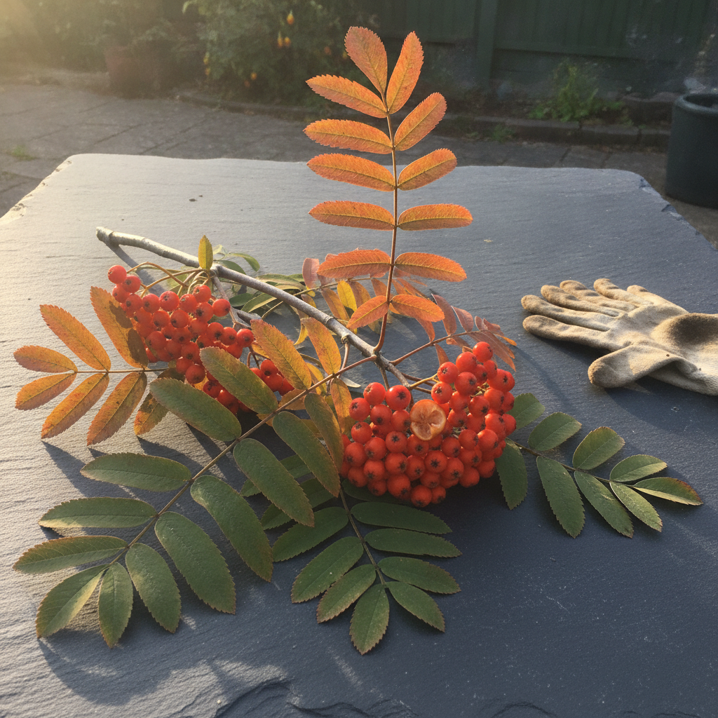
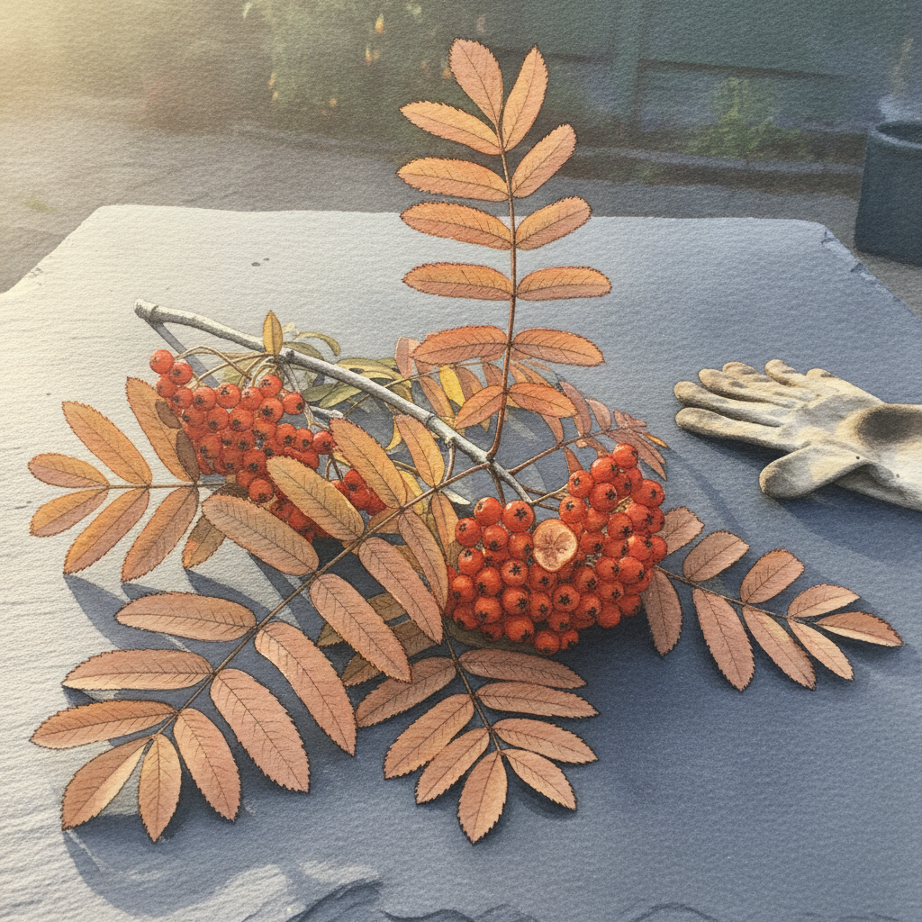
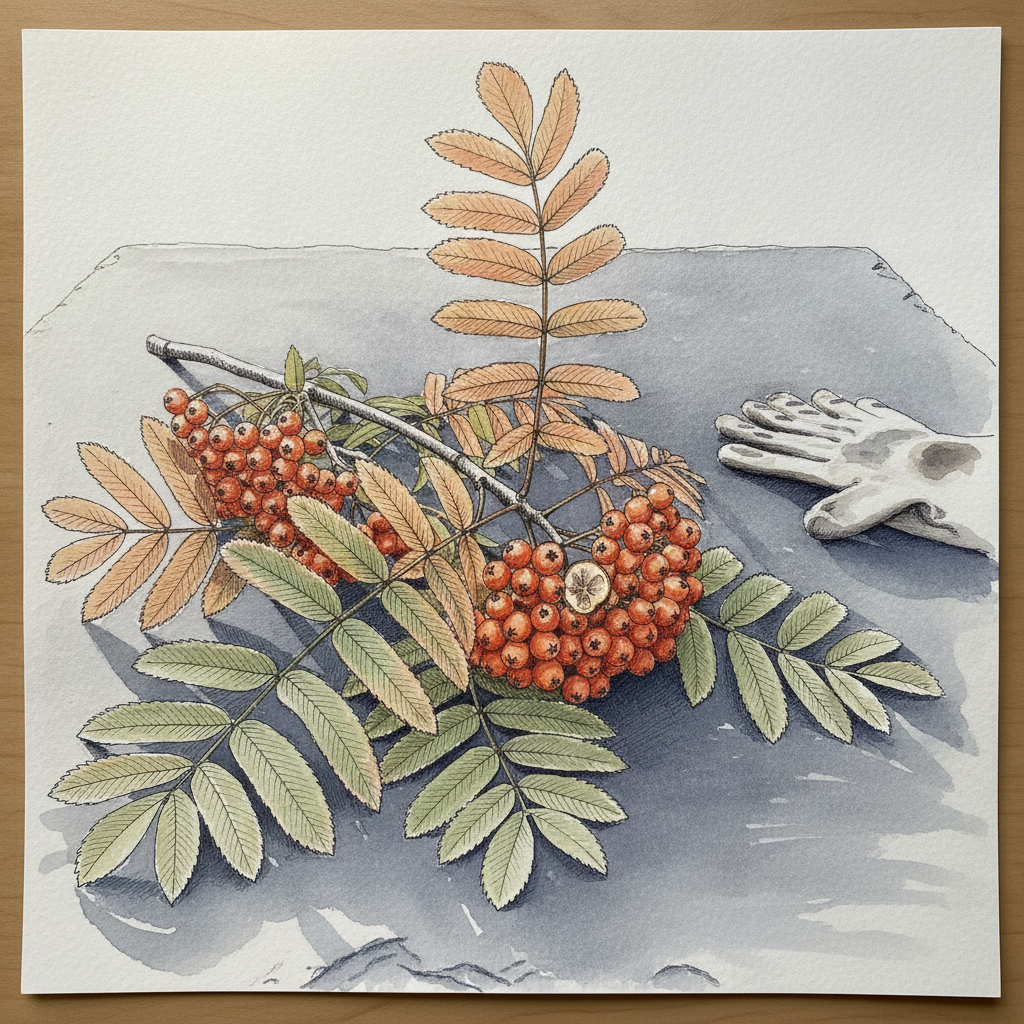
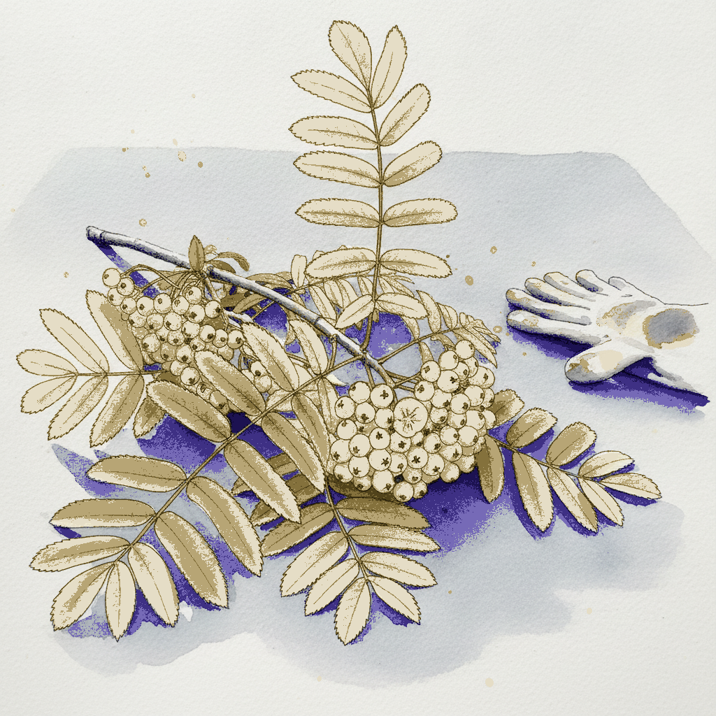
This piece is an excellent study in capturing the glow of late afternoon light on complex organic subjects, making the most of how pen and watercolor interact. Use varied line weights to articulate the delicate structure of the compound leaves and the dense berry clusters, letting ink establish the shadows and core forms. Then, build up the luminous quality of the orange-red berries with careful, layered watercolor washes, preserving key highlights with precision to make them truly gleam and capture the golden light.
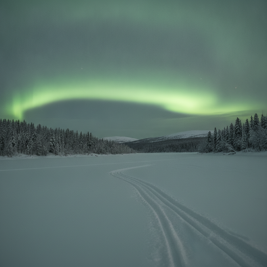
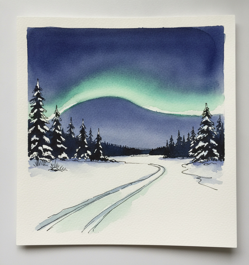
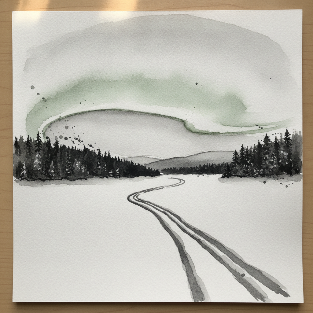
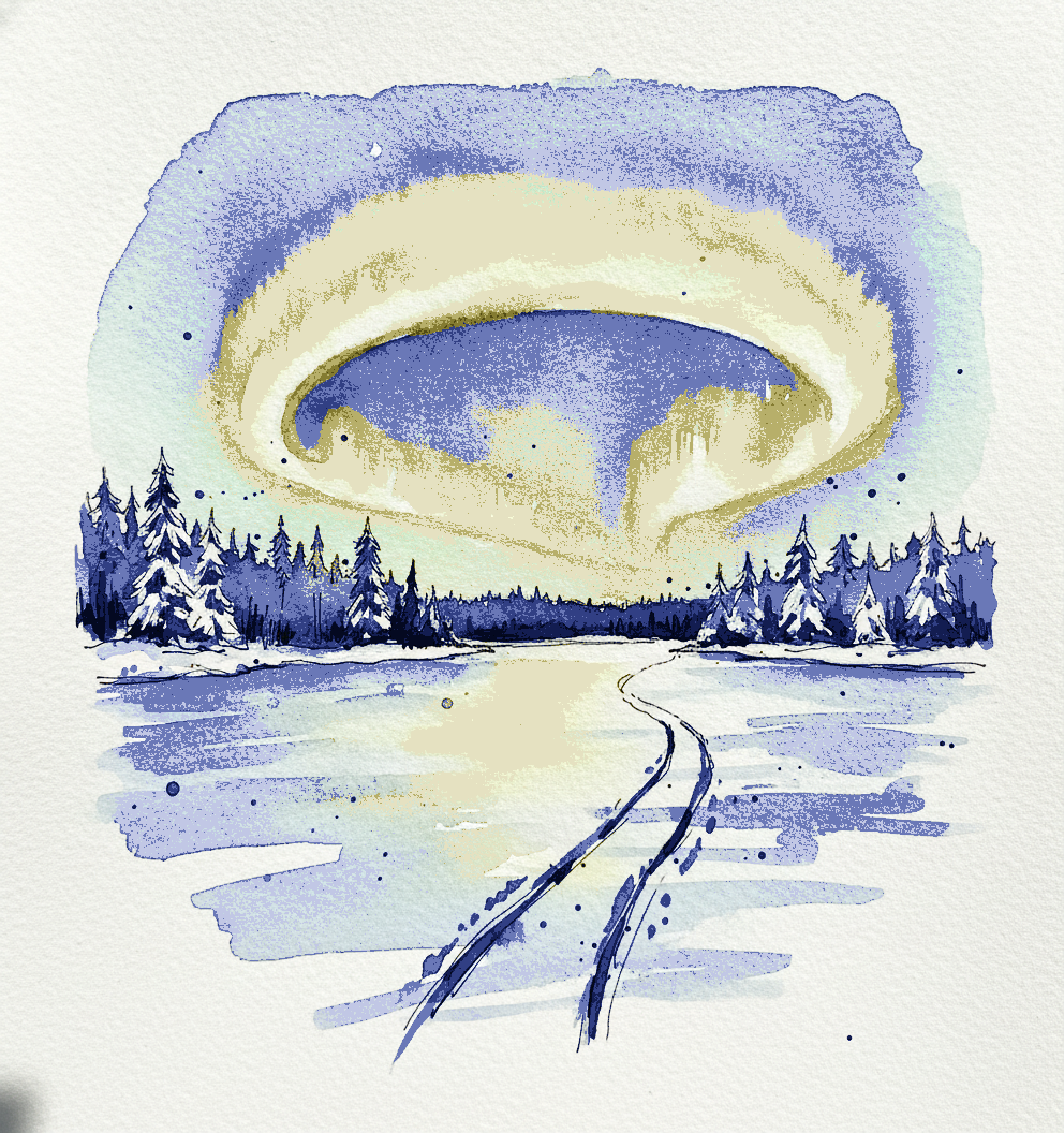
Piece 8 — Torne river aurora, Jukkasjärvi area, Sweden
Pen + Watercolor · Loose pen and watercolor line-and-wash
Three takes

Focus for this piece
This piece is an excellent study in leveraging dramatic value contrast to convey both light and depth: use deep, rich washes of Payne's Gray or Indigo to depict the heavy, snow-laden spruce forest, while applying a smooth, consistent wet-on-wet wash of Phthalo Green for the luminous aurora. Vary your pen line weight significantly, employing heavier lines for the closer spruce branches and fine, crisp lines for the snowmobile tracks to define the foreground. Focus on maintaining a limited, cool palette, allowing subtle shifts in blue-greys for the snow and distant hills to reinforce the biting cold and vastness of the Lapland landscape.